

FANGMANT
FANGMANT
Basket: FB, AMZN, NFLX, GOOGL, MSFT, AAPL, NVDA, TSLA

Good morning investors and traders,
You might have heard of the “FANG” acronym for stocks - FB, AMZN, NFLX & GOOGL. You may have also heard of the expansion of that acronym: “FANGMAN” which adds in MSFT, AAPL & NVDA. For this post, I’m going to throw in an extra letter ‘T’ for TSLA. Silly, I know, but why not? TSLA had one of the most epic runs I’ve seen, up over 2300% in under a two-year period, and it will always have a place in my memory for the gains it provided.
It is now part of the S&P 500. It deserves to be among the FANG basket of stocks, and I include it.
FANGMANT represents some of the world's biggest names and most widely discussed stocks over the last 10 years. Together they cover a large % of the market cap from the Technology & Consumer Cyclical sectors. Yes, there are three Consumer Cyclicals in this basket:
AMZN
NFLX
TSLA
I wanted to put these into an equal-weighted basket and chart it to see how things look. These are the “leaders,” and in my opinion, it would be beneficial to know how they are setting up going forward.
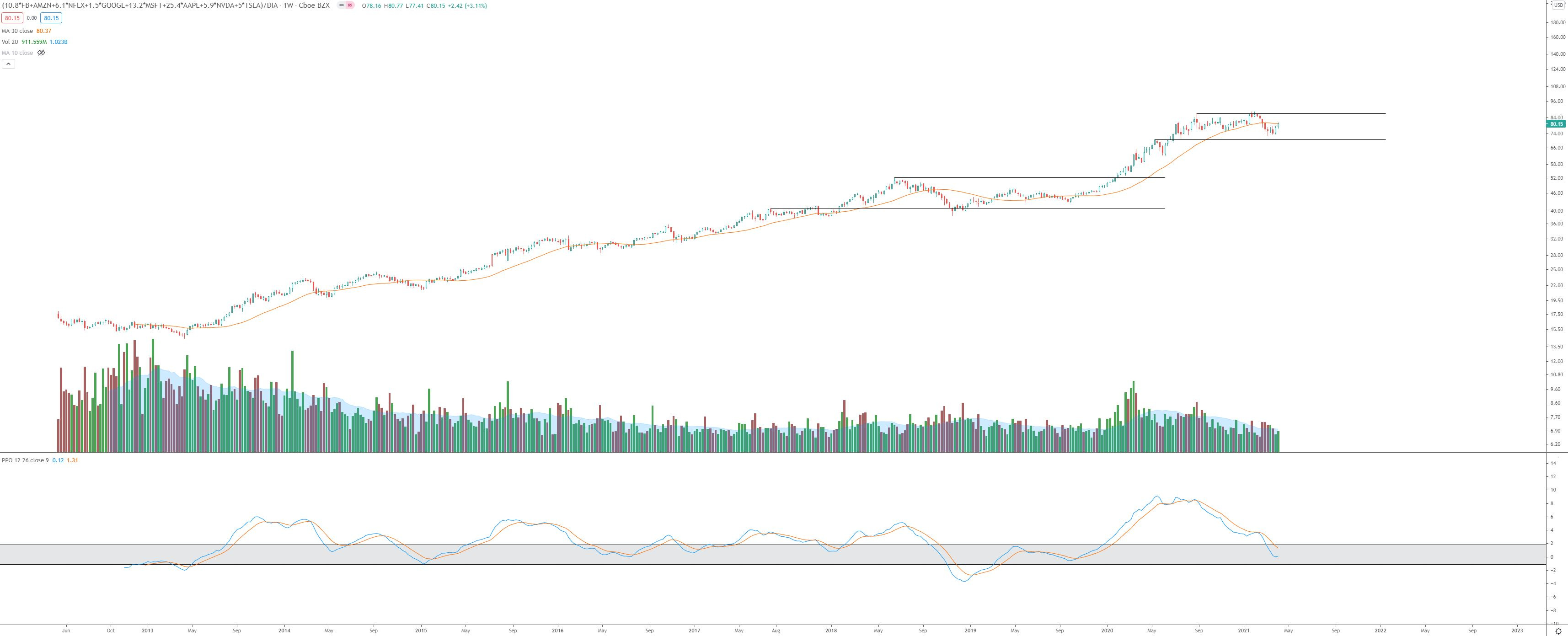
Below are the multipliers used for each, using the largest price of AMZN as the base and everything else multiplied up to it:
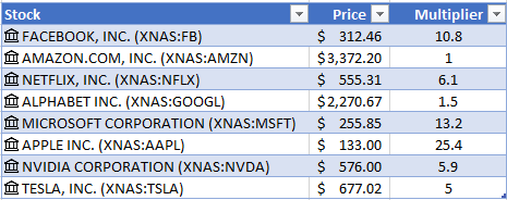
Here’s what the chart looks like with those multipliers taken into account:
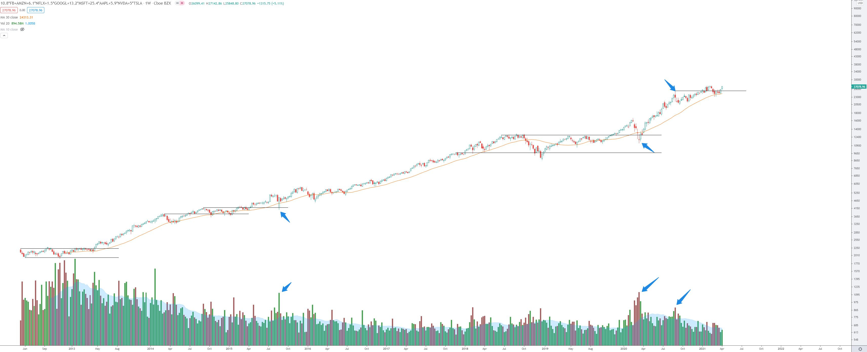
With yesterday’s close (Friday 4/9/21), this basket put in its highest every weekly close.
Some history:
The great thing about charts and the tape is they tell a story and give beneficial information. I traded all of these individual names over the years shown in the chart above. I have memories instilled in me from certain events and headlines throughout those years. Fortunately, trading through those years isn’t a requirement to benefit from future gains.
From the chart, what immediately stands out to me are the large volume spikes I’ve shown in the arrows. There are two noteworthy volume spikes of the selling climax variety:
August ‘15 “Tech Wreck”
March ‘20 “COVID Shutdown”
These were massive volume spikes that occurred after the initial base period of 2012.1 Typically, the basing period will see the largest volume, and as price marks up, the volume decreases. This makes sense from a logical standpoint: When a stock sees significant price appreciation, the market cap increases, and daily volume decreases accordingly. Look through hundreds of charts, and you’ll see this phenomenon repeating in every market.
August ‘15 “Tech Wreck”
What happened then was a consolidation / re-accumulation in 2014-2015 that ended with the August ‘15 selling climax. This was followed by a nearly 3-year, 215% rally.
March ‘20 “COVID Shutdown”
This one is fresh on everyone’s minds. The world shut down. Few stocks were spared. The volume spike here was massive, engulfing that of the 2015 selling climax. This occurred at prices 180% higher than the August ‘15 selling climax. For that reason, this puts in a very historic selling climax, IMO.
With the above taken into consideration, I’ve shown one additional volume spike that occurred more recently: August ‘20.
You might recall how heated things were towards the end of last summer. It was an incredible recovery period in the markets. Tech looked unstoppable, and nothing seemed able to stop it. But ultimately, it became stretched from some key moving averages (I’ve shown the 30-week SMA in orange) and culminated with a very wide-ranging candle that saw a high wick to low wick 15% drop. I’ve marked a horizontal line at this high wick, which price has recently chopped around. What is impressive to me so far is the price recovery from the March ‘21 lows. There were two weeks with low wicks below the 30-week SMA, but the candles could close above the moving average in both cases. A few weeks later, the tape has put in an incredible thrust higher for a powerful two-week rally.
With the recent strength and ability to close above the August ‘20 buying climax2, especially combined with a bounce off the 30-week SMA, I want to seek long setups in the FANGMANT basket of names while it is performing better than the SPY & DIA ETFs.
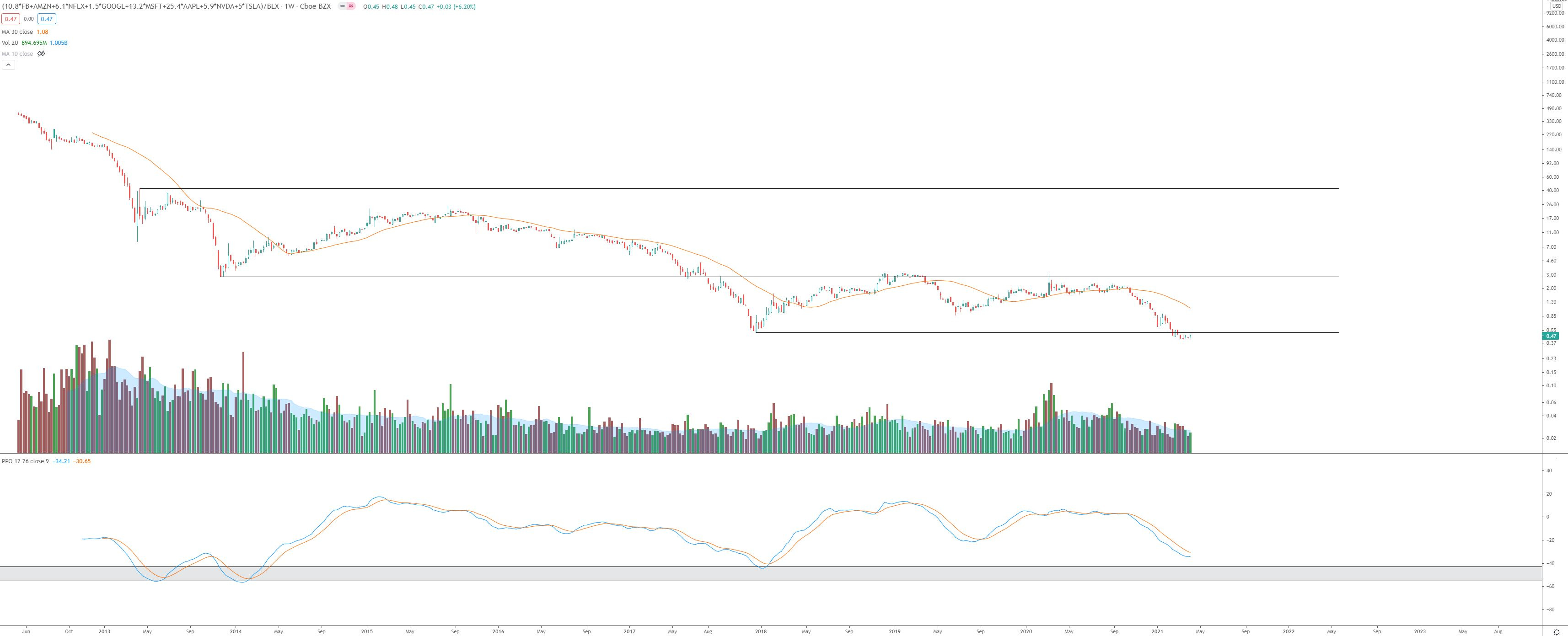
Perspective:
It always helps to take a step back and look at the bigger picture. How does this basket compare to the S&P500 or DJ-30?
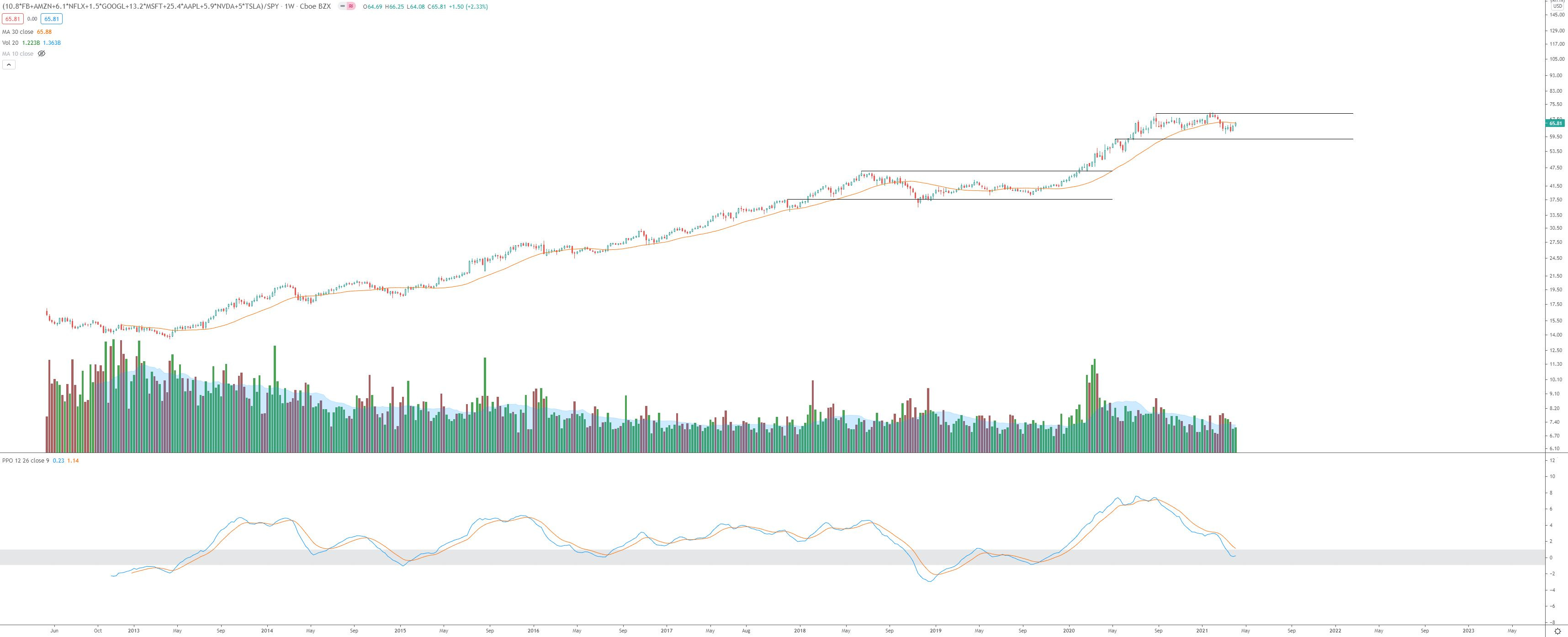
As shown in the two charts above, the basket is trading in a range relative to SPY and DIA. It may be hard to see, but Friday’s close was just below the 30-week SMA in both cases. I respect trading ranges and the 30-week just as much. For those reasons, I will be sure to curb my enthusiasm until the breakout from the range is clear or a tradeable “spring” is put in near the low end of the range.

However, with that said, there is reason to be cautiously optimistic. The momentum indicator (my favorite - PPO) at the bottom shows historical demand zones. This is entering those zones as I type this. With the bullish seasonality set to kick in for tech, and the rest of year seasonal outperformance in NDX vs. SPX on deck, this could be the play for the 2nd half of the year - or sooner should the range break to the upside before then.
How does the basket compare to Bitcoin? I’m glad you asked ;-)
Well, I’ve seen better-looking charts. Unless this can work its way back into the range while putting in a momentum crossover (bottom of the chart, PPO), I prefer Bitcoin. So until then, my focus will be on BTC and bitcoin-related names.
Happy trading,
Trace
FB had its IPO in 2012, so the chart data for this basket begins that year.
If you’re charting this one using the same multipliers, this level stands at $25264.09