

Weekend Update 11-15-20
Weekend Update 11-15-20
Rotation to Small & Mid Caps, Bitcoin Dominance vs. Everything

Good Afternoon Investors and Traders,
I hope this weekend update finds you well, and that you are staying happy, healthy & safe. In these times of social unrest, regardless of your political views, I always say to trust the tape, because unlike you and I, it is not emotional. I said it back in March, throughout the summer and I’m bringing it up again. Just let the tape be the judge and get on the right side of the trades.
This weekend I took a look at hundreds of weekly candle charts and came away with a strong impression that there is a migration to the mid & small caps. This isn’t just a one week move that I’m seeing. There are signs of this rotation taking place over the past couple of months, which I’ll get into below. One other noteworthy observation I made was the Bitcoin dominance vs. pretty much everything else. Today I’ll share plenty of charts that back this statement up. So let’s dig in, first with the weekly charts of the major ETFs (SPY, QQQ, MDY, IWM).
Large Caps
Large Caps (via SPY):
Large caps continue the grind higher, after bouncing off the key $325.85 level and the 30-week moving average (orange)
Prior to the election, subscribers were alerted to a bullish options trade (link here) that was almost perfectly timed near the lows at the $323 area two weeks ago. Many were fearful at the time, but as always, I looked to the charts for answers. This position was closed out for approximately 75% gains in just over 6 trading days. This was the 2nd options trade that I have shared with subscribers to be closed out, and both were nice winners (+100%, +75%).
My targets of $384 and $424 are still active, and are both shown on the chart
Large Cap Tech (via QQQ):

This has been holding steady in the consolidation zone which started in September. With this sideways, chopping action, large cap tech is losing ground to the SPX and Mid/Small caps, which I’ll show later
This is in a nice, long term trend channel and above a very rapidly rising 30-week moving average, so even though the charts are showing this is losing relative strength vs. other indexes, it is nothing to be bearish about
My upside targets are shown on the chart at $328 and $391
As mentioned earlier, QQQ is in a longer term bullish trend channel:
Mid & Small Caps
For the most part, any comments made in this section apply to both MDY and IWM. The charts and price movements are very similar.
Mid Caps (via MDY)
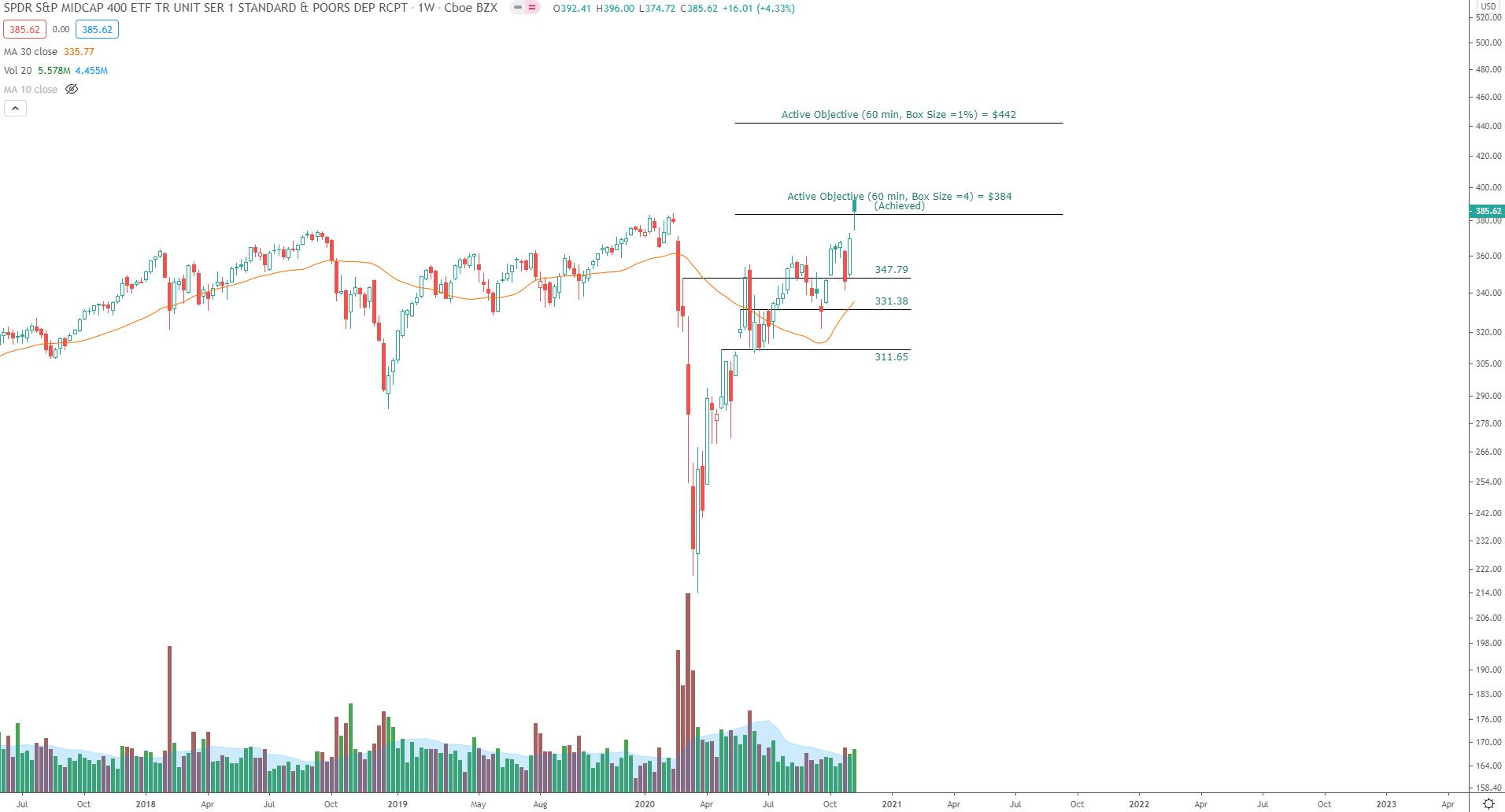
A target that I’ve been sharing with subscribers ($384) was achieved last week.
Sometimes people ask if I turn bearish after an upside target is achieved. No, absolutely not. Sometimes price continues to blast right through the target as it heads for even higher ones, and other times it consolidates, in stepping stone reaccumulation fashion, working up more energy to achieve the higher targets. But I don’t automatically default to a bearish mindset just because targets are achieved. I actually view it as bullish, and expect a trend continuation - leaving it up to the market to prove me wrong.
Going forward I’m going to remove this achieved target from the chart, and I’ve shown a new target which I can generate using the 60 minute Point and Figure 1% settings. The target is at $442, and is about 15% higher than Friday’s closing prices
Small Caps (via IWM):
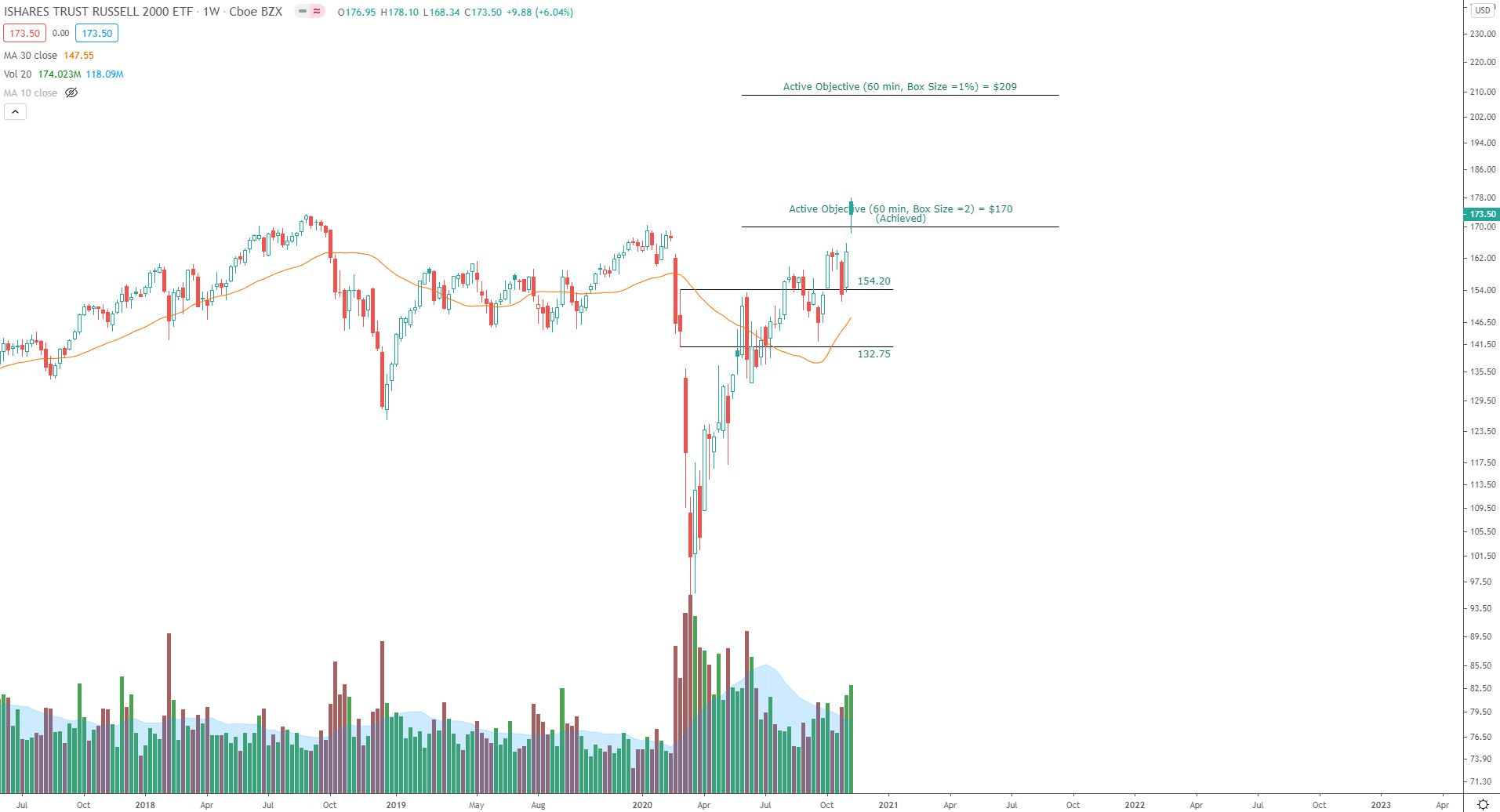
Like MDY, the IWM target I’ve been sharing with subscribers ($170) was achieved last week
I’ve added a new target to the chart at $209, which is about 20% higher from Friday’s close
Relative strength
As mentioned earlier, the relative strength of mid & small caps - and the relative weakness of QQQ - is becoming clear. I zoomed out on these charts using the weekly time frame to get a bigger picture view of what’s going on.
Relative strength of IWM vs. SPX:
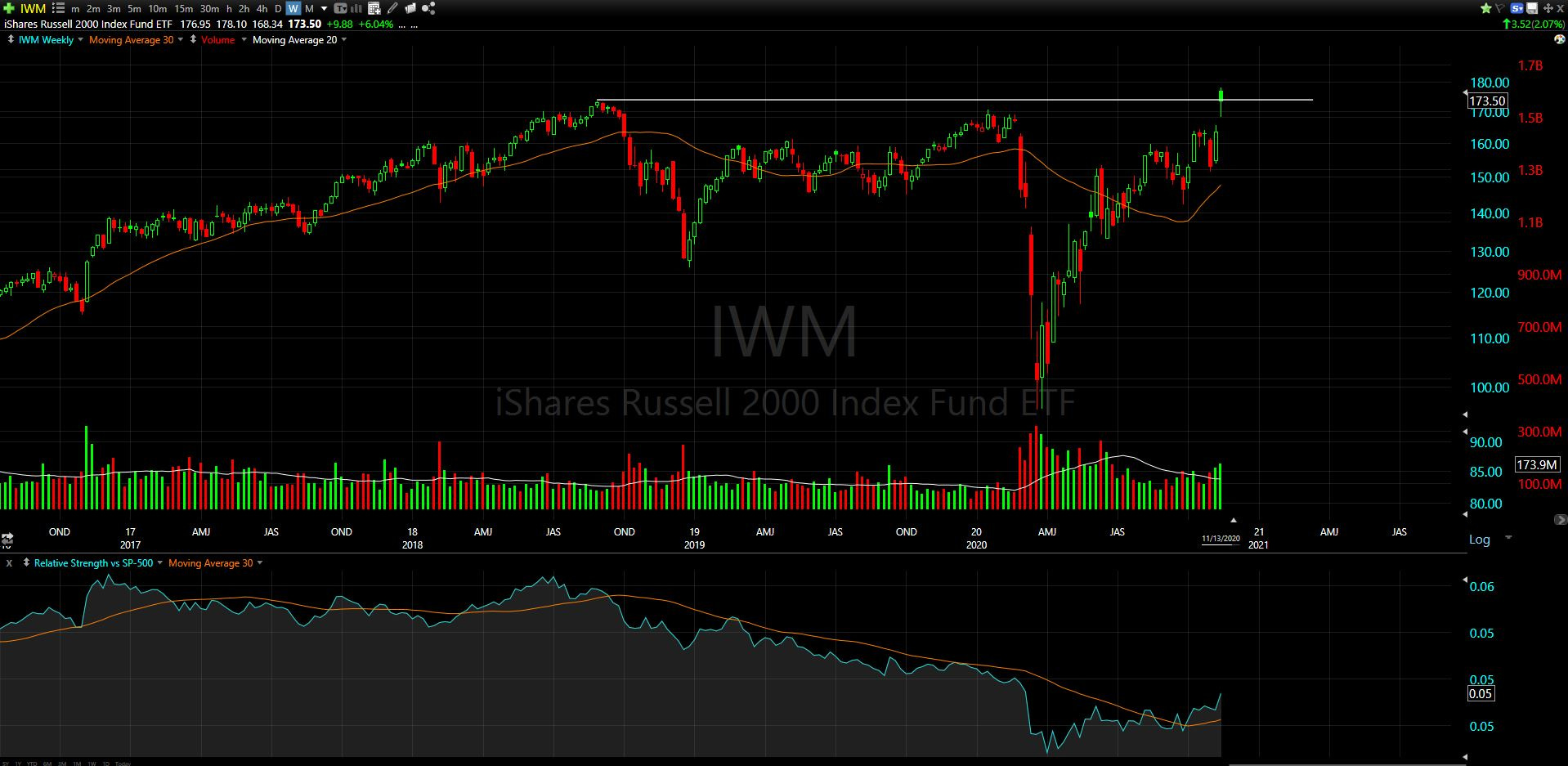
Relative strength, shown at the bottom of the chart, is starting to breakout from the selling climax that was put in during the March lows. This also coincides with new all-time highs in this ETF (which tracks the Russell 2000) which were put in on higher than average volume (bonus)
Relative strength of QQQ vs. SPX:

The relative strength (at bottom) rapidly pulled away from the 30-week moving average (orange) after the March lows. This shot up until the July 10th weekly candle, where the upward advance relative to SPX was halted. Since then, the strength vs. SPX has pretty much chopped sideways and has recently lost ground.
Now as the 30-wk moving average catches up, I am looking to see how QQQ responds in the coming weeks. From experience, continuation should be expected, but the market will tell us soon enough.
Sectors:
As I looked through the 11 sectors this week, I saw some very strong moves which I’ll note below:
Real Estate Sector
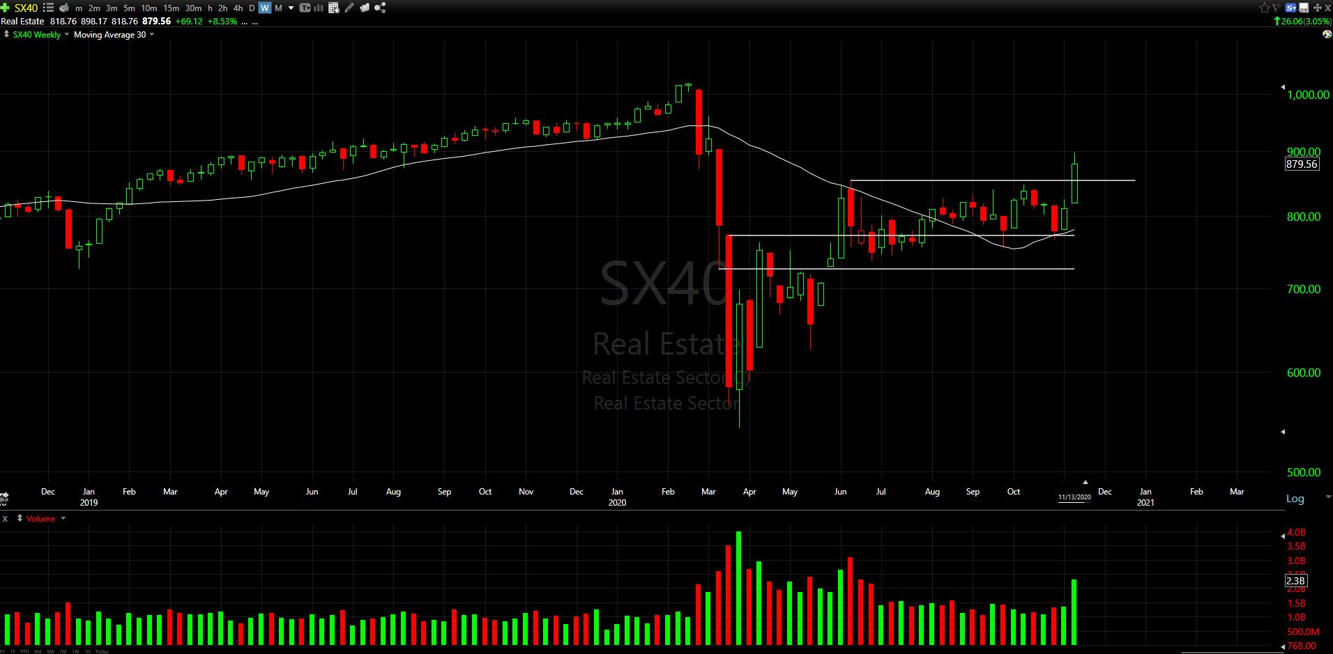
Breaking out above resistance on high volume, this weekly candle had a strong close up 8.5%
Within the sector, the Real Estate Services Industry has a nice looking chart:
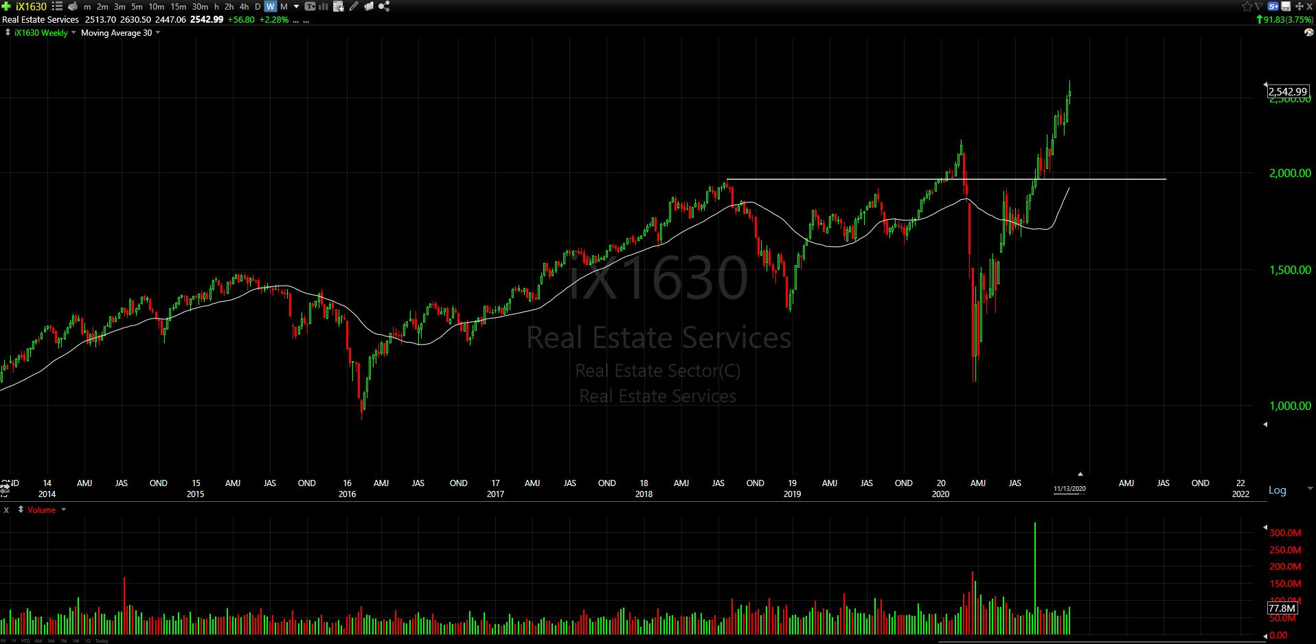
This has become somewhat stretched above its rising 30-week moving average, so I am keeping this industry on my watchlist for any potential backtests or sideways consolidation moves that would make it more attractive from a reward/risk perspective
Energy Sector
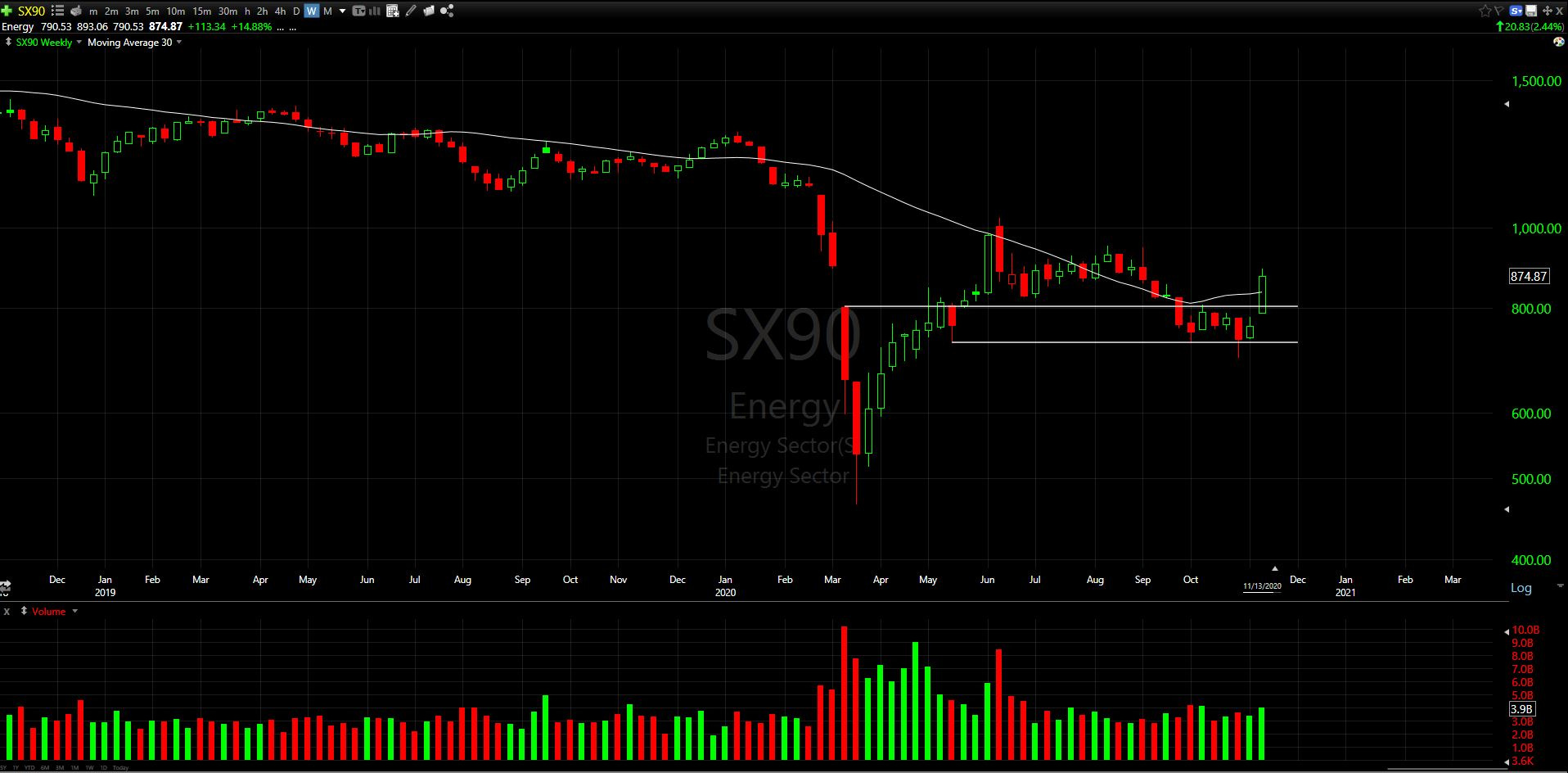
Left for dead in recent months, this is the kind of weekly candle that has my attention now. Not only is price above the March 13th weekly gap down candle, but price is now above the 30-week moving average, which has now curled higher
There is still plenty of overhead resistance to work through here, but this type of candle will keep my eye on this sector
Within this sector, there were a couple names that stand out. One of those names is SJT (San Juan Basin Royalty Trust), which comes from the Oil & Gas E&P Industry.
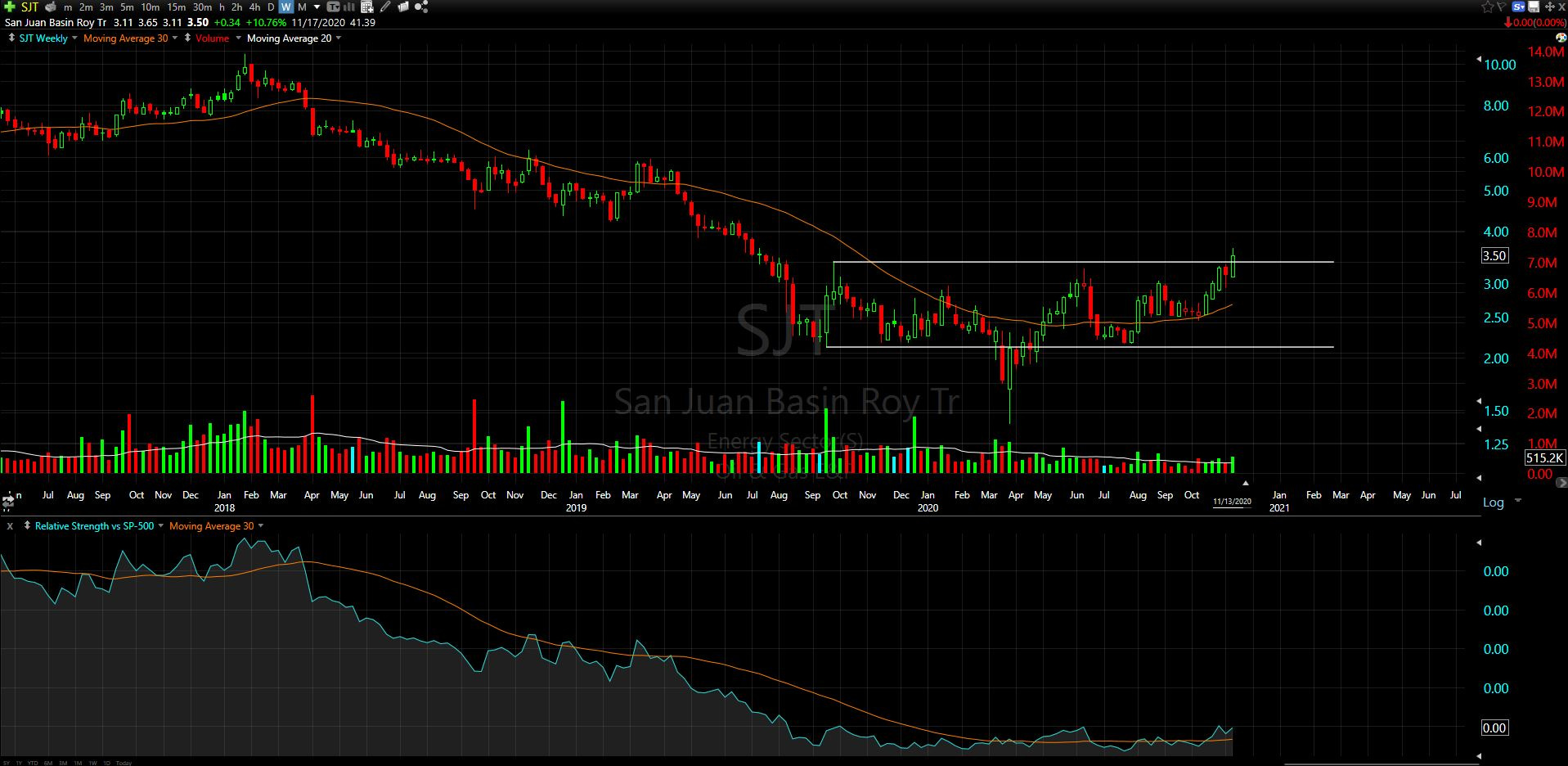
I like how the relative strength appears to be stabilizing now (instead of the continuous decline that went on from 2018-2020).
Price has started to breakout out from what looks to be a Wyckoff accumulation pattern, and put in its highest weekly closing level since July 2019. New 52-week highs usually attract buyers of the technical variety, so this may see some follow through if the Sector and Industry start to see a rotation
There are many beaten down Mid & Small cap energy stocks. I’m not rushing in to buy this sector yet, but it is on my radar more closely now than it has been all year
Industrials Sector
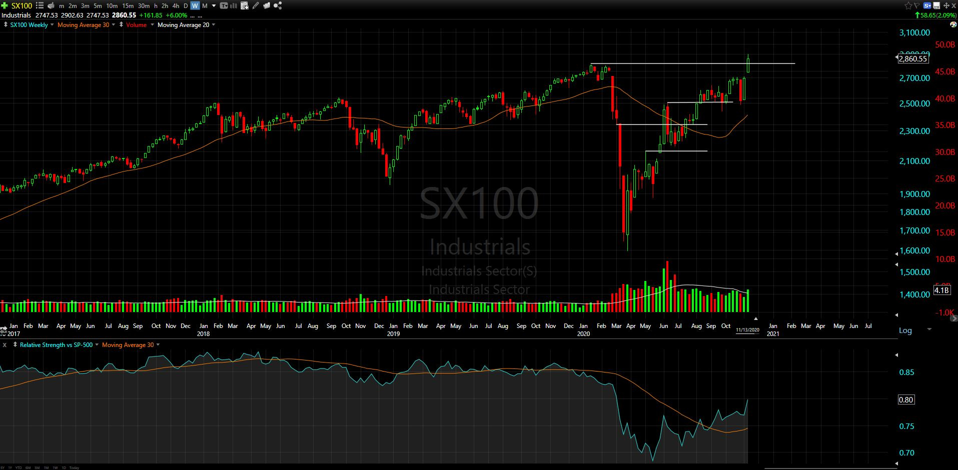
Fresh all-time highs, highest ever weekly close, relative strength breakout on higher than average volume. This checks a lot of boxes.
Within this sector, the Farm & Heavy Construction Machinery Industry looks like it has been working on a very long term base (2007-2017), with a multi-year stepping stone reaccumulation (2018-2020):
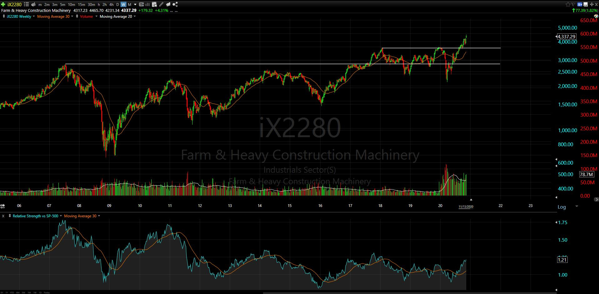
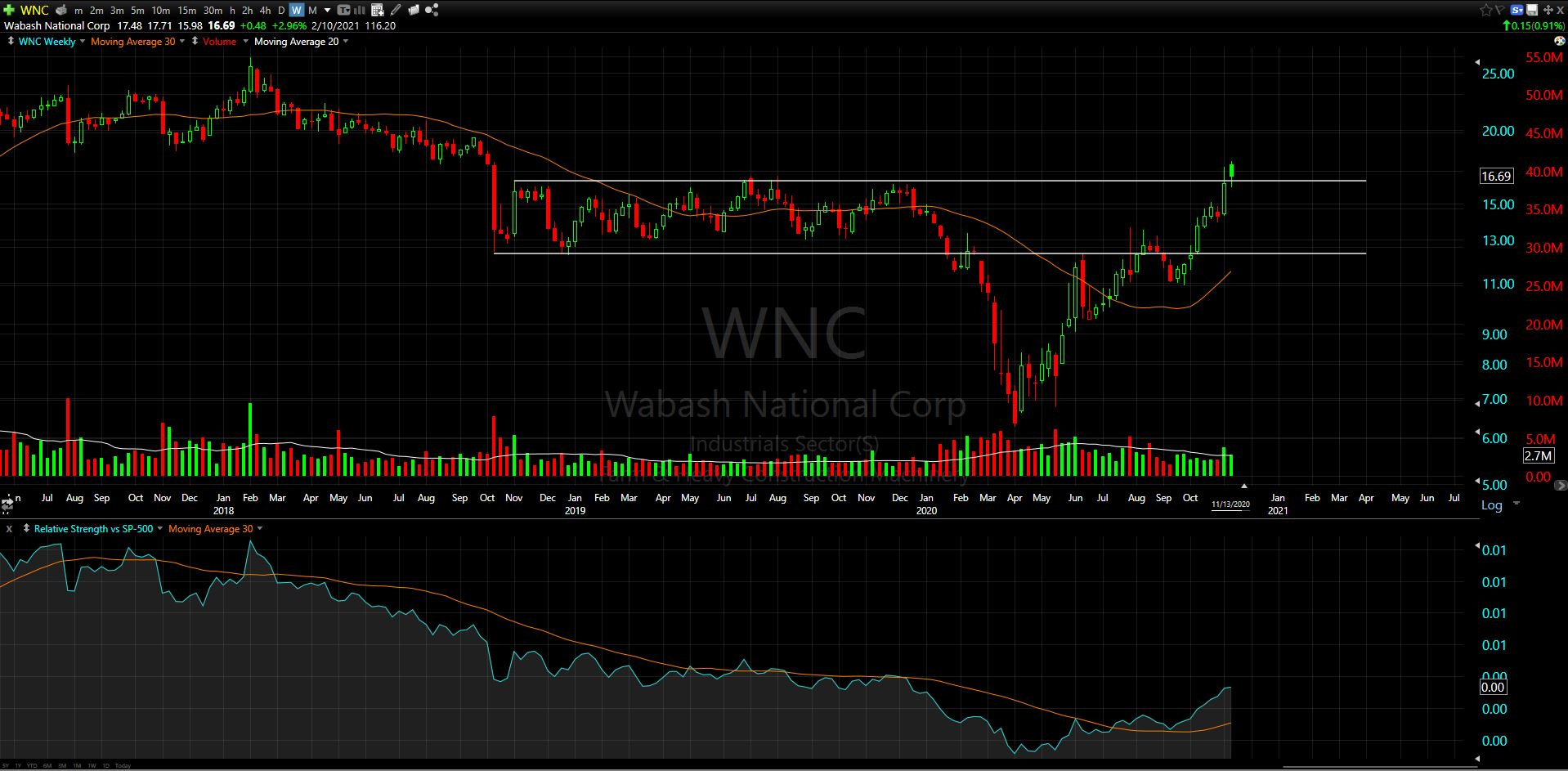
A couple names I see here that look promising are WNC (Wabash National Corp) and the long term leader pulling this industry up, DE (Deere & Co)
WNC:
DE:

Another industry in this Industrials Sector (LOL) that stood out is the Airlines
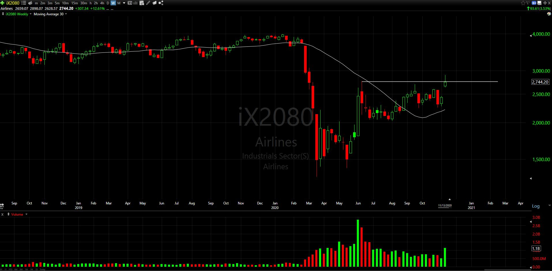
Looking like its testing some resistance on higher volume
Within this industry, I saw a couple names that stand out, specifically CPA (Copa Holdings S.A.)
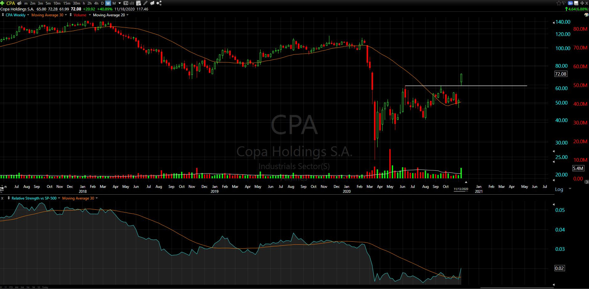
Price breakout on volume, with a bonus relative strength breakout
One other sector that I noticed had a strong move this week was the Financials
Financials Sector
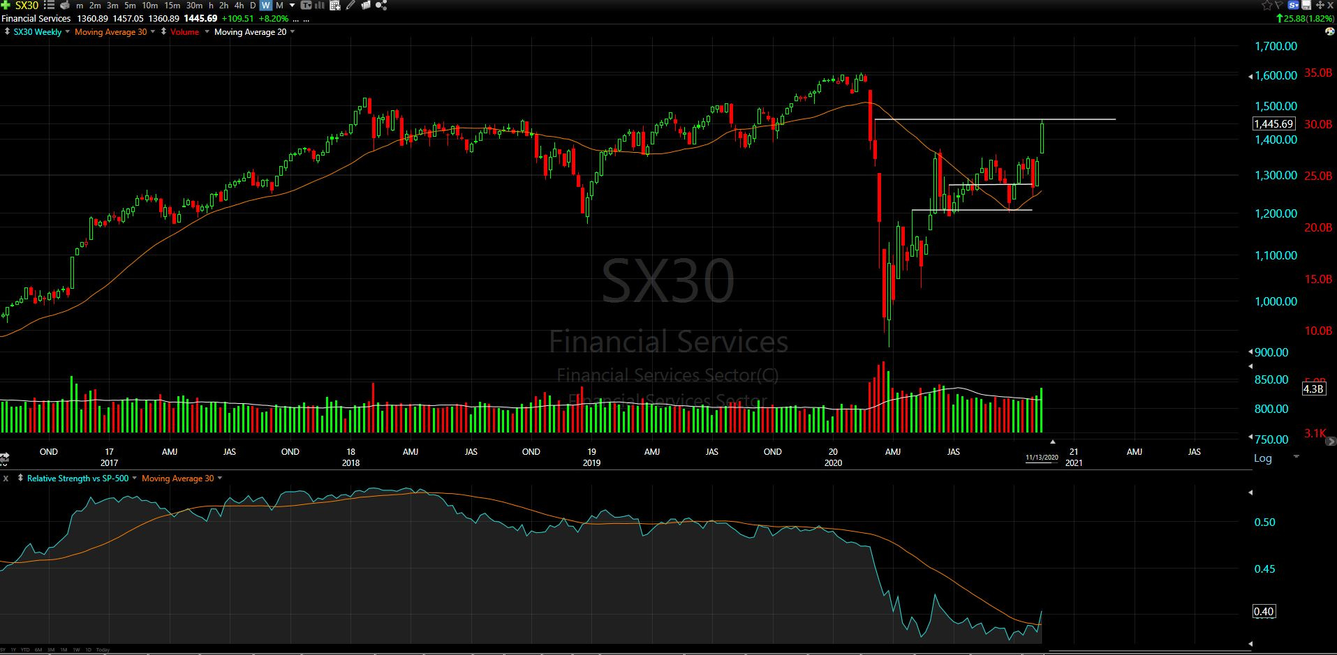
This put in a strong weekly close (+8.2%) and is showing a potential pivot out of the relative strength lows.
This has some work to do - so I’m not going to jump into this sector just yet. I’ll let it prove itself first, especially with all of the other good setups showing promising reward/risk ratios
VIX:
Here is the daily chart of CBOE Market Volatility Index, VIX:
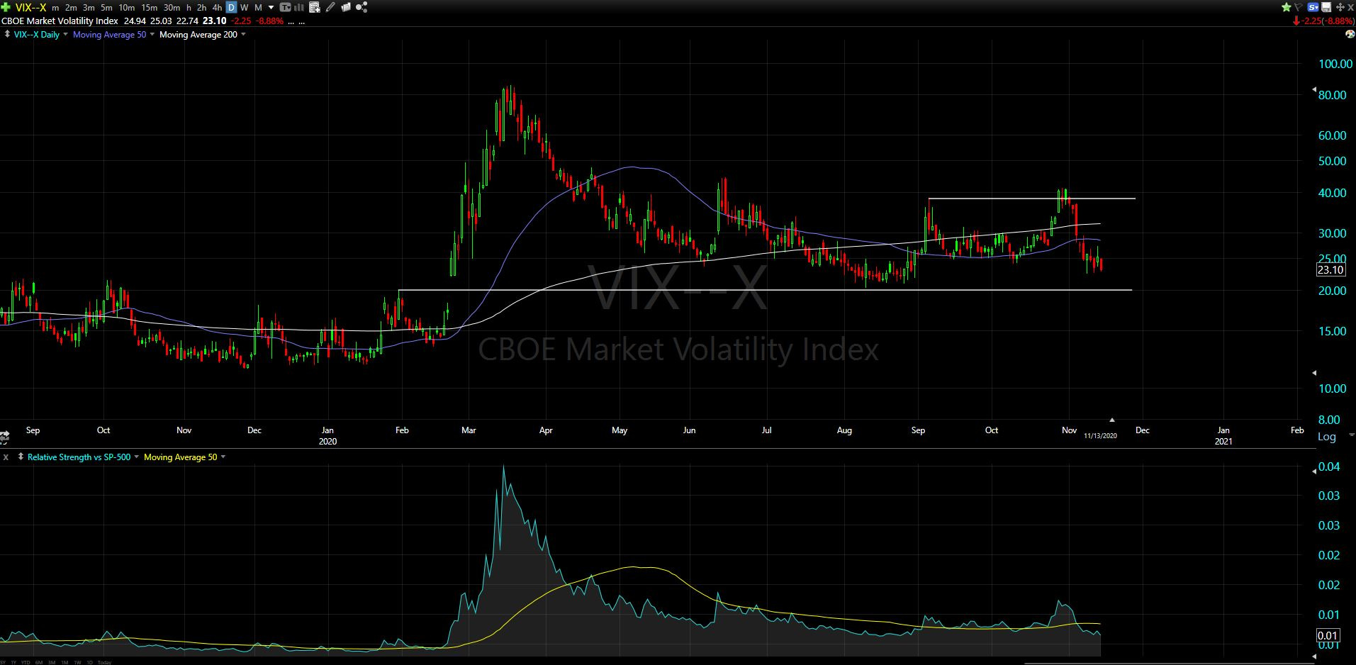
This has quickly retreated from the resistance level shown on the chart
Now it is approaching a technical support level around the 20 handle, which has resulted in several market pullbacks. Needless to say, the equity bulls want to see this close below 20!
Bitcoin
Note: The Charts For Freedom portfolio which I started back in July, is currently long Bitcoin with a ~20% portfolio weighting and >50% position gain. This has been a very solid winner for anyone following along and I am very much looking forward to the next ~15 months or so.
First I’ll share the BTCUSD chart (via BLX ticker on Tradingview) with a couple comments:
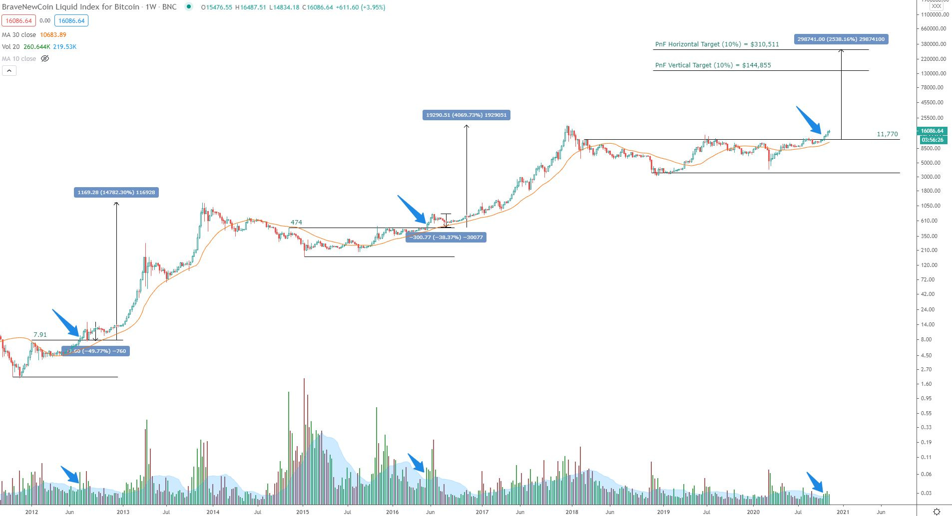
I’ve shared this one with subscribers several times. The recent breakout on volume looks very similar to the two prior bull markets shown on chart
In each of the prior bull markets, there was a steep pullback to test the breakout area. For example, in 2012 before price skyrocketed 14,782% from the breakout area (Yes, fourteen thousand percent) there was a 50% pullback in price to test the breakout. Then again in 2016, before price shot up 4,069% above the breakout level, price pulled back 38% to test said level.
So here we are in 2020, four years after the prior breakout of 2016, which occurred four years after the 2012 breakout. I believe the next breakout has begun. I am loaded and ready, and will look for any pullbacks to the breakout area to add some more. As it stands now, with price recently wicking at a high of $16,487, a pullback to the breakout area of $11,770 would represent a 29% pullback. Is this pullback guaranteed? No. Am I prepared for it? Yes! Do I kind of want it to happen? Well yes, I would love to add as much as I can before what I believe to be an epic markup begins. I am guessing I am not alone in that desire, so it may not happen.. Who knows? The market will decide soon enough - and as I type this price has already pulled back about $700 from those highs.
Ok, now for the Bitcoin dominance that I mentioned earlier. I’ve got a bunch of charts to get through, so I’ll keep the commentary low and let the charts speak for themselves (mostly).
BTC/SPY:

Sent this one to subscribers several times now, this looks to be setting up for something nice
BTC/SPX ratio (via PnF Chart)
Back in May I had pointed out (on Stocktwits) the bearish 45° had broken on this ratio, and provided a target of 5.0. Price is almost there, currently trading at the 4.4 area
BTC/QQQ:

BTC/DIA:
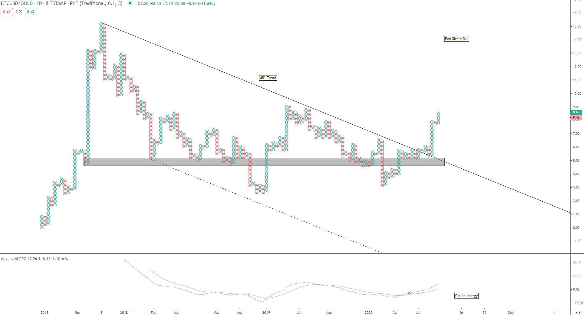
BTC/Gold
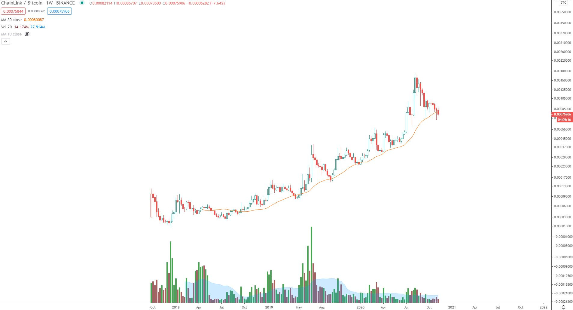
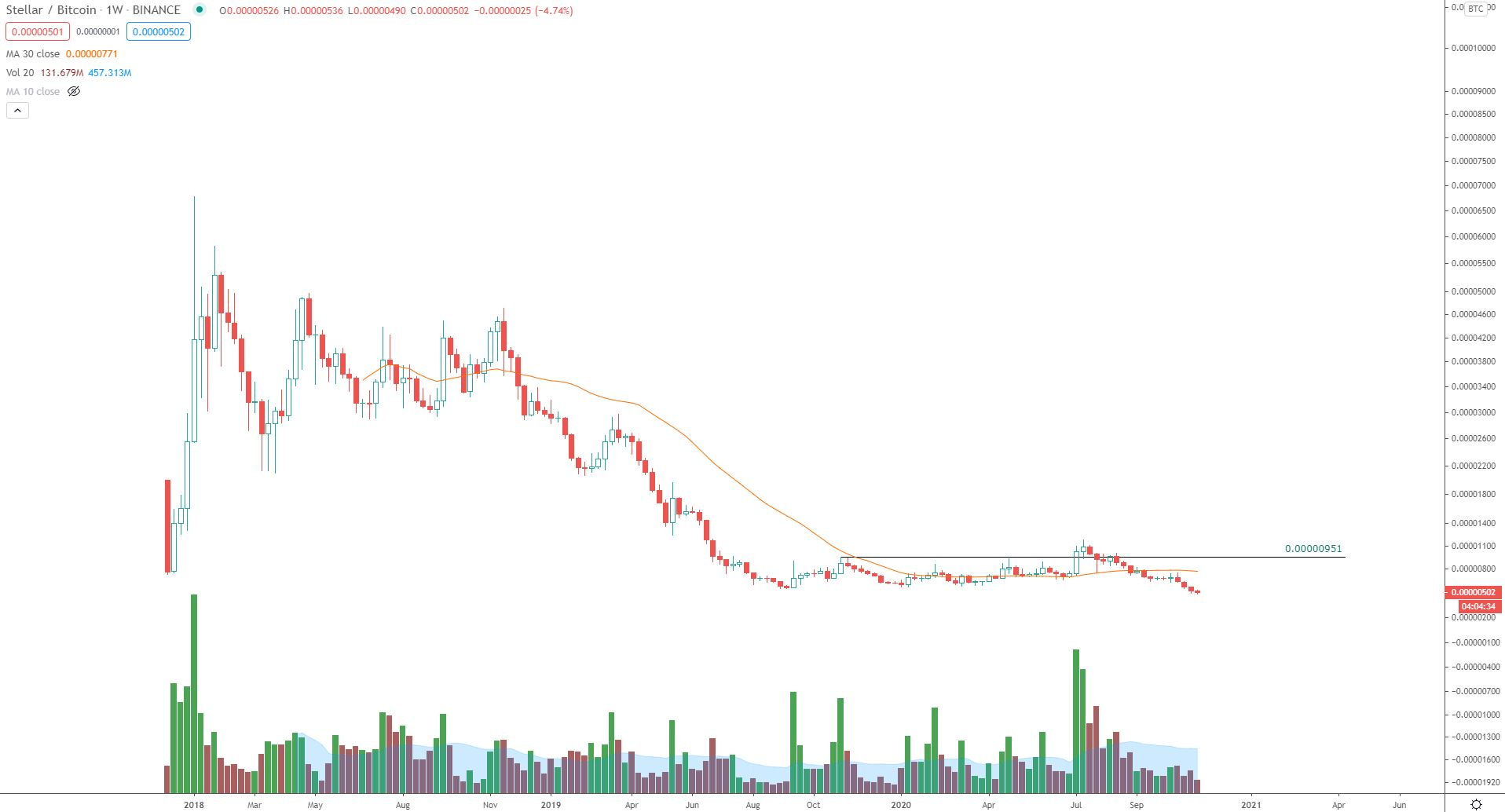
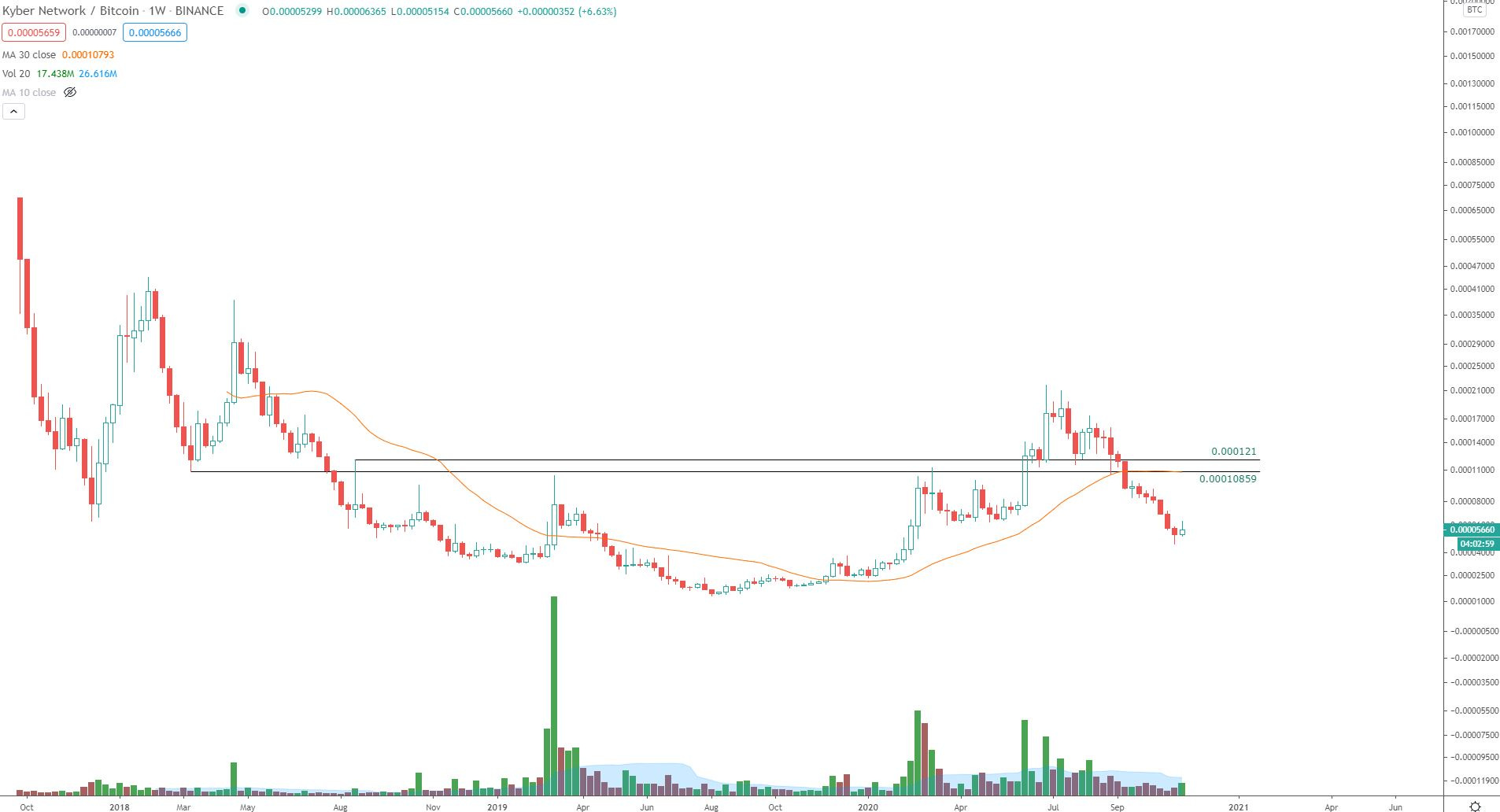
Now a look at the other cryptocurrencies vs. Bitcoin. A common theme across them all: All of the ratio charts are currently trading below the 30-week moving average.
ETH/BTC
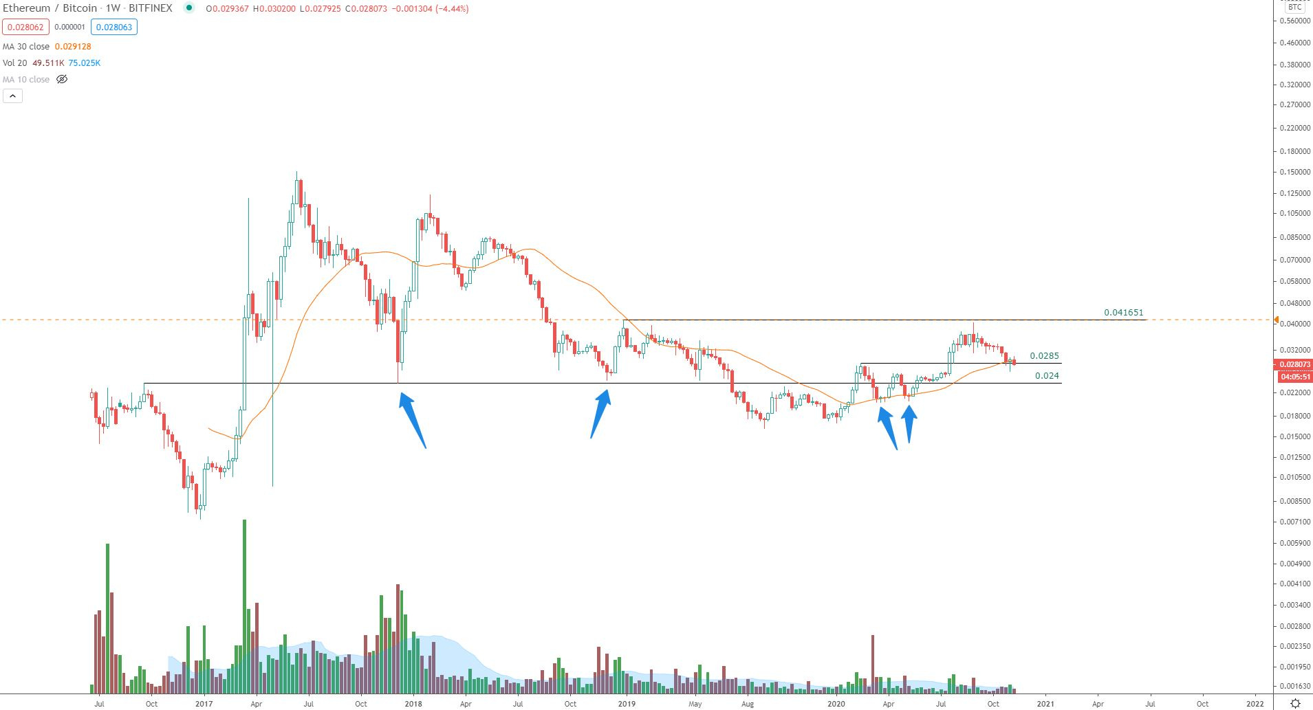
Until recently, this was looking very solid vs. Bitcoin. Perhaps it can recover soon, but as it looks now this is about to close below two key support items (key ratio level and 30-week moving average).
LINK/BTC:
XLM/BTC:
KNC/BTC:
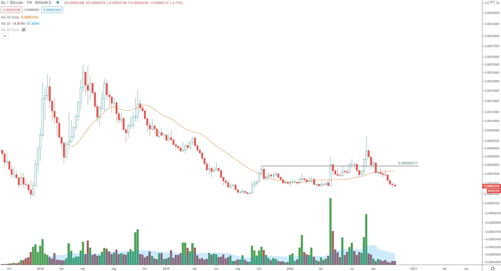
ZRX/BTC:
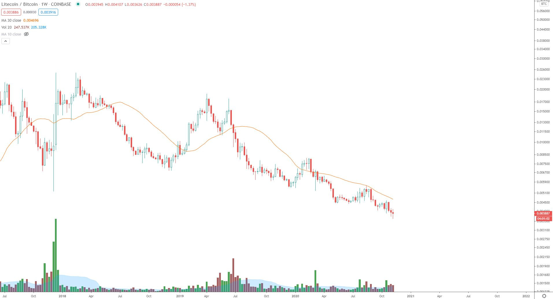
LTC/BTC:
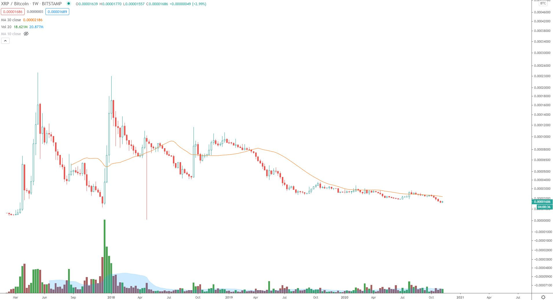
XRP/BTC:
Bitcoin - Just like falling in love, or falling asleep - it’s going to happen “slowly then suddenly”. Right now this has an approximate $290 billion market cap. I don’t see how this doesn’t become a trillion+ dollar market cap in the next two years. The charts are certainly suggesting it. The brightest minds in the world are working on this network and constantly surprising me with new ways to serve people all over the world.
Just as a frog in warm water comes to a boil “slowly then suddenly”, I sometimes wonder if the frog from this will be the banks and other financial institutions choosing not to implement or embrace Bitcoin. It is inevitable - just like Thanos, but with a better ending.
If I had to choose one trade for the next 15 months, it would be…Bitcoin (even with that potential 30% pullback). I think of it as the Dr. Strange “one scenario” from Infinity Wars:

Have a great week,
Trace