


As you all are likely aware by now, I am a huge fan and advocate for Point and Figure (PnF) charting. I absolutely love implementing these charts, and find them extremely valuable. This will be the first post (hopefully of many) I write on PnF. Some future PnF posts I plan to write are:
Counting (including log scale or percentage box size)
Trends and Objective 45° Lines
Tactics
Hopefully there will be good opportunities to do additional PnF posts as this crazy year progresses. With this being an election year combined with the virus news and social unrest, it can sometimes be hard to know what news to trust or if it matters at all with respect to the markets. We’ve all seen the headlines this year related to virus cases, protests, 2nd wave, lockdowns, unemployment numbers, Fed this, Fed that, etc. But since March we’ve been in a sustained rally, just as the news seems to have constantly been negative. This year is just another reason why I don’t pay attention to the news, and I trust PnF to keep me on the right side of the trends and as a navigation tool that helps block out the noise.
From the day I started utilizing these charts my success increased overnight. It was an immediate eye opener and I soon realized that I had at times been needlessly fighting against trends or selling too early. I wish I had found it sooner and quickly learned a few things:
I discovered a reliable way to gauge whether a rally / decline had exhausted all of its energy i.e. “gas in the tank”
I was able to determine how close a move might be before the the next pause, and in some cases, reversal would be
I quickly found that PnF charts work on ANY market that I had interest in (equities, commodities, cryptos, etc.)
The principles of PnF can be applied to 1 min. charts (very tactical) all the way up to daily charts for counting purposes
PnF helps remove emotions and subjectivity
So of course in my early days of Point and Figure charting, I went back to look at historical examples where I had made major mistakes. We’ve all made mistakes, and I’ve had my fair share. In just about all cases that I could recall, if I had known about and implemented my PnF findings, I most certainly would have avoided the steep losses from fighting against trends and likely would have been on the right side of them. I also would have captured larger gains when selling too early (another mistake).
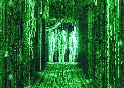
So what is Point and Figure? I recall the first time I read about point and figure charts when studying Richard Wyckoff. I had no idea how the heck they could be used, let alone that they were even useful. To me, it just looked like a fancy tic tac toe board game. But once I started digging in, I began to appreciate their value. Once I learned how to read and construct PnF charts, I felt like the operators from The Matrix who could just look at the screen and intuitively know what was happening in the program.
To me, PnF is a way to measure the potential effect from a given cause. Or said another way, the potential markup / markdown from a given accumulation / distribution. I was able to clearly see the battlegrounds that took place between bulls and bears in a well defined consolidation range. When price begins to escape from a given range, I am able to establish a count (objective), and gauge the reward/risk on a certain position. Below is an example of how PnF can really cut out the noise and shows a clean picture of what’s going on. This is a Daily PnF chart of the $SPY ETF, using a 4% Box Size with 3-Box Reversal.

[This is a “close-only” chart, meaning the closing prices are the only way to move a column of X’s or O’s. The alternative chart I use is a “High-Low” chart, which incorporates the high or low from a given day into the X’s and O’s. I’ll explain this in more detail in a follow up post.]
This daily PnF chart covers nearly 20 years of price action. Notice how the X-axis is not consistent in size between years? This is because PnF is a function of volatility, and not time. Areas of high volatility will print more columns than areas of low volatility. Look at the number of columns that were printed in high volatility years 2001, 2002 and 2008. This is a key characteristic of PnF.
For contrast, here is the Monthly Candlestick chart of SPX:
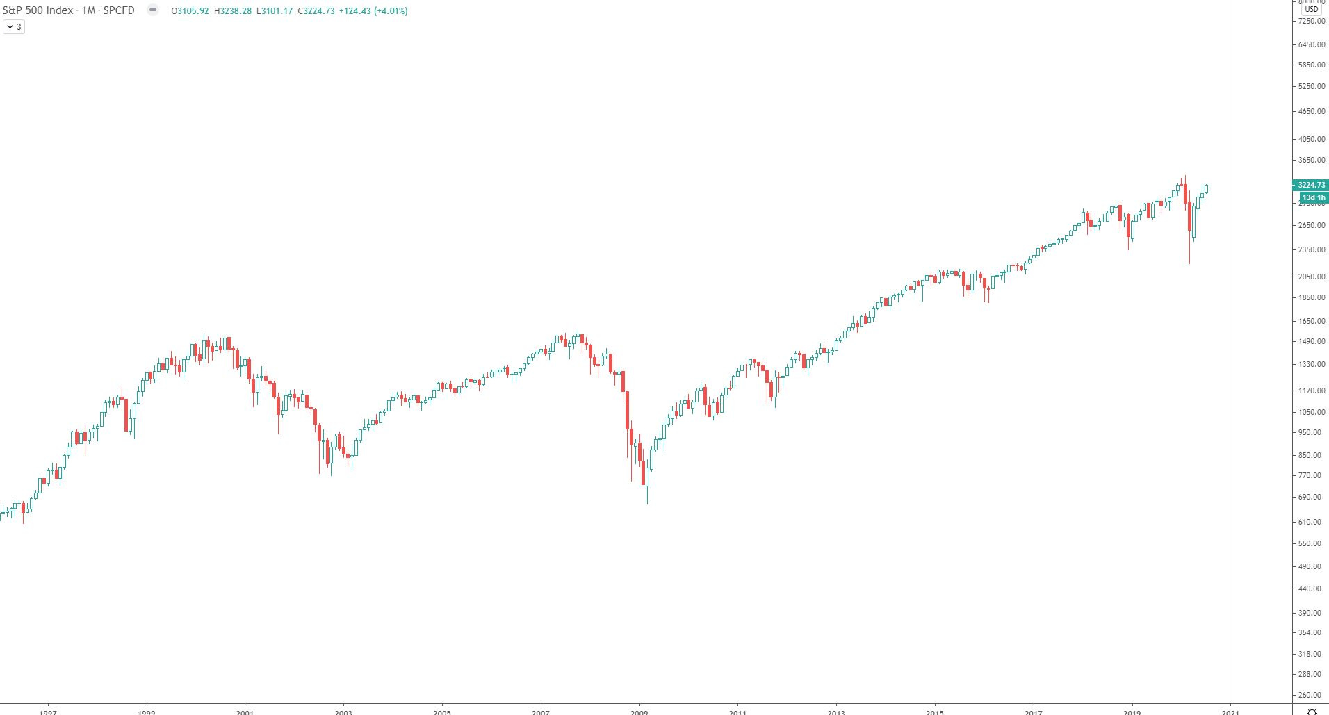
Notice how the “battleground” that lasted from 2000-2009 is harder to see? It’s there and I can see it, but it is much easier for me to see the same battleground on the PnF chart. PnF also gives me a rules based way to measure the cause and estimate the effect that may result. From the 4% chart above, I can generate an objective of $326.46. Yes, nearly 11 years ago, one could have used the PnF chart to generate a count of $326. I’m always amazed at the volatility that took place between 2000-2009, and even more amazed that there was a relatively easy way to gauge the strength of the resulting move.
So here are the basics of that 4% chart: (Note I’ve used 4% in this example, but other % box sizes can be used)
Price increases are reflected with Xs
Price decreases are reflected with Os
The Xs and Os are called boxes
The columns of Xs and Os represent demand and supply
Price is scaled on the Y-axis, determined by the box size
For the example chart above, the box size is set at 4%, meaning the value at every next row will be 4% higher than the previous row’s value
Price gaps are recorded as though price traded through the gap
How to print an additional X on a column of Xs: Only on a closing price which is 4% above the current box value, will an X print.
How to print an additional O on a column of O’s: Only on the closing price 4% below the current box, will an O print.
The timing is not linear on the X axis. This is because PnF is a function of volatility, and not time
3-Box Reversal. This means for a new column of X’s to be printed, price must close 3 boxes above the current columns’ lowest O. Similarly, in the opposite direction, for a new column of O’s to be printed, price must close 3 boxes below the current columns highest X. If desired, the reversal amount can be altered to 1 or 2 boxes. This will result in more noise, but can be a tactical method.
For additional PnF chart construction techniques, a good resource to use is on stockcharts.com (link)
For an excellent blog on Point and Figure, I recommend Bruce Fraser’s blog Wyckoff (link). I have been following Bruce’s Wyckoff blog since 2016 and I have learned great amount from his writings, not just limited to PnF. If you also have an interest in Wyckoff, it is a great read. While you’re at it, follow his colleague Roman Bogomazov on twitter: (@WyckoffAnalytics). Both of these guys are top notch technical analysts.
My favorite book on Point and Figure is by Jeremy Du Plessis titled “The Definitive Guide to Point and Figure”. For me, this is my favorite book on technical analysis. Mr. Du Plessis describes PnF charts as his “island” chart. Meaning, if he had to live and trade from an island, and he could only use 1 type of chart, it would be PnF. It’s a close call for me, but I would agree with him if I had to make the same decision.
Another bonus feature of PnF is the objective 45° trend lines. Too many times I would draw a diagonal trend line on my candle charts, see it break, slightly adjust it to fit my narrative, see it break, so I adjusted it again on and on. The problem is, diagonal lines on bar / candle charts are subjective by nature. A chartist subjectively decides where they will place Point A, then decides where they will place Point B. If it breaks, personal bias may lead them to adjusting it because they are unwilling to admit they were wrong. I’ve seen it happen countless times, and I’m guilty of doing it in the past as well. In a follow-up post I’ll go over the objective 45° lines and how I use them.
So where do I see the current counts and objectives for SPY? Below is a 60 minute chart of SPY, using Box Size 3.0.

As shown on chart, if price prints an X at $324, the objective for $384 becomes active
Why did I choose Box Size = 3? It’s not scientific by any means, but experience has taught me that using the ATR(20) from the period between the columns of interest is a good start. See chart below:

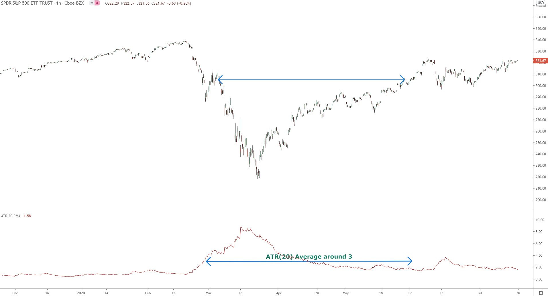
Does this mean price will go straight up to $384? Almost certainly not. This is just one more piece of evidence I will use when gauging the potential for further rises in price. First, there will likely be a technical resistance at the SPY ATH area. 2nd, the price objective for $384 hasn’t been activated yet. So if the price objective isn’t “active” yet, what is the currently active objective? For that I take the same chart, start from the same beginning column of Os and stop at the first column of Xs to reach $291. This is the highest column of Xs in the consolidation range that has been exceeded, therefore it is where I stop my column count. This yields 14 columns and an objective of $348. Still, before this objective is achieved, price will need to overcome the supply that will hit the tape at ATH levels.
I hope you enjoyed this post, and maybe learned a thing or two. For more posts in the future, be sure to subscribe. If you are new to this blog, I also do premium posts for members with live portfolio updates, stock market, futures & crypto technical analysis. I also analyze the market sectors and their leading industries and components with chart setups that have actionable ideas.
Have a great weekend!