Today’s post is going to be dedicated to why I chart and use technical analysis. The prior week’s action is a good reminder and opportunity to share why I believe charts are the truth (price) and opinions (social media, TV, headlines) are noise.
Talk is cheap. But when the market speaks, it behooves us to listen.
The ability to stay as objective as possible and leave emotions out of market decisions is likely to be the most significant difference between the professionals and the amateurs.
On Monday, after what seemed to be a stressful day for many (including one of my relatives - more on that below), I sent out a thread with some observations:
Below I’ll recap the week and share the updated charts from that thread.
Starting with VIX, then the major ETFs, small-cap futures (US2000), and finally, the convenient BPSPX indicator.
VIX (-14.7%):
VIX Daily Candles
VIX got slammed pretty hard starting around the last hour of Monday’s session. It was evident something was going on as it was rejected at the May highs, dropped 12% in that final hour of trading, and closed below the May highs.
VIX Hourly Candles, Red arrow marked at Monday’s final hour
It’s crazy how the market action has a psychological impact and how quickly it induces fear in some people. I believe this fear is supplemented by the headlines and talking heads on TV. Fear sells. It’s as simple as that. A fear-induced click-bait article will generate more hits than more rational, objective-based headlines. Perhaps it’s because the media has figured out that sensationalism is better for sales than boring, objective facts?
I don’t know, but what I do know is my performance has drastically improved once I turned the TV off and focused on the primary market truth I’ve come to accept: Price.
It's just anecdotal, but on Monday afternoon, I received a very concerned text from a relative with about 30 minutes to go until the close. They wanted my opinion on whether they should close out of their positions.
Simply incredible. My relative was at extreme pessimism right as the VIX slam was kicking off! The market headlines and TV personalities sharing their sell signals will do that to people.
The above is another reason why I study charts and turn off the noise.
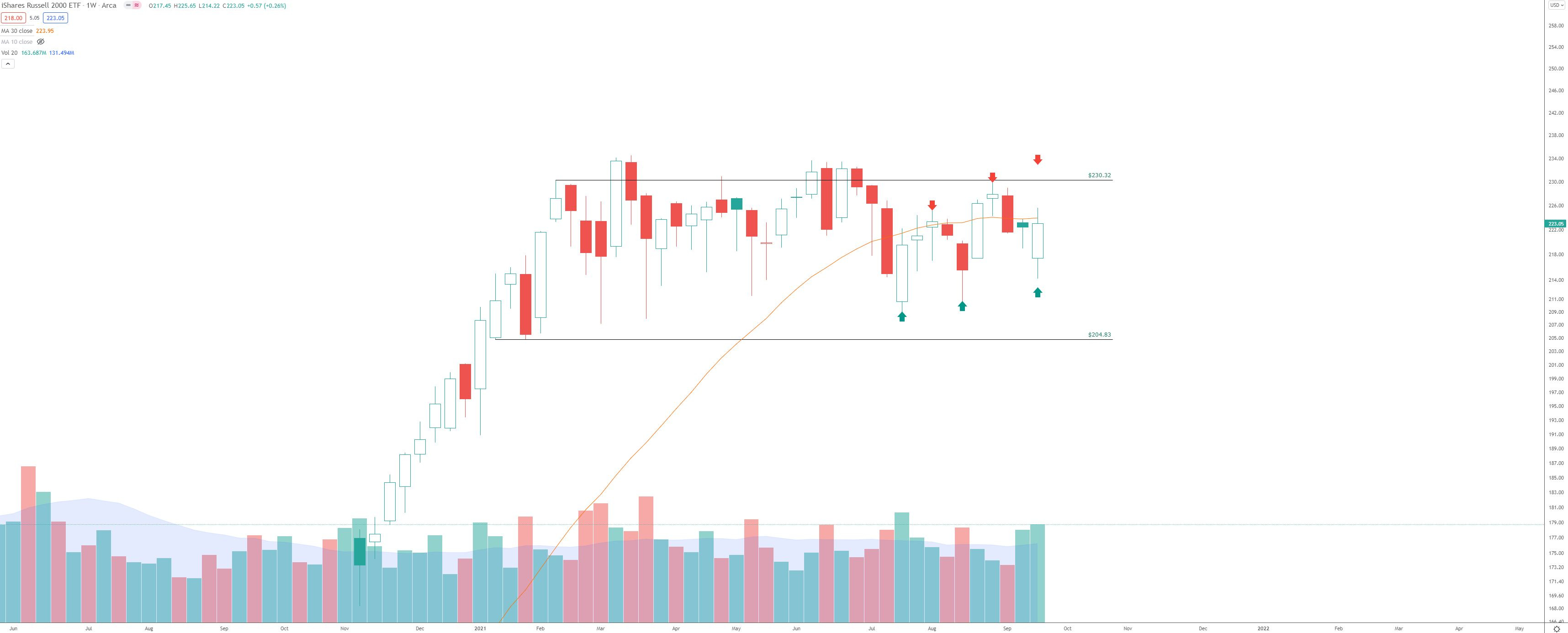
SPY (+0.57%):
SPY Weekly Chart
Wick below the demand line, but the trend remains intact
QQQ (-0.13%):
Nothing is guaranteed; it’s another facet of the market I’ve accepted. But there are times when the tape gives vital clues.
The weekly chart of QQQ has given some substantial clues of local bottoming action:
Long, low wicks under the candles coinciding with high volume.
What is high volume? Well, for me, I try to keep it simple, using the 20-period average as “normal.” Anything above that is “high.”
DIA (+0.65%):
DIA is another example. See the theme yet? Big trend save with a long wick underneath the weekly candle on high volume.
“The trend will bail you out”
IWM (+0.26%):
IWM has been stuck in “no man’s land” for almost 38 weeks now. There isn’t a market edge here, so I feel it is best to avoid it.
There is a potential higher-highs, higher-lows development brewing. But it will be up to the market to tip its hand on which direction this long-term consolidation resolves in.
Looking at the small-cap futures via US2000:
US2000 4-hour PnF, Box Size = 10
After consolidating for nearly a year, the momentum (bottom of the chart) has approached a “reset” level.
Except for the Covid March ‘20 selloff, this momentum area highlighted in gray has previously served as a good launching pad.
BPSPX Indicator:
(Pardon my hand-drawn lines)
The bounce off the 50-area suggests the bulls will not let this area, and more extensive market bull trend, go quickly.
The way I learned it was, BPSPX can pull back to the 47-53 area in bullish trends and then bounce back above 70, confirming the bullish trend remains intact.
SNAP (+11.17%):
The coil I mentioned last week (and somewhat expected from July) has resulted in an explosive move higher:
The below is from a series of passages sent to premium members in July and again last week in the Market Outlook:
I have to go back to a July 26th post for this reminder:
When I look at the SNAP chart now, I was reminded of the SQ chart back in 2017:
Anyone that was around back in 2017 remembers that melt-up. It was started by an excellent green candle on above-average volume, followed by 7-8 sideways candles, which allowed the 10-week SMA to catch up. Then for nearly two years, it continued rising epically. This type of move isn’t guaranteed, but the gas in the tank is definitely there, with targets at $96 and $243.
SNAP just completed its 8th post-ER candle - and it has consolidated in a relatively tight range. The coil is building up here.
SNAP was up 11% on the week. I don’t see any company-specific news or announcements from my glance at the headlines.
This lack of news leads me to believe the “Composite Operator” (Wyckoff) is in firm control, and his campaign is ready to continue the markup at the existing stride of the primary trend:
SNAP Weekly Candles
If you haven’t studied campaigns or how large operators position themselves, I recommend looking into it. There are multiple resources about the “Composite Operator” (sometimes called Composite Man).
Another resource that I HIGHLY recommend is the book Reminiscences of a Stock Operator. There are so many good stories from the life and times of Jesse Livermore in there, and it will help understand why stocks don’t always move in the direction the headlines might suggest.
Over the years, I’ve learned that charts allow you to separate the truth (price action) from market opinions. The tape shows what the large operators are doing in real-time with their money, rather than what you might see on TV or read from the thousands of social media opinions. The tape doesn’t lie, and this is why I chart.
Pay attention to trends, pay attention to volume, and pay attention to price levels.
Point and Figure targets, momentum, BPSPX, and seasonality are excellent tools to have as well. But they all take a back seat to price, trend and volume.
Here is the seasonality going into the end of the year (including all 11 years of data):
Recall from last week that September is the most bearish month of the year, with -8% average returns. So far, after 19 days, it is up just over 1%
From Sept. 20 into year-end, the average returns (including the bear market years) is 62.8%, which annualizes to 473%. Not too bad!
In the Post-Election years, the Sept. 20 into year-end returns are a staggering 363.8%, which annualizes into 24,225%. I’ll take that!
So after last week’s ~9% BTC pullback, the month of September is back in line with historical BTC averages, currently at -8.2%. Thursday’s close will mark the end of the month, and Friday begins a solid historical seasonal period (from the 11 years of data).
Between Oct. 1 and Dec. 31, the historical returns averaged +65.4%, annualized to +653.6%.
Nothing is guaranteed, and the above data is from 11 years of data (still somewhat small relative to SPX data), but it is all we have to go off of for this young asset class.
Local Bitcoin PnF Counts
Anyone that follows me knows that I love Point and Figure counting. I’ve been pretty bullish on Bitcoin lately due to the massive upside counts I can generate. But I wouldn’t be objective if I didn’t call out the bearish targets when I see them.
Using the 60-minute Point and Figure chart with 1% box size, I have a couple of distribution targets that don’t seem unreasonable.
The first one is a distribution from the early August through early September period. There are 22 columns, and the distribution objective is $27,196.
Further to the right, there’s a mini “re-distribution” with seven columns (counting only the X to X. This yields a target of $34,877.
How does this stack up with the larger time frames?
Here’s a daily chart using the 3% box size with the Hi-Lo method:
The above chart shows an objective 45° trend with a big pocket of accumulation between May-August
The 18 columns are enough to generate a target of $145k
How do I factor in the short-term distributions with the bigger picture? Well, I always err on the side of the more significant trend. That doesn’t mean I disregard short-term counts; they are important clues that the market provides.
If the more significant trend absorbs a short-term distribution, the market is speaking, and the trend is strong.
Have a great week, and remember to block the noise!