

Market Outlook 4-24-22
Market Outlook 4-24-22
A market designed for optimal whipsaw, Seasonality update


The recent market action has been a textbook whipsaw environment. Stocks go up, then suddenly pull back. Stocks go down, then unexpectedly rally.
Staying on the sidelines during all the chop & whipsaw is ideal, but easier said than done. I prefer to zoom out, get a bigger picture view, and lower my time preference.
Over the past few weeks, I have seen many frustrated traders on social media. Here’s an example from an experienced trader:

Here are my thoughts for those getting frustrated:
Zoom out.
Have patience.
Don’t rush in.
And as Tom said, “we all have limitations.” So, you better know your limits and tolerance levels.
The time to go heavy long will come. The time isn’t now, in my opinion. Friday’s close could be the lows of this correction/bear market, and things can blast off higher from there. But I don’t know that until I see it. Right now, I’m seeing evidence that bears are in control. The Fed is not providing a friendly environment.
Major ETF charts:
General Comment:
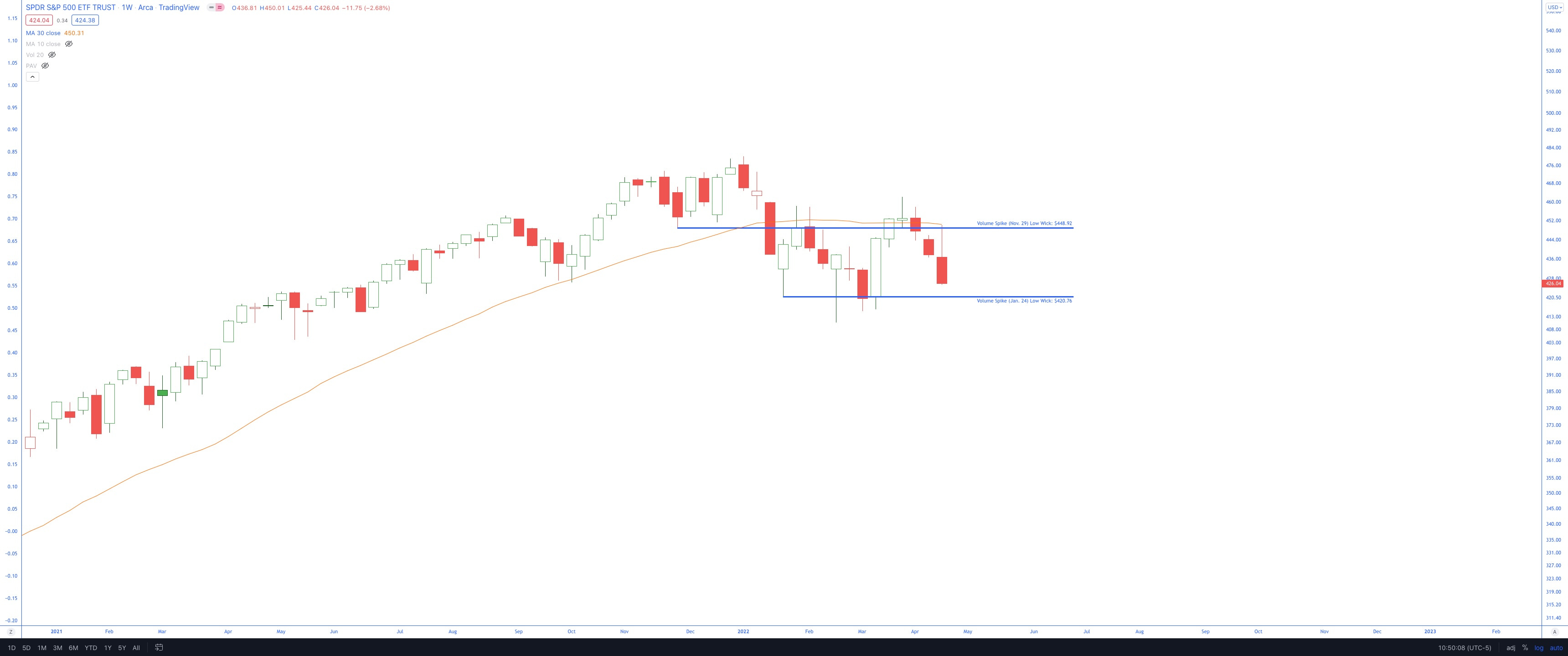
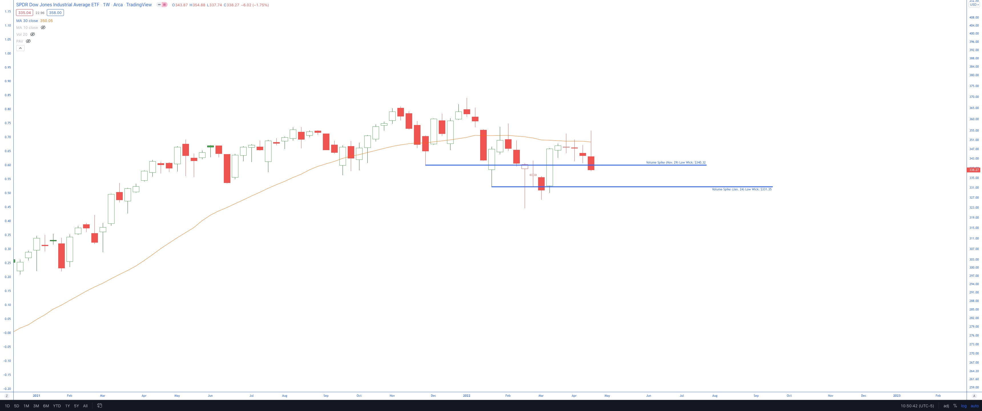
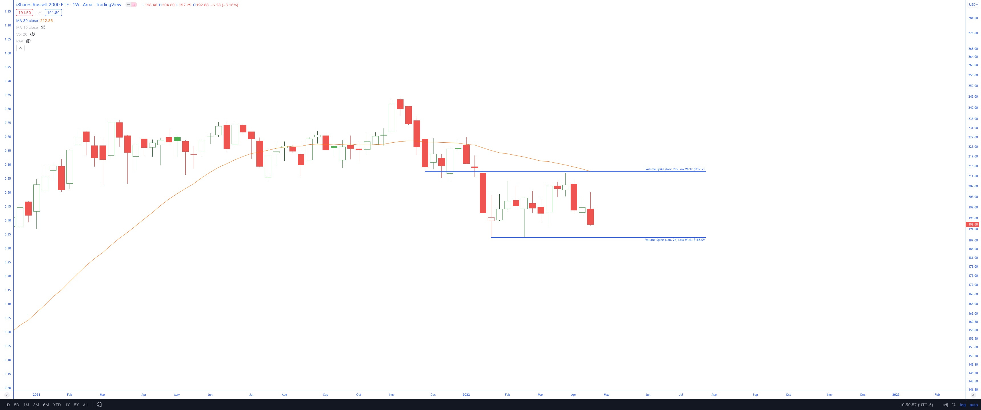
These are all trading below the declining 30-week SMA - AVOIDING
SPY
DIA
QQQ

IWM
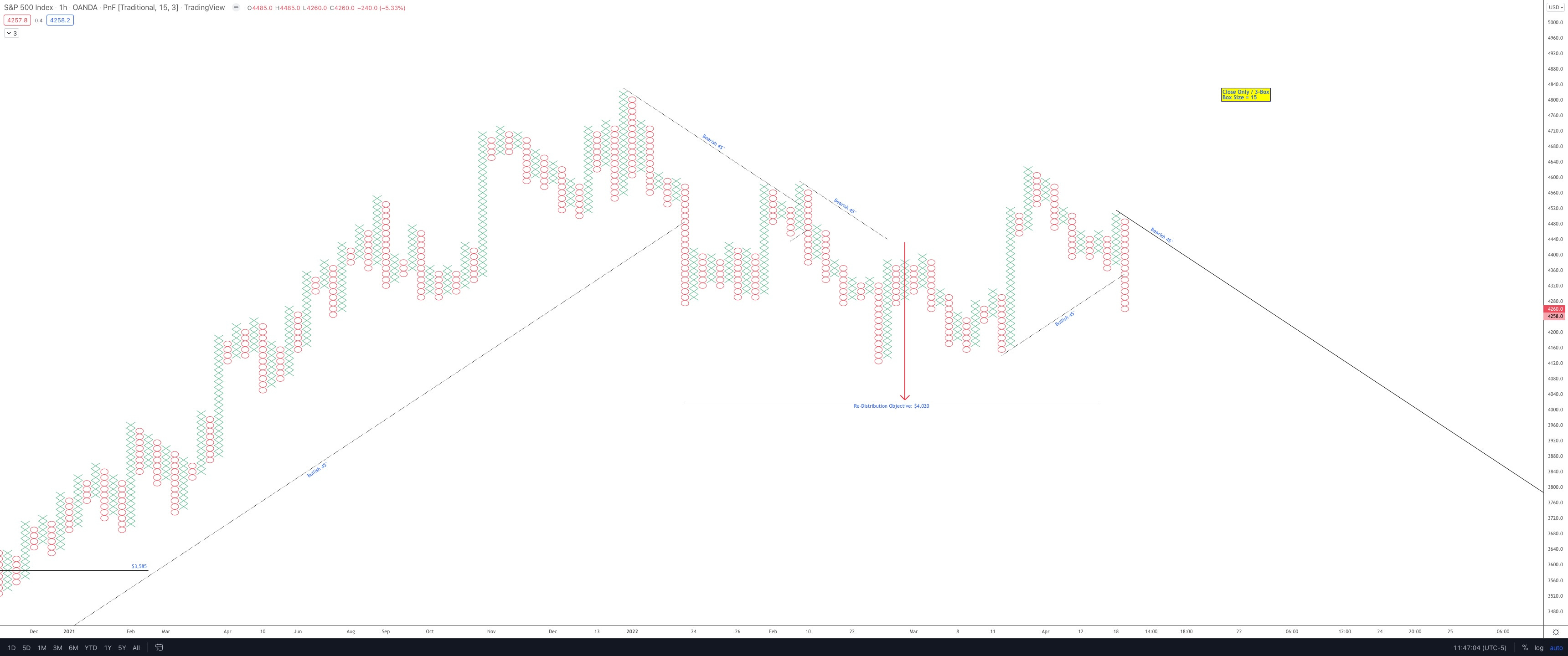
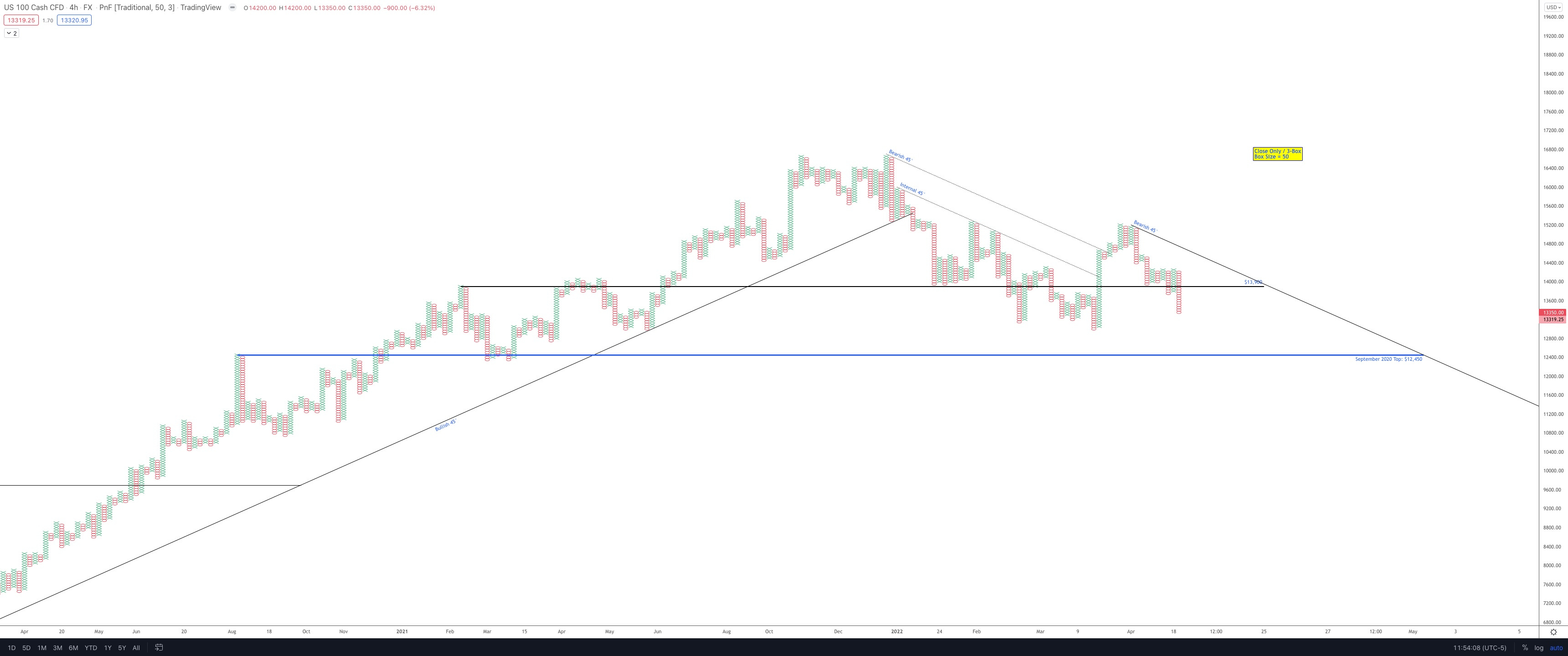
Futures PnF Charts
General Comment:
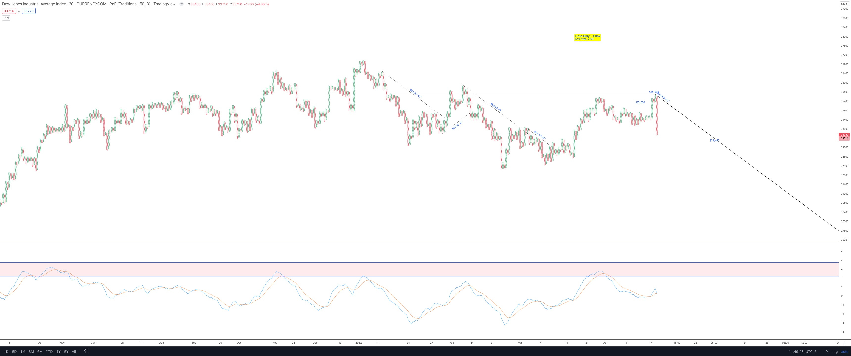
These are all trading below the bearish 45° - AVOIDING
30m - US30 (DIA Futures)
60m - SPX500 (SPY Futures)
4h
US2000 (IWM Futures)

NAS100 (QQQ Futures)
VIX
As noted earlier this morning in the options update, the VIX is elevated at 28
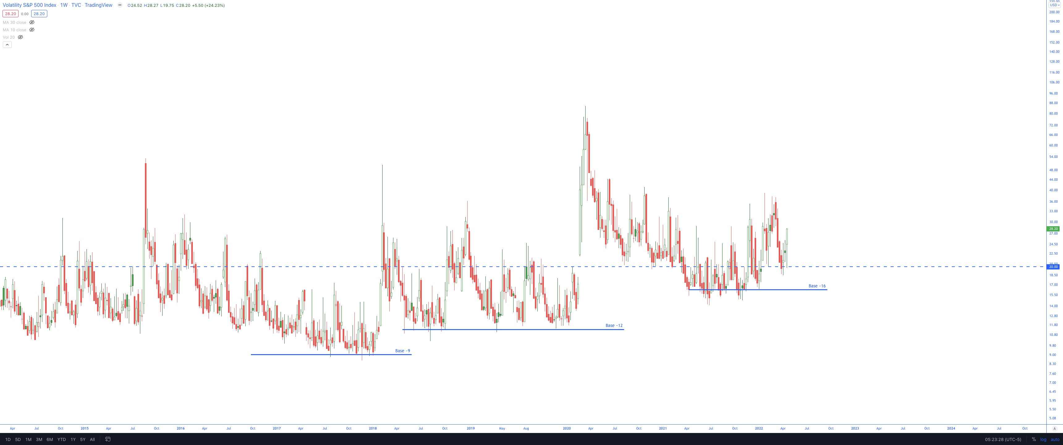
All of the above (weekly candle charts below declining 30-week SMA, futures PnF charts in bearish trends, elevated VIX) are enough to stay out of the markets. The current market conditions are unstable, and I won’t risk any more capital unless I find setups with a long-term thesis.
Tech has been in trouble lately (to nobody’s surprise). I’ve mentioned the NDX vs. SPX ratio many times now, but it is worth tracking.
Here are some ratio charts I’ve been looking at:
NDX vs. SPX
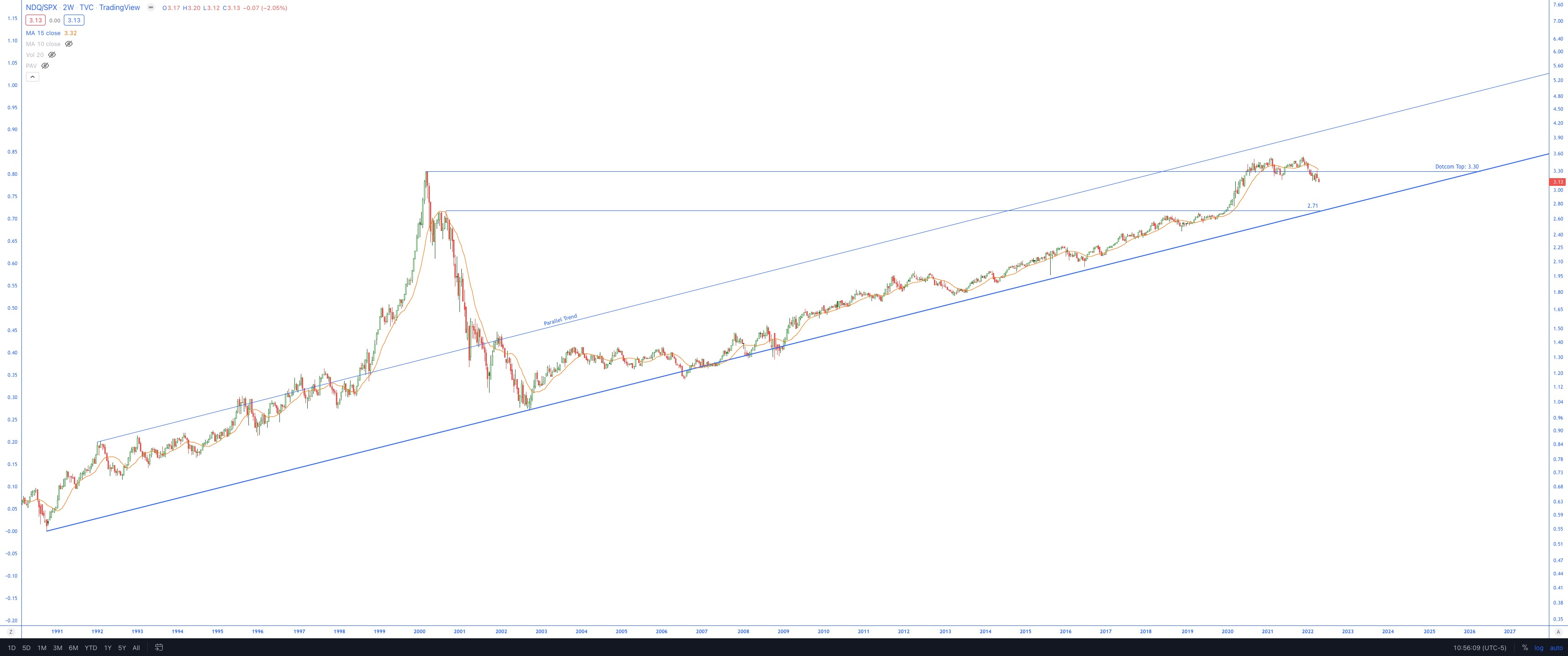
Trading below the dot-com top, the next significant support is at the 2.71 ratio level. For reference, the ratio is currently trading at 3.13.
NDX vs. XLE
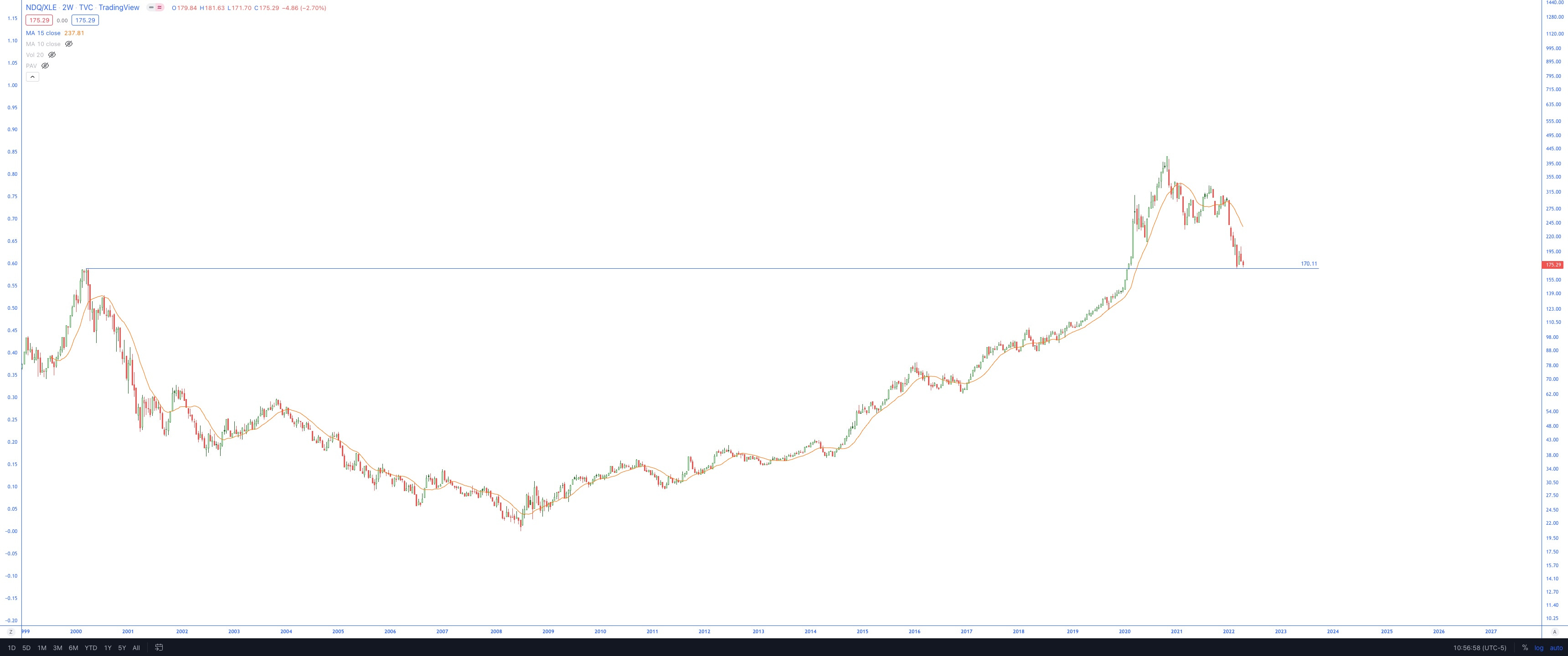
Potential support is coming up at the dotcom top
NDX vs. BTC
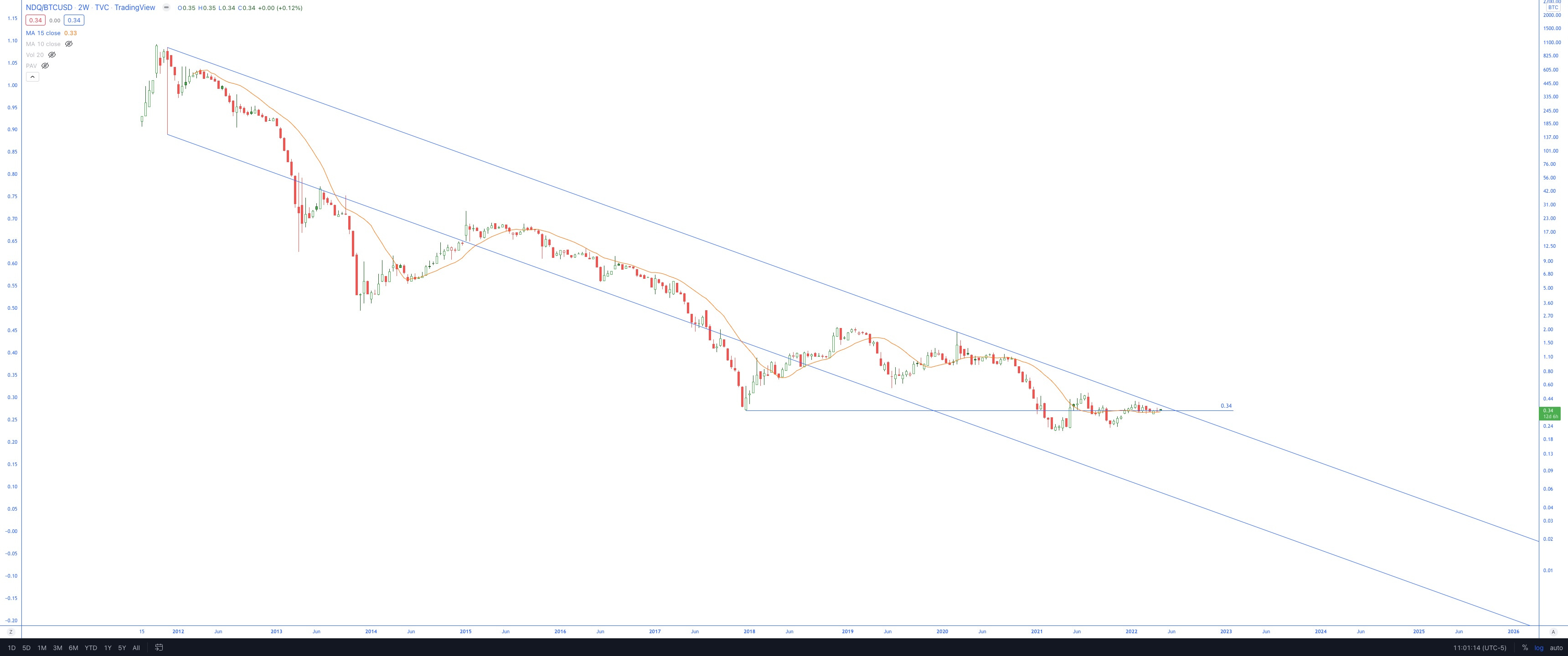
This is an unconfirmed channel with only two basis points.
It would need a 3rd basis point to confirm, but the trend is clear.
Energy is still showing the best performance over the past 12 months and YTD out of all the sectors. It’s not close. So I’m going to be watching Oil closely because I have exposure via COP and IMO, but also because this is where I’d look first if I wanted to add exposure to the market sectors.
Oil
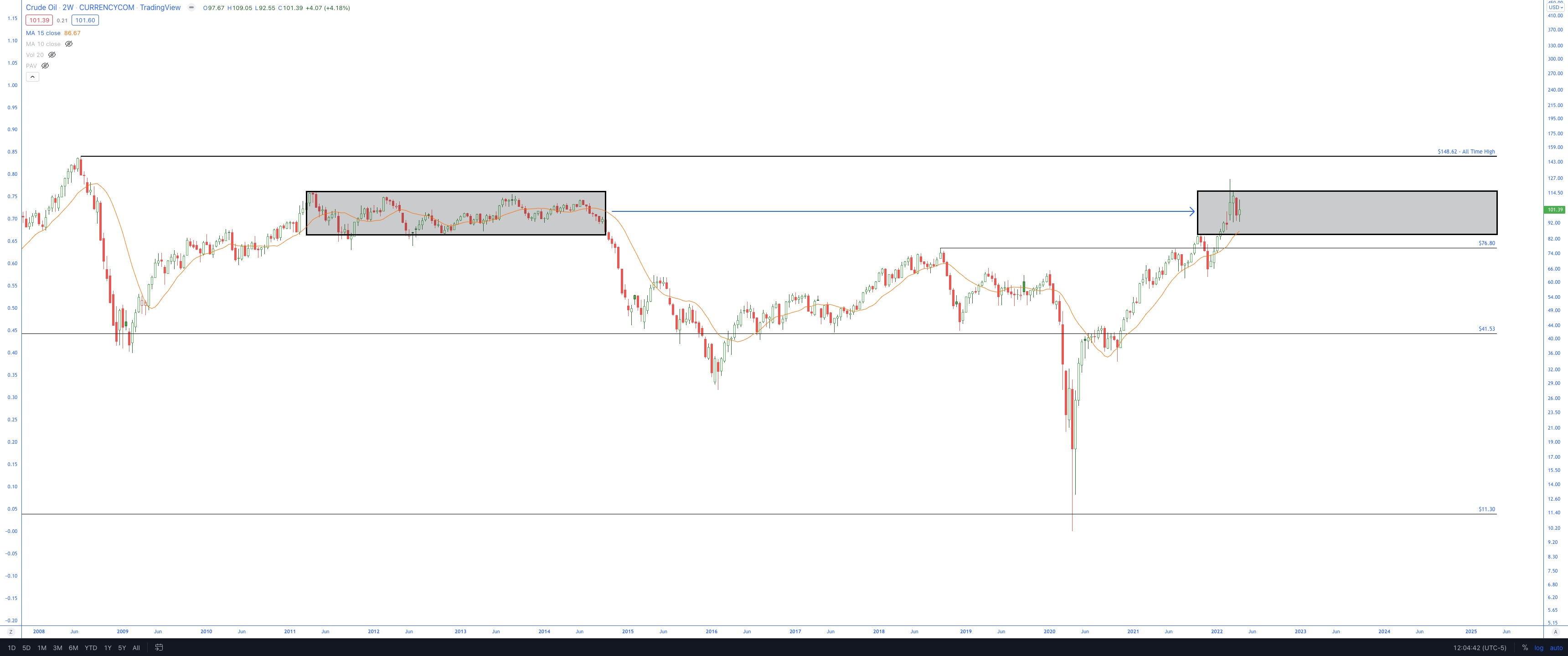
The trading range from 2011 to 2014 is gray on the left side. I’ve copied that same range over to the right, which seems to have been a good indication of where the ups and downs would be, at least initially.
The big difference I see is the velocity at which the price entered the range. The slope of the 30-week SMA is rising faster than the comparable period in 2009-2011.
How oil responds to the 30-week SMA will be telling. If it uses that average as a support and rallies from it, I think the bullish implications will be clear. The Energy sector should benefit tremendously as a result.
“Sell in May”
The sell in May period is coming up, and therefore it is only prudent to look at the seasonality.
Below is a chart of the S&P500 Seasonality, filtered for Midterm years.
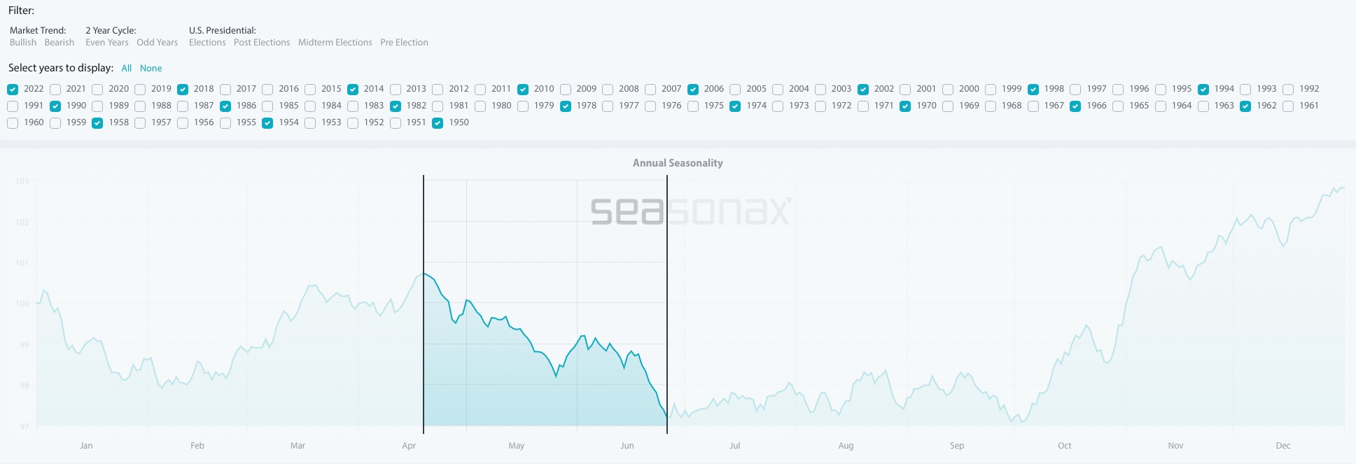
What is very evident is the decline between mid-April through late-June. This is the worst time of the year from a seasonality perspective. The bulls don’t get the winds at their backs until October. This, of course, is just another indicator, but it does not indicate the bulls will be receiving any seasonal favors, so I plan to tread lightly.
Have a great week,
Trace