

Market Outlook 4-10-22
Market Outlook 4-10-22
QQQ vs. SPY, BPSPX, Housing Sector Index, Mortgage Rates

Good afternoon,
I have a lot of charts to share today:
Monthly SPX & NDX Charts
Weekly ETF Charts
Nasdaq 100 Distribution vs. S&P 500
Volatility via the ATR Percent Indicator (Trace’s custom indicator - see Resources)
Point and Figure Charts & Trends of the Major ETF Futures
BPSPX Indicator
Housing Sector Index
30-Year Mortgage Rates
There’s a lot to go over today. I hope you find value in the charts.
For premium members, please drop me a line in the comments or an email/Twitter/StockTwits message if there are topics you’d rather see more or less of.
If I’m not following you on Twitter/StockTwits send me a message so I can follow you back. Thanks.
Major ETFs
Monthly Charts
NDX

Trading below the 12-month SMA for the third straight month
The momentum curl is now firmly lower, beginning from the top of a historical momentum range. There’s quite a bit of room before the momentum reaches that historical range support.
SPX

I notice a few things when I look at this monthly chart.
First, there’s that channel that originated from the Great Recession lows. History shows that prices have hovered around this channel's supply line (top parallel line), so a tag and pullback isn’t an immediate sign of looming danger, in my opinion. However, there is a long way before the demand line (parallel bottom line) would be tagged should there be one of those 2000/2008/2020 pullbacks.
Second, there’s the 12-month SMA, which SPX remains above. This is a noticeable difference vs. NDX, which, as noted earlier, is trading below this key moving average.
Third, the bearish momentum crossovers. The two prior times this occurred with an equivalent rate of change are shown at points 1 & 2 on the chart.
Point 1: The bearish momentum crossover did not result in a prolonged bear market. SPX shook off the momentum, and prices rose into the dot-com top, forming a solid negative divergence.
Point 2: The bearish momentum crossover resulted in the Great Recession's prolonged bear market.
Even though the prices have been tagged and were rejected from the top channel line, AND there’s the bearish momentum crossover in place, I believe the price action remaining above the 12-month SMA is more important. Said another way, I would rank the three items per the following hierarchy:
Price Action > Channel Support/Rejection > Momentum
Weekly Charts
The weekly candle charts suggest the bears remain in control.
SPY

SPY closes below the Nov. 29th high volume support level AND the 30-week SMA, which is now flat.
DIA

Once DIA lost the 30-week SMA in January, it has not been able to overtake and close above it. The moving average is now downward sloping.
DIA is the only Major ETF to remain above the price-adjusted volume spike levels.
QQQ

I can’t sugarcoat this one even if I wanted to. There are back-to-back rejections and wicks off the declining 30-week SMA.
The firm close at the lows is also a concern— I’ll be watching to see if the bears follow through next week.
IWM

This looks just as ugly as the QQQ chart. Not much to add other than this couldn’t even get above the Nov. 29 price-adjusted volume spike level— let alone the declining 30-week SMA.
Nasdaq 100 Concerns

I mentioned this chart a few weeks ago.
The concern I have is if this results in a distribution, the markdown phase will be rough.
There’s always a possibility that this is a re-accumulation, and the price is seeking that spring (if it hasn’t already been formed at the March lows.)
A Look at Volatility via ATR Percent

The above chart uses the weekly candles. There’s a big difference between the daily ATR and weekly ATR, which shows up with the 2008 spike.
On the daily chart (not shown), the March 2020 (Covid) spike nearly matches the (2008 Great Recession) spike.
But on a weekly timeframe (shown in the chart above), the 2020 spike fits within a channel and doesn’t appear significant— at least relative to the 2008 spike.
What I see on the weekly channel is a pattern that has played out twice before:
Period of stable ATR % readings within a predictable range.
A post-stable period where ATR % begins to creep higher and eventually culminates in a market bottom.
The post-2009 ATR % readings have been predictable and within a steady range. Relative to the 2000 & 2008 crashes, the market pullbacks have been shallow. The March 2020 pullback looks like a flash crash that had a short recovery period on a weekly timeframe.
Even though it didn’t feel like it at the time, it was relatively low on the volatility scale.
What I’m watching for: Higher lows/highs in the ATR % readings, forming an ascending channel similar to the prior periods marked at 2.
Point and Figure
Believe it or not, all of these trends remain above the bullish 45° lines.
30-minute (US30 - DIA Futures)

60-minute (SPX500 - SPY Futures)

4-hour (US2000 - IWM Futures)

4-hour (NAS100 - QQQ Futures)

BPSPX

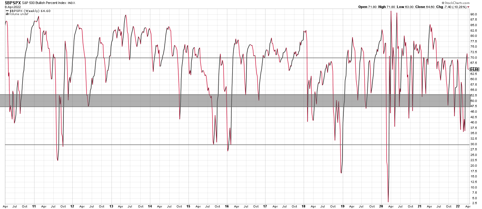
Two observations:
The bears were unable to send it below 30.
The bulls were able to send it above 70.
One of my favorite indicators, BPSPX, never confirmed the bear market. The next test will be on any pullback to the 47-53 range. A bounce from there and subsequent rise above 70 confirms a new bull market.
Until then, it is a limbo period.
Housing Sector Index
It has been almost a year since I first charted and shared the Philly Housing Sector Index chart (HGX). I wanted to look at it now with the 30-year Mortgage rate chart.
Here’s what I had to say in May 2021:

The above chart showing the weekly candles is more interesting to me than the lumber charts. I think most people will remember the horrible housing collapse from the 2006-2008 period. There were three harrowing years with bankruptcies & foreclosures right during the peak of the financial crisis. This index has finally come back to those levels after approximately 15 years. Next will be up to the markets to determine, but I wanted to put together some targets and chart them, mostly out of curiosity. I don’t intend on selling my house even now that this chart is at resistance, but if it were to make a move up to that $1,888 level, I might consider it.
With that said, I would not be surprised if the market were to cool off for a while. With this chart, I have another one on the watchlist to monitor now!
Recall that the definition of this index (from Nasdaq) is:
Index Description
The PHLX Housing Sector Index (HGX) is a modified market capitalization-weighted index composed of companies whose primary lines of business are directly associated with the U.S. housing construction market.
The Index began on January 2, 2002 at a base value of 250.00; options commenced trading on July 17, 2002.
Since the timing of that May 2021 post, the index has not been able to make new highs. I don’t want to confuse this with housing prices, which have marked up.
In my opinion, this index is best used as a leading indicator of the equity markets, as I’ll try to show below.
But first, two observations:

The index is now trading under the 30-week SMA pulling back to the 2017 buying climax
The momentum support zone should be coming into play soon.
Housing Sector as a Leading Market Indicator?
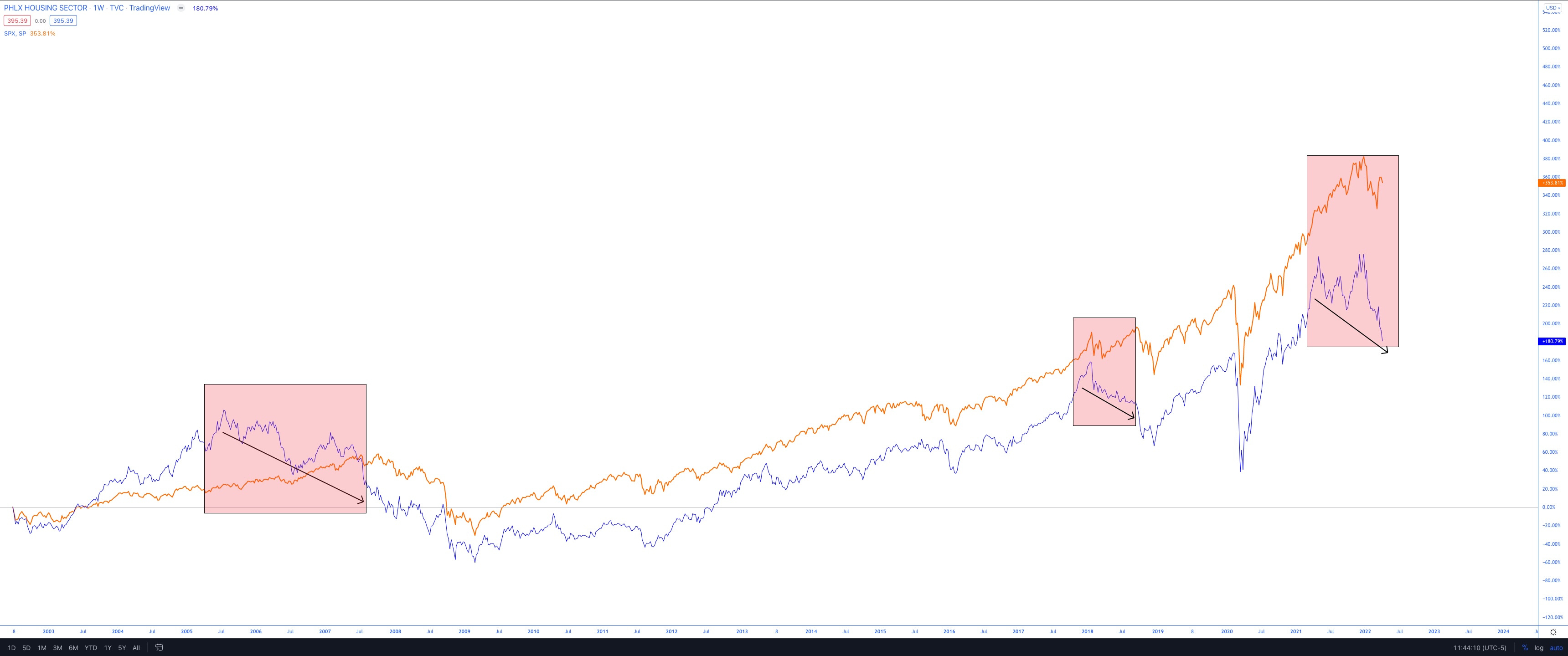
Two lines are shown in the above chart:
Philly Housing Sector Index (HGX)
SPX
I’ve shown three periods of negative divergences: two prior and one current.
Please note that the intent is not to sound the alarms here but to show a potential for concern with the decently sized negative divergence between the HGX index and SPX.
I’ve learned that negative divergences have to be taken with salt. It isn’t easy to know for how long they will last. And even then, if I wanted to, I could spend a whole day dedicated to proving negative divergences don’t always pan out the way perma-bears wish us to believe. There are plenty of examples of failed negative divergences. So again, always trust price and use proper technical analysis to know when to be cautious.
Considering there are plenty of warning signs, I think this divergence deserves some attention.
30-Year Mortgage Rate

Wrapping up with the 30-Year Mortgage Rate.
It has broken above a long-term downward trend.
It has entered an area of momentum resistance.
It looks poised to enter an area of price resistance.
There are some mixed signals here. Ultimately, if the rates can break through that 5.24% resistance and above into the 6+% range, then I think it’s a decent sign that rates will stay elevated for a while.
What will be interesting to observe over the coming months is if the HGX index bounces at the 2017 buying climax and the 30-Year rate gets rejected around the 5.5%-6% area. Perhaps this is a 2022 story to watch. I know I will be watching it.
Have a great week, and a reminder that I’ll be off next weekend to spend time with family and enjoy the Easter holiday.
If I happen to take any trades throughout the next two weeks, I’ll send out the trade details as I take them.
Hoping you have a great Easter and take care until the next post,
Trace