I’m going to throw many ideas out there today, so please bear with me. I think there are some essential takeaways from the charts this weekend, and depending on how the markets respond to critical levels, it could give big picture clues for the next 2-4 quarters.
Today I’ll look at:
Major ETF weekly charts
QQQ vs. SPY
NDX Monthly Channel
SPY extension below the 30-week SMA
HGX vs. SPX
30-Year Mortgage Rates
Futures PnF Charts
Oil
Bitcoin vs. M1 Money
And I’ll try to tie it all together into what I consider a couple of scenarios.
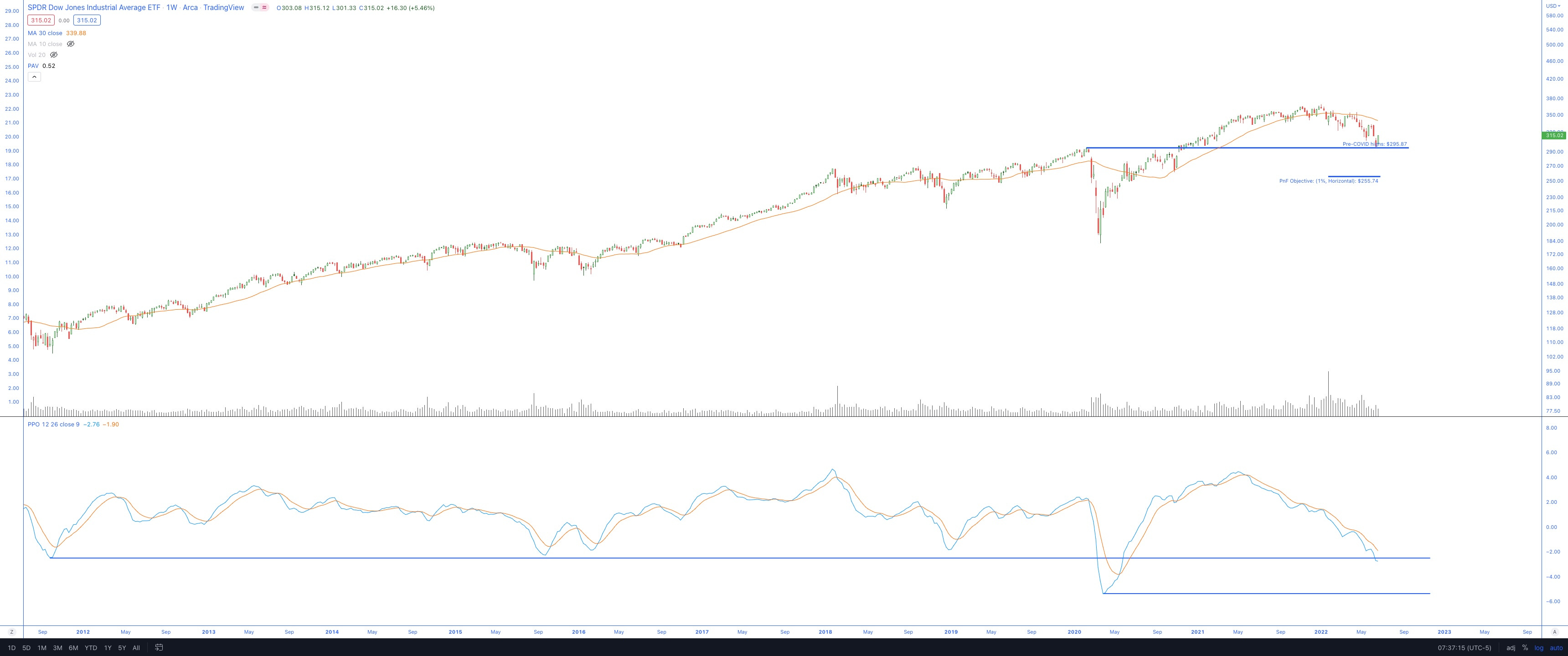
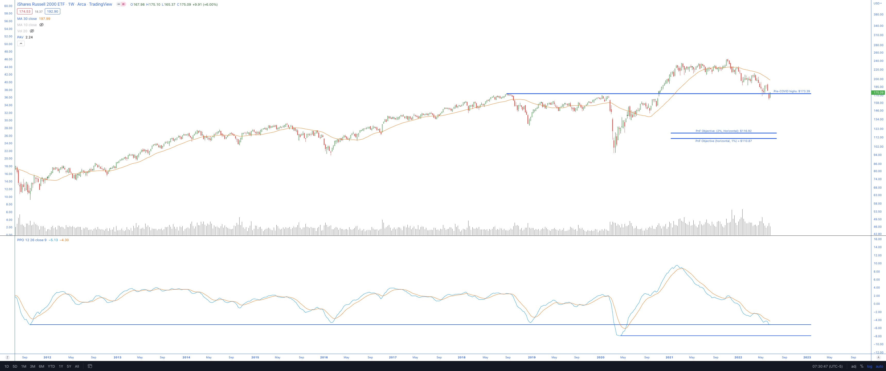
Major ETFs
SPY
QQQ
DIA
IWM
So far, objectively speaking, the ETFs bounced at:
pre-COVID levels
Momentum support
SPY & QQQ
Now it is up to the bulls to carve out a bottom and avoid further disaster.
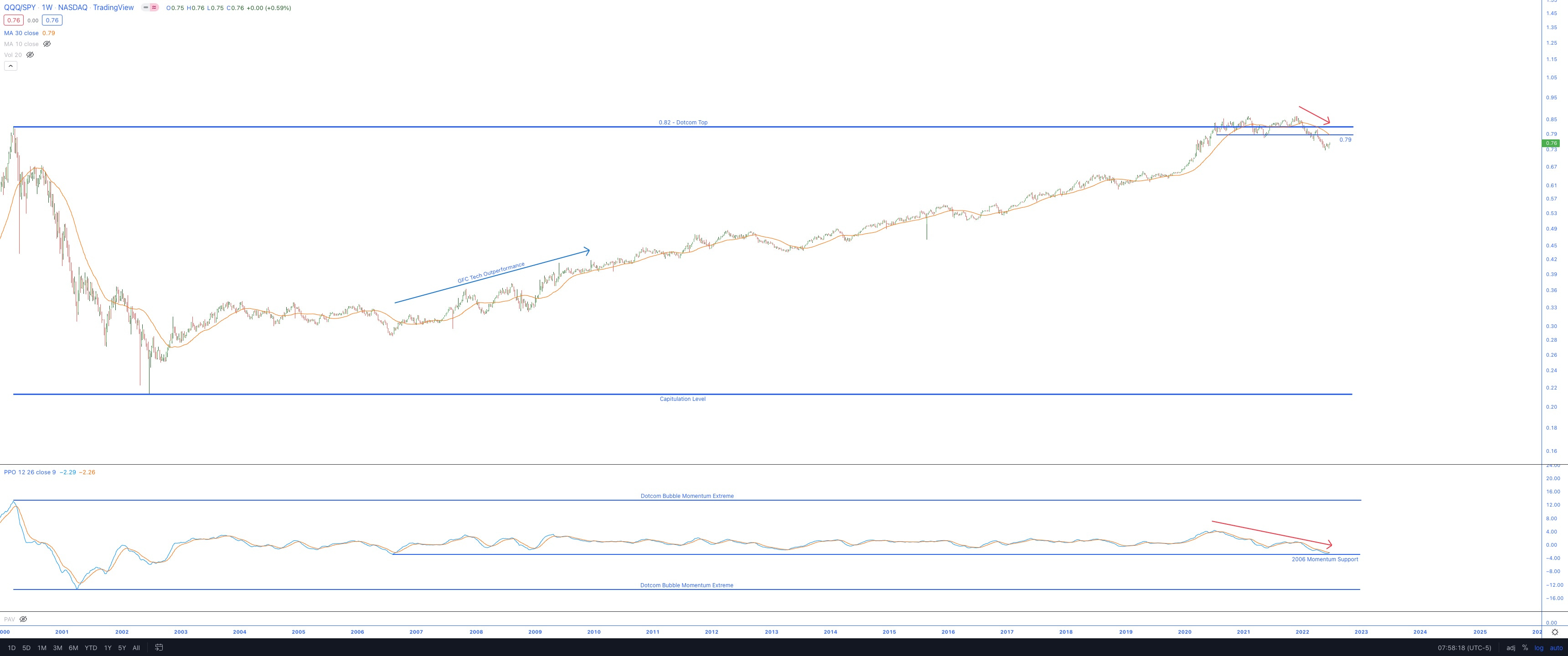
QQQ vs. SPY
A few months after the original post, it still has the looks like a distribution (Stage 3 top)
However, the momentum of this ratio chart is now at a critical support level.
Best not to break below it now.
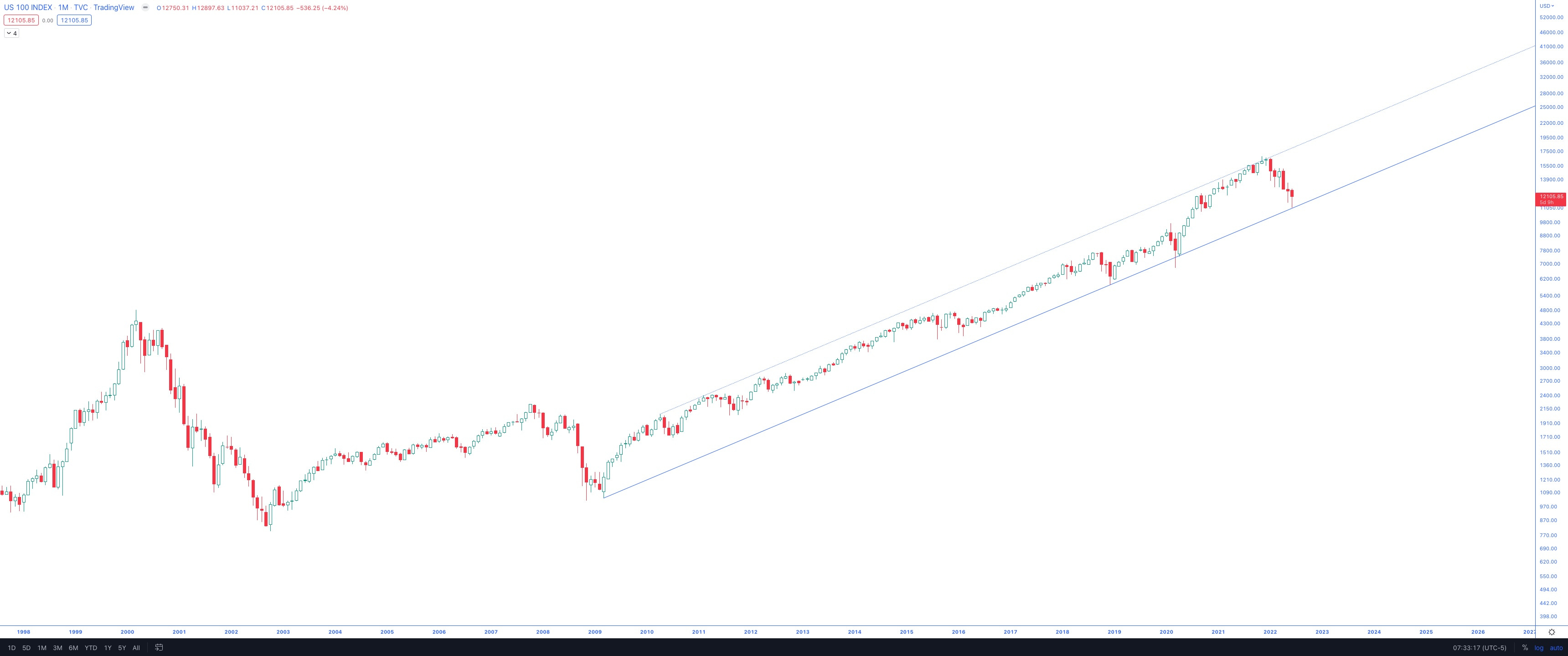
NDX Monthly Channel
Perhaps the most significant ally to the bulls, this monthly NDX chart has served as major support thrice before.
Time will tell, but now would be a good time if the bulls were to stage a comeback.
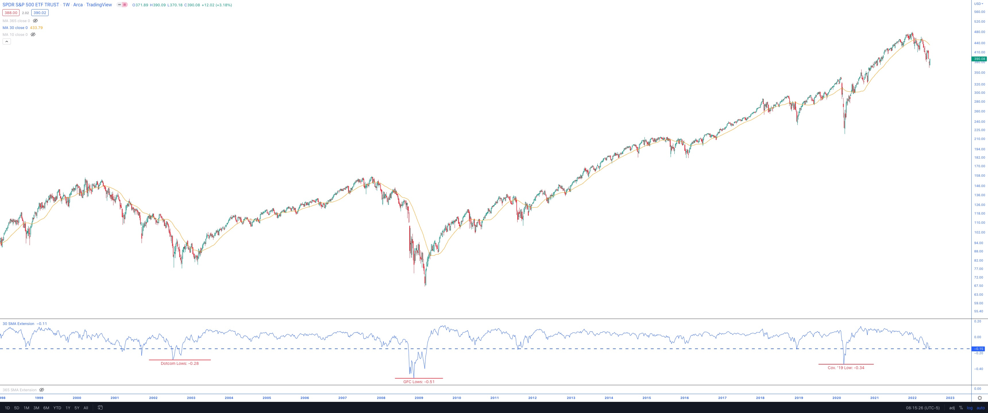
Extension
Speaking of time to stage comebacks, I’ve shared the extensions from the 30-week SMA (bottom of the chart) in the SPY chart above.
There are some historical levels from which SPY has bounced, and the current level has been the most common over the past 30 years.
A continued decline from here is likely signaling some Dotcom or GFC bigger picture move.
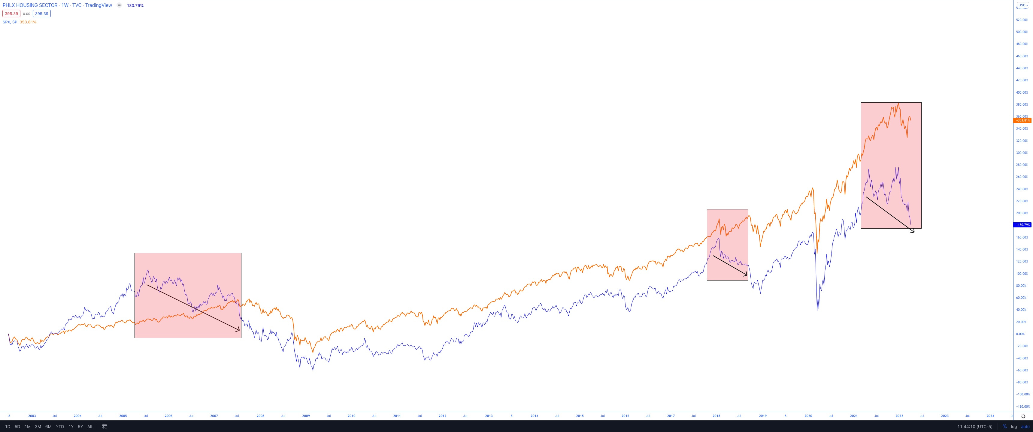
HGX vs. SPX Divergence
Back in April, I first shared the HGX (Philadelphia Housing Index) vs. SPX divergence:
I’ve shown three periods of negative divergences: two prior and one current.
Please note that the intent is not to sound the alarms here but to show a potential for concern with the decently sized negative divergence between the HGX index and SPX.
Below is the updated chart, showing how the divergence ultimately materialized:
From the April 10 post, SPX dropped 19% into the June 17 lows
SPX currently resides 12% below the April 10 level
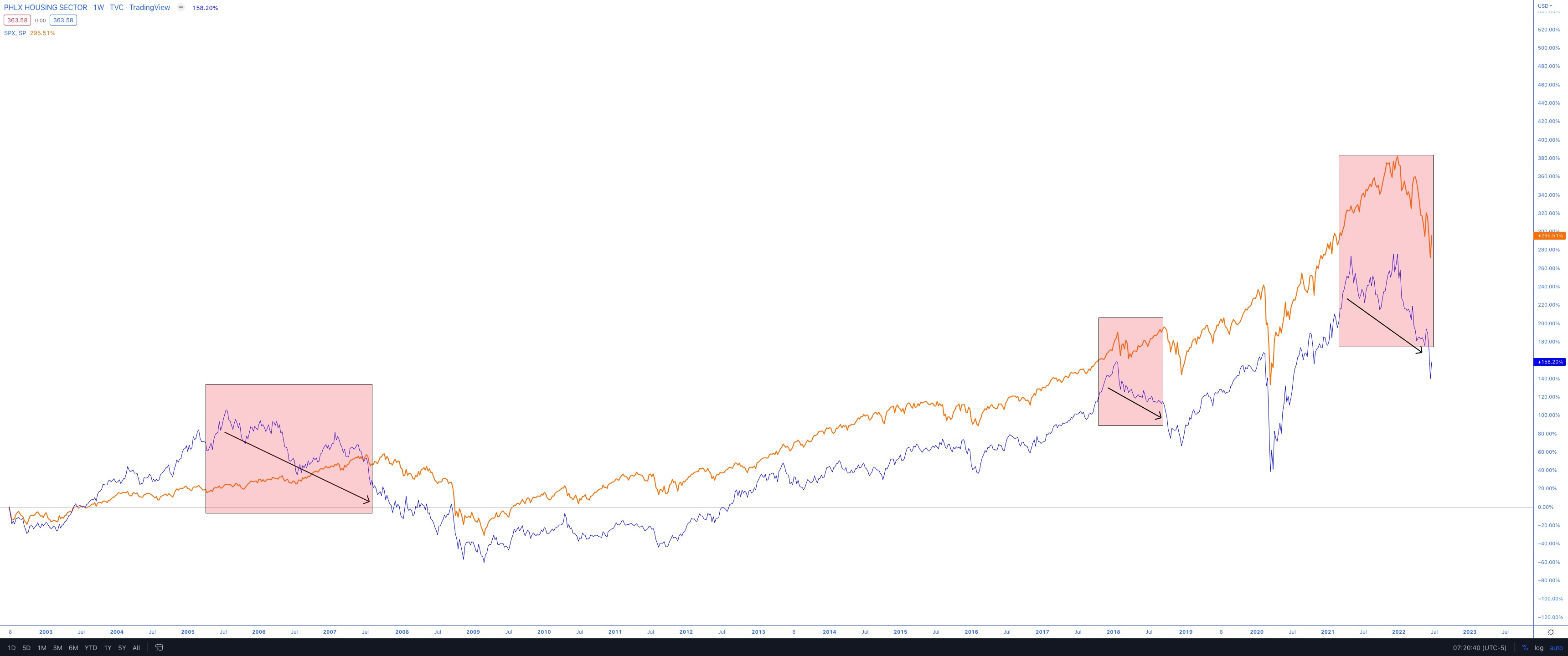
So the divergence did play out. Now, the two indexes are moving in sync, bouncing off the June 17 low. I think it’s worth looking at HGX to see if there’s anything that market participants can use for future projections.
HGX
There are roughly 20% further declines before the $291 level from the 2005 highs; however, it is not a necessary path.
Should the index stage a rally now and overcome the early 2018 highs, there’s a good chance this recent pullback turns out to be one of those shakeouts of the “V” variety.
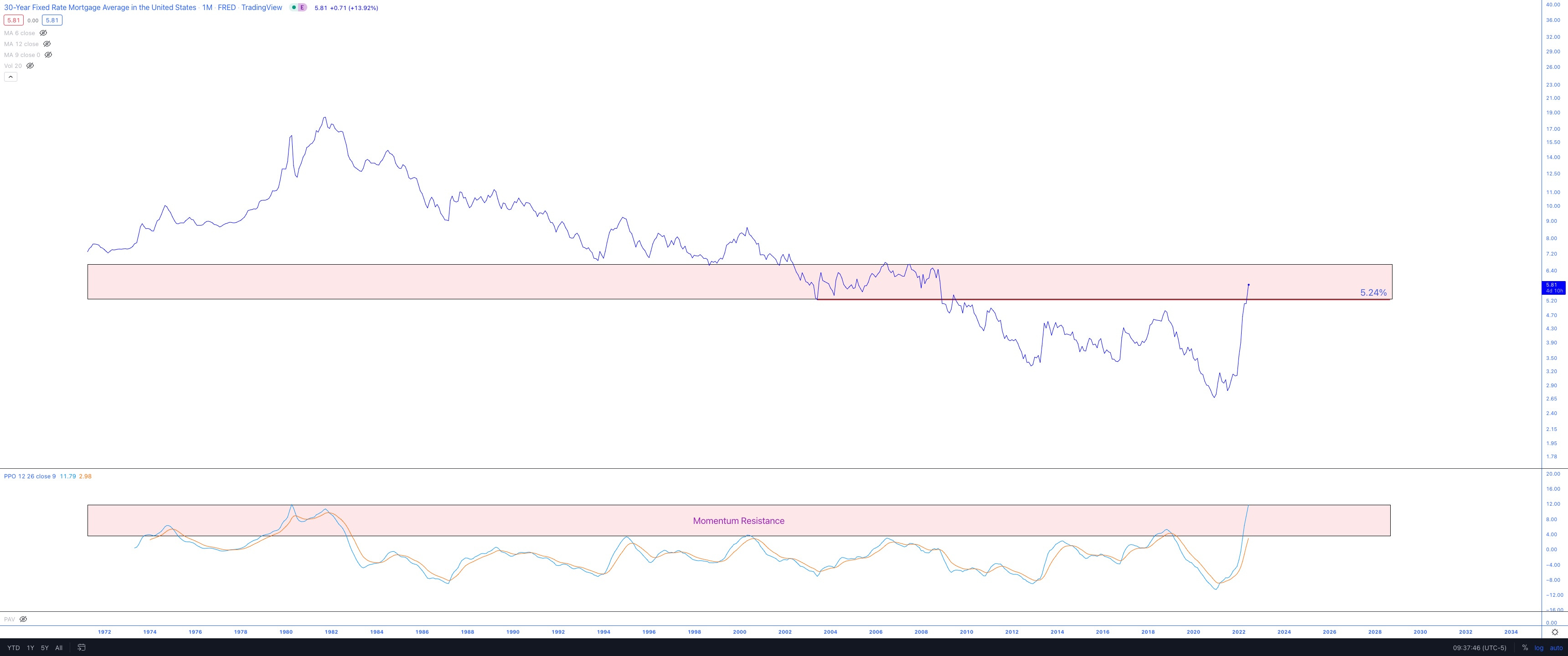
30-Year Mortgage Rates
It is no secret that 30-year mortgage rates have shot up to levels last seen in the six years between 2002-2008, which ultimately resulted in the housing bubble of the early 2000s.
I can’t help but notice, via the monthly timeframe, that the momentum indicator is at the same extreme levels seen in the super-high interest rate era of the early 80s.
For reference, the 30-year rates ranged between 5.2%-6.8% during that period (2002-2008).
Currently, at 5.81%, the rates are in the middle of the range.
What might happen is the momentum indicator begins its retreat from the historical extremes, while rates float slightly higher to test the highs from 2006 (6.8%).
There’s many factors at play here, including FED policy, so it is naive to think that this chart’s momentum resistance is the end all, be all, however, these things often prove to be self-fulfilling. Everything is intertwined, and mortgage rates are no exception. Perhaps this is a good way to gauge the FED’s QT tolerance before easing up again.
Unfortunately, JP Morgan just laid off hundreds of home lending employees.
Nobody wants to see it. Jerome Powell et al. can say what they want, but ultimately actions speak louder than words. They have taken a very hawkish stance so far, but how long will they be able to afford to do so?
Human psychology doesn’t only impact market participants; it affects everyone. I don’t think the FED is any exception.
My prediction is the FED will reverse course soon. Just a prediction, though. My job as a trader & investor is to respect the charts, look for whatever clues I can, and position accordingly.
Futures PnF Charts
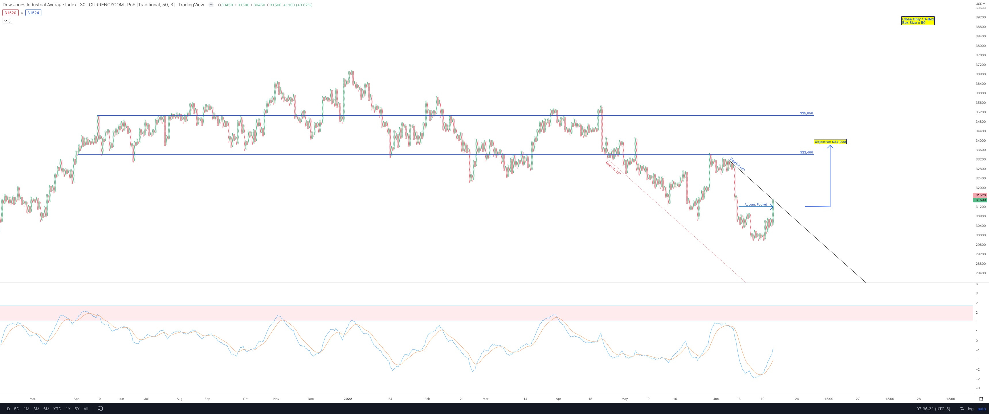
US30 (DIA Futures): 30-minute timeframe
There is room to run on a break of the bearish 45 should it happen
A PnF objective of $34,000 is now active
Not only is there room to run on the price, but there is room to run on the momentum.
On a rally attempt to the $34k area, I would expect supply, or at least pausing action, to hit the tape in that area, should it get there.
A potential sign that the worst is over: Should the Dow slice through the $34,000 area quickly, I would interpret that as a sign that the supply has been absorbed, and the bears are exhausted. That remains to be seen but will be my interpretation should it happen.
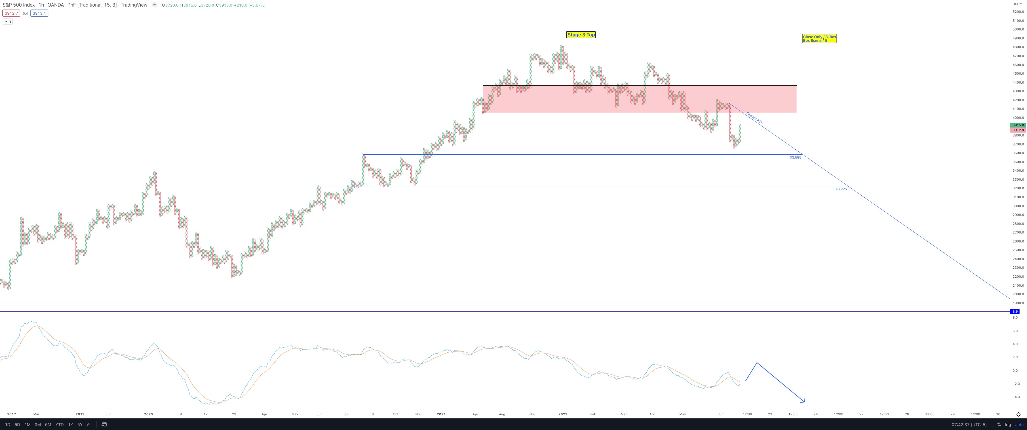
SPX500 (SPY Futures): 60-minute timeframe
There is still a bearish trend, but a possible scenario I can see playing out is a relief rally up to the Objective 45°, followed by a further pullback to the July 2021 highs ($3,585) for a total reset in the momentum indicator.
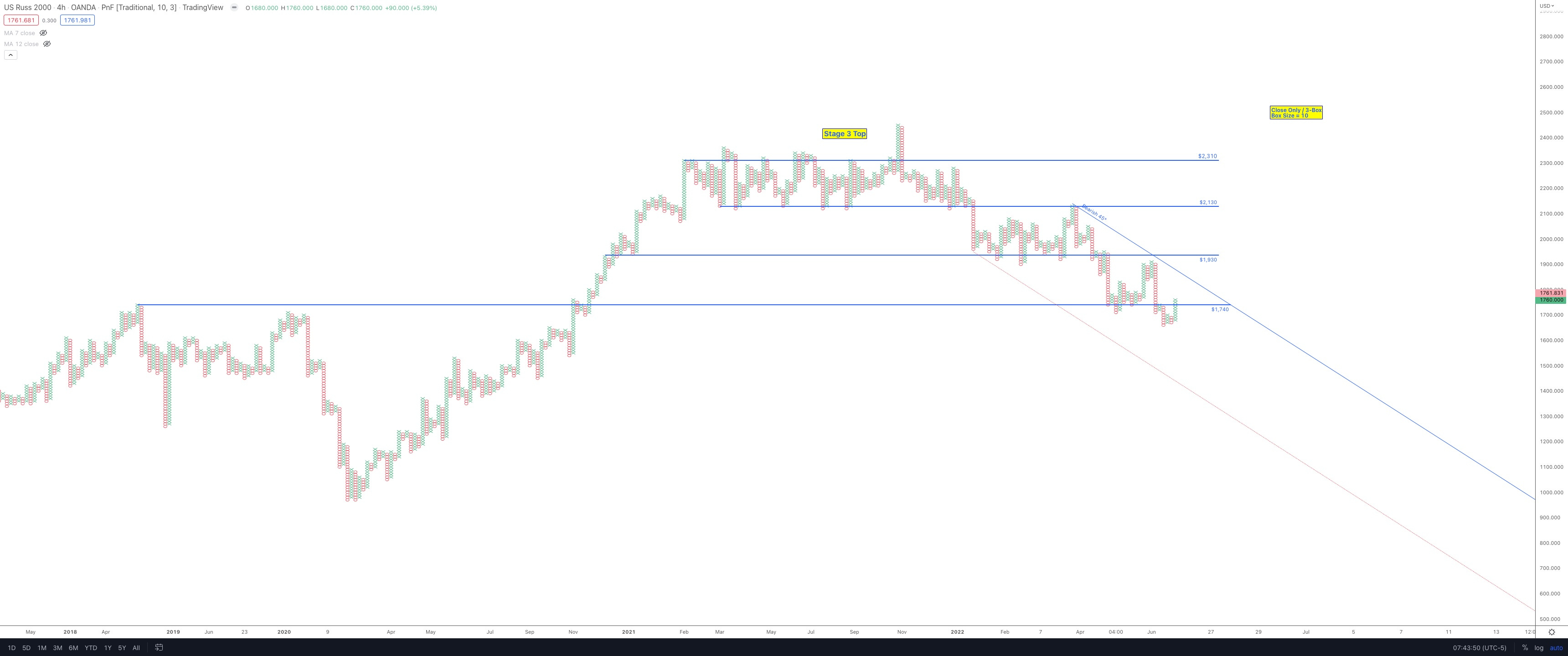
US2000 (IWM Futures): 4-hour timeframe
Lots to unpack here, but mainly what I’m looking for is the winner of the pre-Covid highs line in the sand ($1,740).
Should the bulls win this battle, they need to get over that bearish 45° and start breaking down the resistance levels at $1,930, then $2,130, and ultimately the $2,310 level.
Lots of resistance levels to overcome, but if the bulls are to save face, they have to start somewhere. And beginning with the pre-COVID highs is imperative; else, they fall below another support level that will turn to resistance.
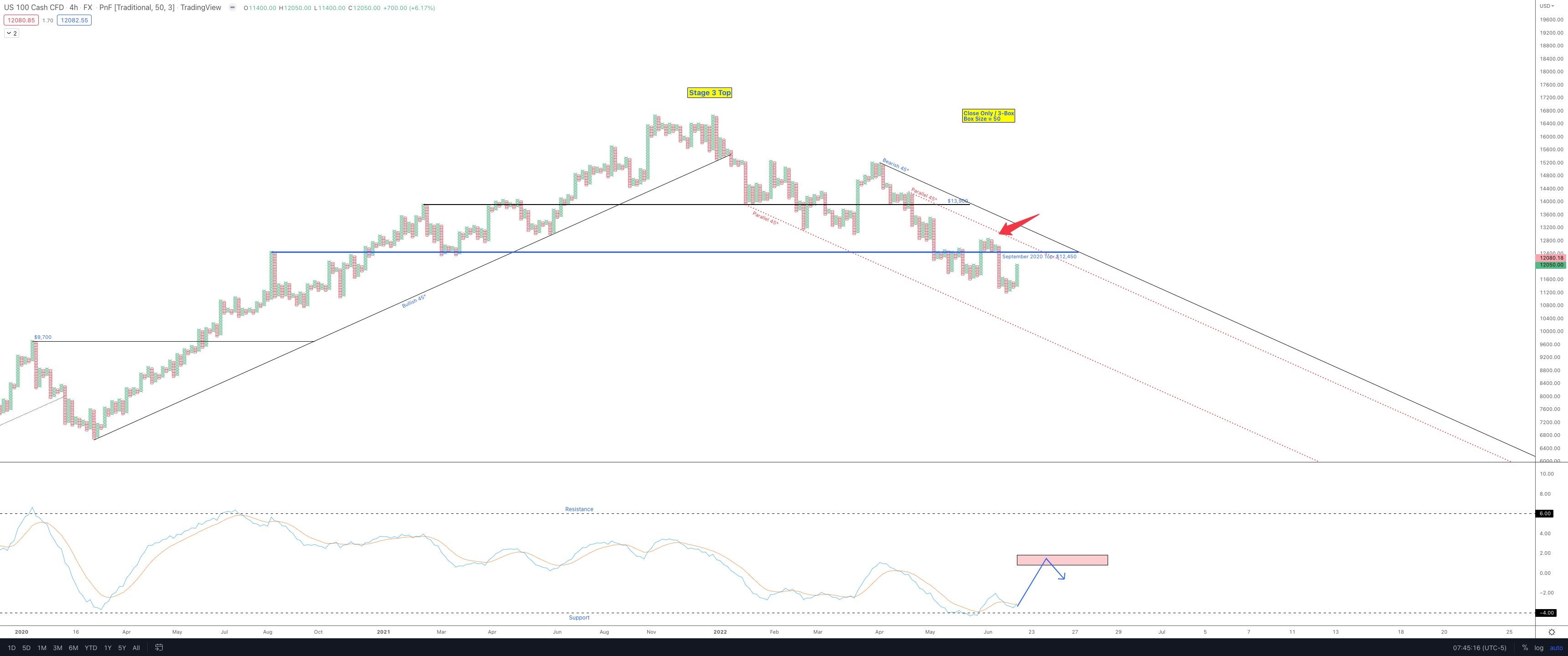
NAS100 (QQQ Futures): 4-hour timeframe
In the momentum section (bottom of the chart), I’ve highlighted a potential trajectory for the Nasdaq 100 futures.
These deep momentum levels can provide a lot of fuel for a strong bear market rally.
But until they break, those bearish 45° objective trend lines remain the resistance that the bulls must respect.
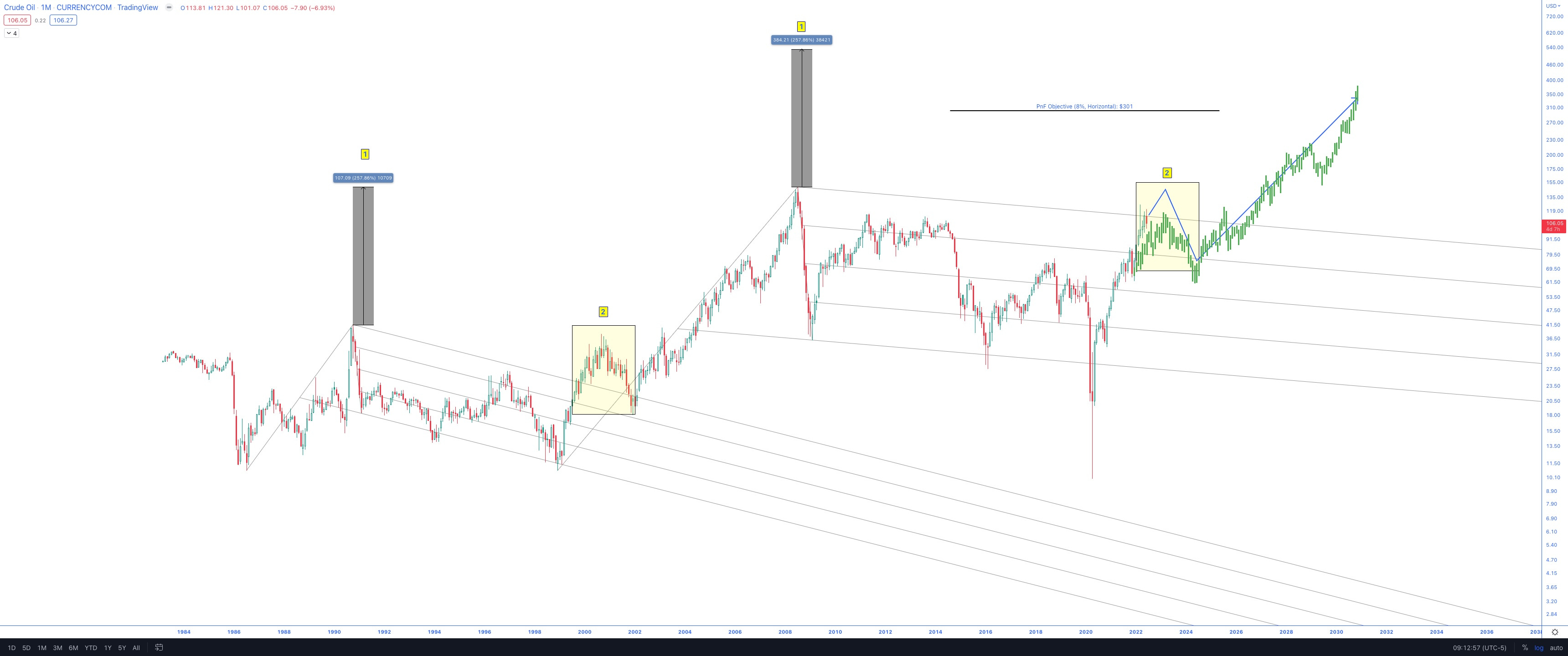
Oil - Just a Thought
This is the same Oil Pitchfork chart I shared in late 2020 after the Covid lows. As many long-term subscribers know, I’ve been calling for much higher oil prices over the last 22 months. I’m probably the only person I know of who is calling for $300+ oil. Sounds crazy, right? But so did $70 oil back in 2020. I’m just following the charts.
I think a possible scenario that plays out is an oil test of the ATH levels from 2008 ~$140-$150, followed by a steep pullback into the next election (2024), then blastoff to the stratosphere. It is outlined in the blue arrow path in the updated oil chart. The green ghost bars are a trajectory from the 1999-2008 playbook.
Bitcoin vs. M1 Money - Just for Fun
A nice inverse H&S is forming.
Possible Scenarios
With all of the above considered, I’m not going to make predictions but want to know what some possible scenarios are. Markets have the potential to bounce here based on the monthly channel (NDX), the extension from 30-week SMA (SPY), and the futures charts.
There might also be some aid from interest rates hitting a wall (soonish) and perhaps an oil decline into the 2024 election.
Either way, I believe the markets must put in some recovery bounce now, or else they will show extreme weakness, as seen in the Dotcom and GFC eras. If the markets were to save themselves from further disaster, now is the time to put in the bounce.
As always, respect the charts and block out the noise. The tape will be the ultimate judge.