

Market Outlook 13-May-2023
Market Outlook 13-May-2023
Navigating Market Volatility: Insights on IWM, QQQ, BTC, and the Energy Sector

Dear Investors and Traders,
Last week was quite the whirlwind. Between the overload of news headlines and the constant buzz of market speculation, it felt like we were on the brink of some major market shifts. Interestingly enough, the charts remained stubbornly indifferent.
A flurry of texts from friends, who seem to be changing their market views with every sunrise, underscored the palpable uncertainty in the air. It appears that the lack of decisive movements in the market is leading to an increasing sense of frustration among market participants.
What I've come to realize, though, is that these periods of apparent standstill often serve as a reminder to stay grounded. It's easy to get swayed by the noise and start second-guessing our strategies. But in times like these, our analysis and understanding of the underlying trends become even more critical. Let's dive into this week's findings...
Market Chatter
Despite the chatter, last week presented us with a mixed market bag. Three of the major ETFs dipped, while one managed to swim against the tide. However, the tape didn't reveal any significant plot twists, reasserting the old adage that all that glitters is not gold.
As I took a closer look at IWM, it struck me that we might need to exercise a bit more patience, possibly another month or so. But don't let this dampen your spirits. I firmly believe there's a case for bullish seasonality that could unfold once we get past mid-May. We'll delve deeper into this later.
This week, I'm setting my sights on the charts for IWM, SPX & NDX (keeping an eye on seasonality), BTC, and the Oil & Energy sector. Let's see what stories they have to tell us.
IWM Wyckoff Accumulation (& SPX Too)
First off, it's important to mention that following these zig-zag charts blindly can lead to significant disappointments. Just because a pattern has unfolded accurately to a certain point doesn't mean the rest of it is a guaranteed success. However, it's still worth monitoring them, as these charts can offer insights into how the market usually behaves, creating a "cause" and leading to the "effect".
Interpreting these charts is quite subjective. If you ask ten different traders to interpret one, chances are you'll get ten different responses. From my own experience, the most challenging part is correctly identifying the phase. For example, I've noticed that I'm not the only one who's spotted the ongoing accumulation pattern. I found a tweet yesterday that provides an individual's interpretation of SPY, identifying it as already being in the "SOS" or Sign of Strength phase.
So, take these charts for what they are—just patterns showing how market phases evolve. Please go back to the definitions I shared last week and study them. The thing I appreciate about these charts is that they can guide me through tough periods and help identify key turning points. For instance, if you can spot the selling climax leading to an automatic rally, you've already done more than most traders. You've identified the main range. In my experience, this approach helps set realistic expectations, and the horizontal lines drawn from these crucial points are more helpful than any diagonal line. Horizontal lines trump diagonal lines.
IWM
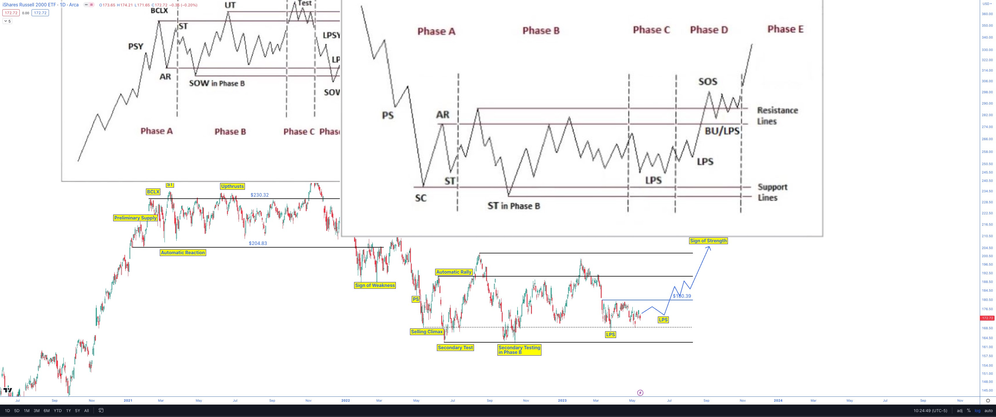
From the overlay, it appears we might face another month or so of volatility before the transition from the Last Point of Support (LPS) to the Sign of Strength (SOS) phase. This timeline suggests the SOS phase could begin in early September, with Phase E kicking off in late October. Interestingly, this aligns with a typically bullish season (October to December) in the market.
SPX
I came across a tweet featuring the same pattern overlaid on the SPX chart. As I mentioned earlier, this trader believes the market is already at the SOS phase, which is in the middle of Phase D. Just sharing what I've found.
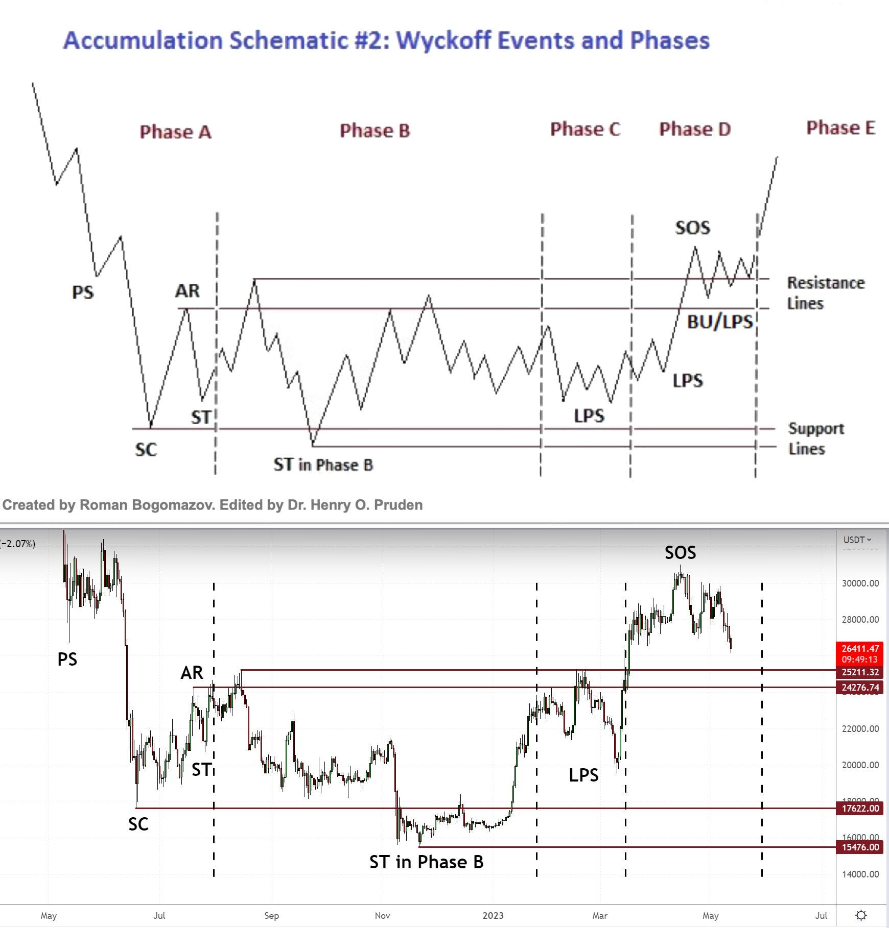
https://twitter.com/MustStopMurad/status/1657032268899139587?s=20
VIX
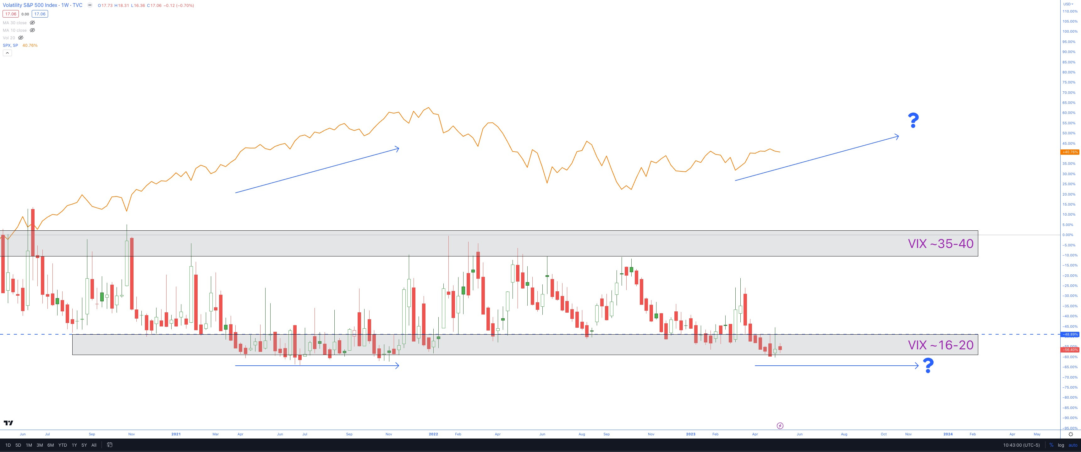
As I did last week, I’m going to highlight the potential for a sideways, choppy VIX while SPX grinds higher, as it has done previously.
This would seem to align with the seasonality (see below).
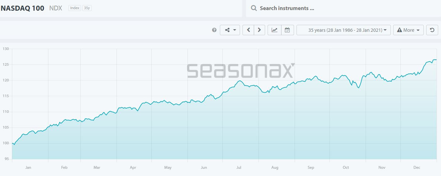
Seasonality
If history repeats itself, we're on the cusp of a period that'll favor the bulls.
Let's take a look at a couple of seasonality charts, specifically filtered for pre-election years:
SPX - Notice the shift in May and the trend that follows.

NDX - Again, the change in May and the path to year-end are worth paying attention to.
BTC
First, here is a daily chart (high timeframe) of the Point and Figure variety. I have chosen 4% box size, as that aligns with the Daily ATR%. There is a noticeable pocket of accumulation (usually shaped as a “U” or “W” and has a clearly defined wall on the left and right).
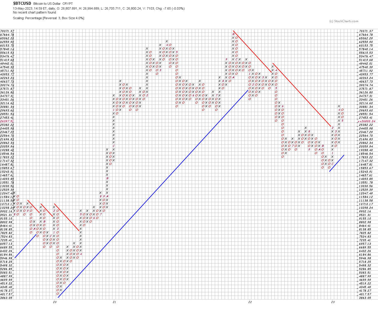
Note the bearish trends have been broken, and a new bullish trend has been established.
Next, is the daily candle chart:
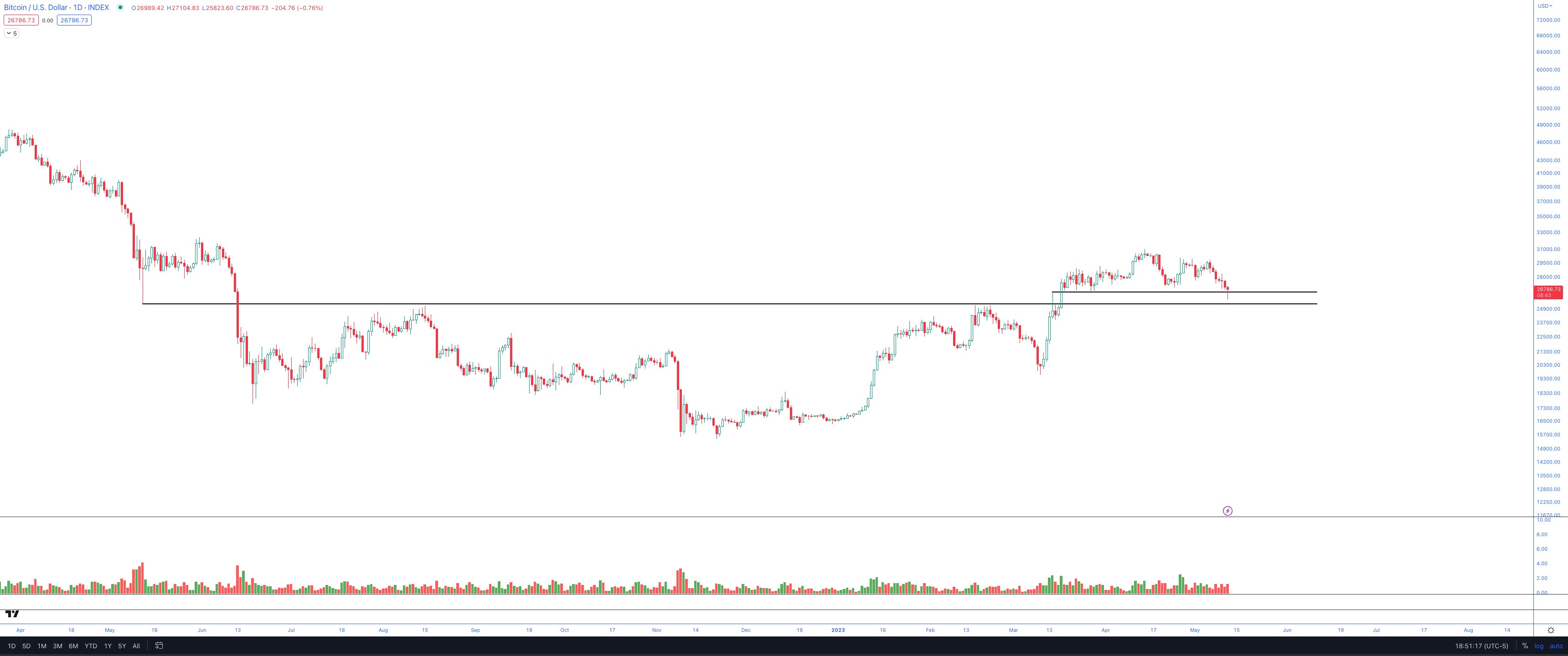
Here, BTC has demonstrated demand stepping in with the long wick under yesterday’s candle.
This was no coincidence, as this was previously an area of interest for the market (look left).
Finally, here is the weekly ATR% Chart:

The ATR% chart is a great way to get some historical perspective— especially on a volatile tape.
The bear market is still fresh on the market’s mind, and there are some that believe we are still in a bear market. I am not one of those people.
There is a lot of noise out there, but at the end of the week the tape will report the score like a scoreboard. Zooming out helps tremendously.
Some questions I like to ask myself:
Has this happened before?
What clues can we take from the past and apply to the current tape?
How has the news flow impacted price, and has it mattered in the past?
Oil & Energy
Starting with the Oil chart, as I believe that drives the Energy chart:
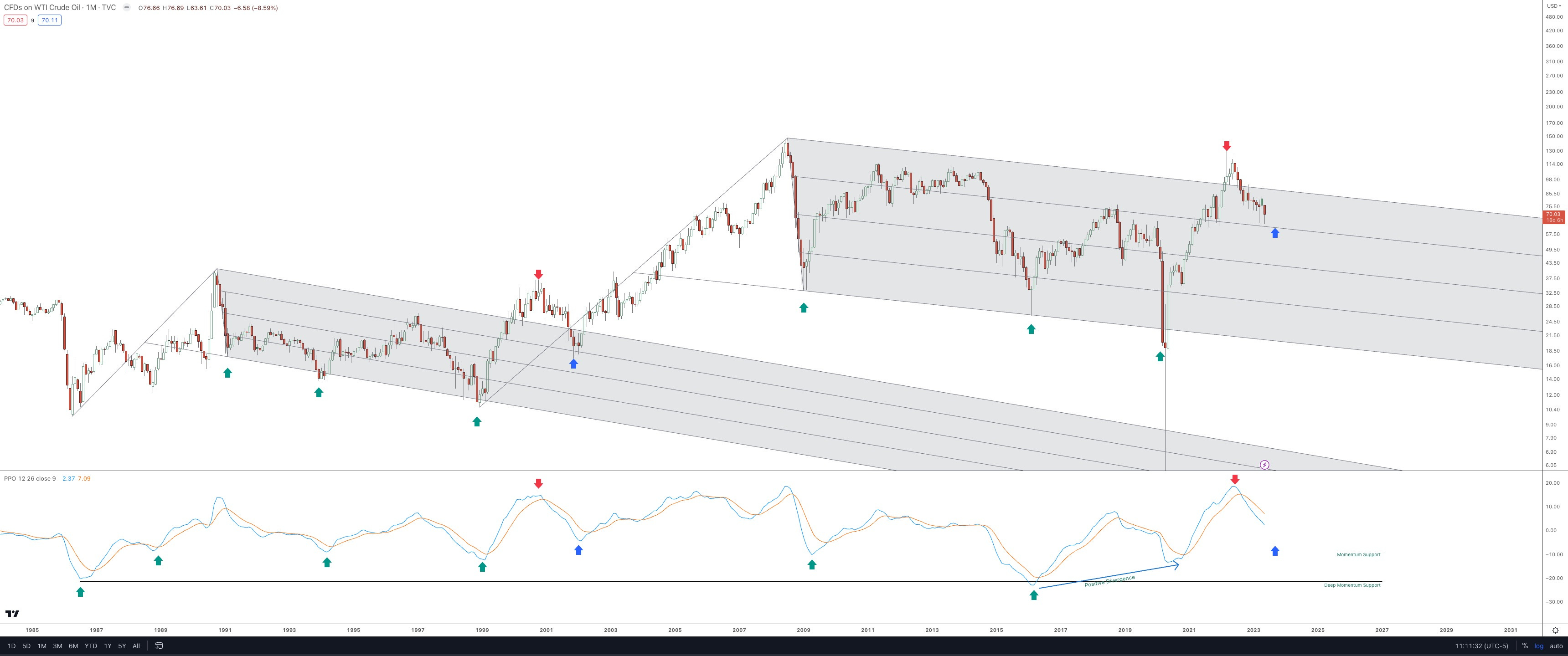
The analog has played out very well, as I’ve been sharing for the past 2.5 years—and the monthly low wick is very near to the pitchfork line that was forecast last year (blue arrow).
The analog suggests another 1-2 months of chop, but this isn’t necessarily a requirement.
How I plan to play it: Watch for another pullback and similar demand wick to show up on the monthly candles.
Energy:
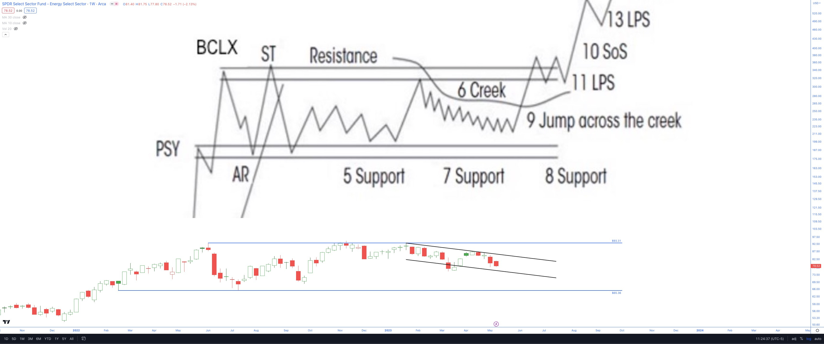
XLE - Reaccumulation: Hank Pruden Analog
This insight is courtesy of the late Prof. Hank Pruden. Currently, it seems like XLE is in the volatile area, often referred to as the "creek". The "creek" represents an extended phase where there's a plentiful supply, and the bulls are gradually taking it all in until the market is ripe for price increases.
Just another month or two of this volatile phase might be all XLE requires to fully absorb the supply. After that, we could see a substantial price uptick resulting from this reaccumulation pattern.
This would align with the “1-2 months of chop” from the oil comments above.
Best Regards,
Trace