

Market Outlook 12-Jun-22
Market Outlook 12-Jun-22
Leading Sectors & Industries, Quarterly Charts, Finding Opportunity in Further Downside, VIX, Oil vs. SPX, Added Distribution Counts, Bearish PnF Trends, ETH Distribution targets achieved, BTC update

Good afternoon market traders and investors,
I can’t sugarcoat it even if I want; the market action is ugly. All eleven sectors were red for the week, with Energy continuing to produce the most resiliency.
Just how bad is it out there?
When I scan the sectors & industries for strength, I have three general time frames I like to look at, with the below criteria:
3-month returns > 20%
6-month returns > 30%
12-month returns >50%
3-month Scans
There are surprisingly (or not surprisingly) two industries in the Energy sector that are both up > 20% in the last three months:
Oil & Gas E&P
Oil & Gas Refining & Marketing
Other than that, the only other industry to accomplish the same is Tools & Accessories from the Industrials sector.
6-month Scans
The 6-month scans yield the same results as the 3-month, but add in a few more industries in the Energy Sector:
Oil & Gas Drilling
Oil & Gas Equipment & Services
Oil & Gas Integrated
So in the last 6-month period, five (5) industries from the Energy sector with > 30% gains. Quite remarkable in this environment.
The only other industry in this scan is Coal, from the Basic Materials sector.
12-month Scans
The 6-month scan yields many overlapping results from the first two.
Energy:
Oil & Gas E&P
Oil & Gas Integrated
Industrials:
Tools & Accessories
Basic Materials:
Coal
See a theme yet?
Excluded from the above scans are the following sectors:
Technology
Consumer Cyclical
Financial Services
Real Estate
Consumer Defensive
Healthcare
Utilities
Communication Services
Bottom line: It’s slim picking out there. If I must be long new names, with rare exceptions (DIS, NFLX, TSLA), I want to find safety in the strength. But I don’t have to be in the markets. Cash is also an option. I find that high cash levels and patience are the best ways for me to ride out these storms. Better times will return, but surviving the volatile periods is a must.
Quarterly Chart: SPX
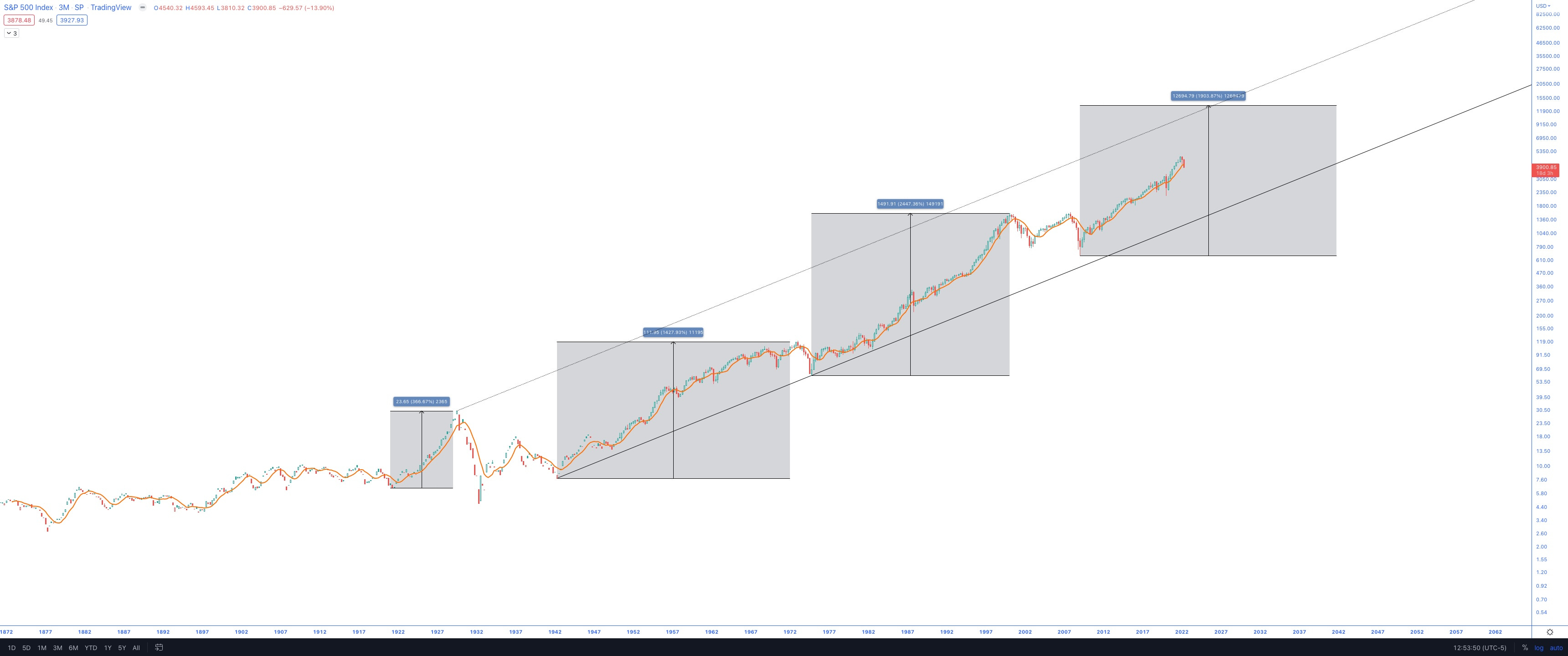
There are still 18 days remaining in the quarter, but I thought this weekend was an excellent time to look at the quarterly chart of the SPX to gain some perspective on the longer-term trend.
What I have found is that there are three prior periods of phenomenal gains, which culminate in some dramatic pullback:
The roaring ‘20s leading to the 1929 crash: +366% gains
The rally starting in WWII (Bretton Woods) through to the Gold Standard ending (Nixon) in 1971, leading to the 1972-1974 crash: +1427%
The 1974-20001 rally led to the Dotcom bubble bursting in 2000-2002: +2447%
It appears that a similar period began in 2009, with incredible gains of 622% from the lows in 2009 to the top in 2021.
Is the top in?
Keep reading with a 7-day free trial
Subscribe to Charts For Freedom to keep reading this post and get 7 days of free access to the full post archives.