Market Outlook 06-Aug-2023
ETF Analysis: SPY Dynamics, Monthly Update on Case Study Insights, Seasonal Patterns, and the Small Caps & Energy Uptrend
Greetings to all investors and traders,
In today's analysis, we'll be covering:
ETF Analysis: A closer look at SPY (SPX)
Case Study (Positive Jan > 4%): Update
Cyclical Cues: Decoding the Seasonality Trends for SPY & Gold
Market Dynamics: Spotlight on the Resurgence of Small Caps & Energy versus Large Caps
Major ETF Spotlight: SPY (SPX)
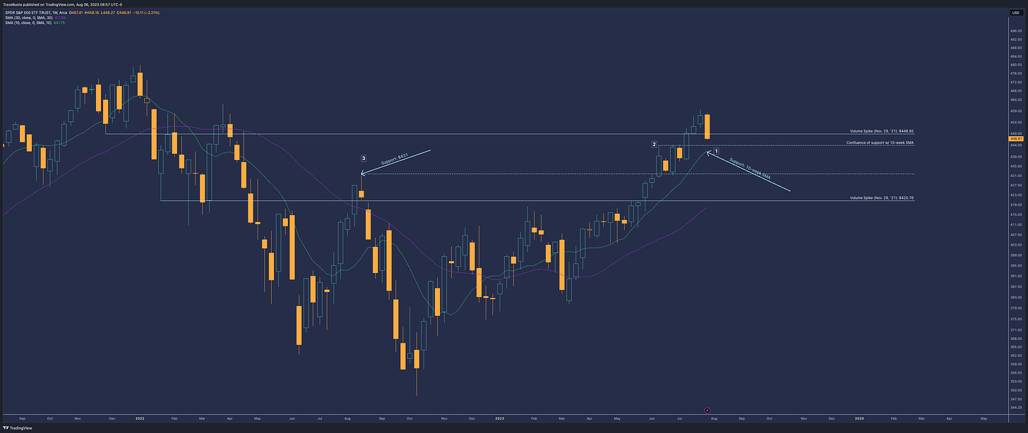
SPY's Candle Analysis:
The SPY displayed a notably bearish candle, with average trading volume.
It dipped below the previous “volume-spike” level of $448.92 from November 29, 2021.
Potential Support Points on the Chart:
Rising 10-week SMA: A trusted indicator for potential bullish reactions.
Confluence of Support Factors:
Highlighted by the high wick of the June 12 candle.
This particular wick acted as a resistance point during the weeks of June 26 and July 3.
Expect the 10-week SMA to align with this point soon, signaling a strong confluence of support.
$431 Mark: The high wick from the August 15, 2022 candle serves as a point to watch. The market has previously reacted here.
General Overview:
Current trend: Upwards.
Challenges: The SPY faced some resistance around a high-volume zone, which is typical, especially during this seasonal time frame.
Potential Outcome: A pause to balance the bullish momentum can prepare the market for a robust year-end rally.
What I'm Watching Closely:
The first level where bullish sentiments manifest.
The intensity and results of the bearish moves. If there's high effort (observed through volume) from bears without much price decline, it may suggest that the bullish phase will resume. Conversely, if prices decrease easily with minimal volume, we might see an extended market ranging phase.
Additional Insights: In the following sections, I'll provide statistics, delve into seasonality patterns, and draw parallels with past trends.
Case Study Update: Positive January (>4%) with a Dip in February
July's Performance: SPX wrapped up July with a commendable gain of +3.11%. This success extends the pattern of positive outcomes since March, aligning well with the average results across our seven-year observation.
August's Forecast: On average, August sees a growth of +1.44%. However, this month is off to a rocky start as the first week already marked a significant drop of -2.4%.
Hope for the Bulls: Despite the challenging beginning in August, data from our seasonality analysis suggests there's potential for a bullish rebound.
Seasonality Update (SPY & Gold)
Starting off with SPX.
There's significant buzz, especially on Twitter (X), about the prevailing bearish seasonal trends for SPX.
Fortunately, we've touched on this topic several times before. Nonetheless, it's essential to keep pace with these evolving patterns.
Below is the Seasonax chart showing seasonality, specifically filtered for pre-election years:
For a more in-depth look, see insights from the Almanac Trader, Hirsch:
I observe that bulls face challenges during three distinct intervals:
Early to Mid-May
Mid-July to Mid-August
Early October to Late October
Currently, SPX is concluding the second interval.
The seasonality indicates a general upward movement from now until mid-September. While it may appear volatile, the overall direction is upwards.
Now for Gold.
Gold hasn't been getting much attention lately.
Below is the Seasonax chart, specifically filtered for pre-election years.
The trend is straightforward, as indicated by an arrow.
I currently hold GLD call options.
Small Caps vs. Large Caps: A Shift on the Horizon?
For what feels like the past ten years, small caps seem to have been overshadowed, sidelined, and forgotten.
Comparison Charts:
RUT vs. SPX:
Observing the divergence over the last three years, there's notable positive momentum in the RUT/SPX ratio. This pattern dates back to the 1980s.
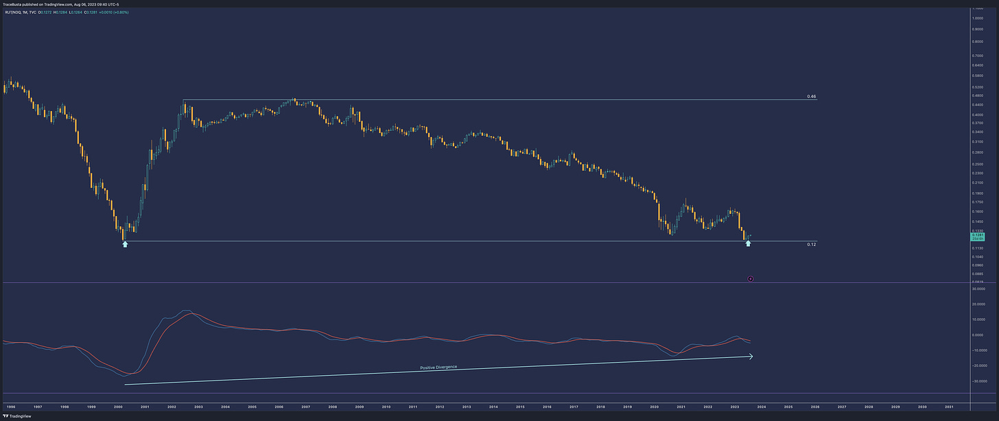
RUT vs. NDX:
There's a prolonged bullish divergence in momentum. Additionally, the price recently rebounded from the support level set during the Dotcom period.
One sector that could propel small caps against their larger counterparts is the Energy sector.
Energy Sector Charts (Using XLE ETF):
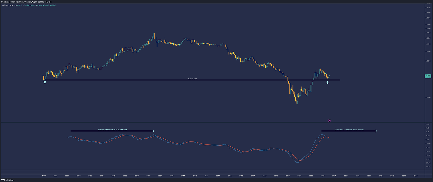
XLE vs. SPX:
A broader view shows the market's memory at work. By zooming out, we see the XLE ratio bouncing just above its initial low from 1999.
XLE vs. NDX:
XLE has not yet surpassed the Dotcom era ratio level but remains close beneath it.
Small caps, especially in the Energy sector, might be poised for a resurgence against large caps. The historical data and current trends suggest a potential shift that could rebalance the scales in the market. Investing wisely in this sector could offer rewarding opportunities in the coming times.
Have a blessed week,
Trace


Thank Trace, really good as always! what are some relevant tickers you see in this Market (XLE)? Also, btc mining stocks are getting a bit of a beating, whats your take? thanks!