

Market Outlook 02-Jan-23
Market Outlook 02-Jan-23
Sector Performances, VIX, Stocks vs. M2, Stocks vs. Bonds, Santa Rally, Seasonality & More

Good afternoon and Happy New Year,
2022 was a rough year and most likely didn’t go as planned for most market participants. But it is now in the past, and we have 2023 to look forward to.
I have a lot to get through today.
Sector Performances & Analysis
Major ETF Performances
VIX
Stocks vs. M2 Money Supply
Stocks vs. Bonds
Santa Claus Rally & Stats
Seasonality
Sector Performances & Analysis
I have a few charts to go over from the 11 different sectors. For simplicity, I’ve made these line-style charts, and I’ll cover three timeframes:
2000-March 2009 (First Major Cycle of the century)
March 2009 - March 2020 (GFC bottom to Covid bottom)
2020-2022
This is the best time to look back at how specific sectors performed at the start of the century, through the Dotcom & Real Estate Bubbles, and how they’ve performed from the massive market bottom of 2009. Similarly, it is also an excellent time to see how things have settled after three full trading years in the post-Covid world.
After reviewing these charts, I was surprised to see where specific sectors landed at the end of each era examined.
As a proxy for the 11 sectors, I’ll use the SPDR ETFs, with two exceptions:
Communication Services (Vanguard - VOX)
Real Estate (iShares - IYR)
More data was available for the above two sectors using replacement ETFs from Vanguard and iShares.
In all three charts below, I have adjusted them for dividends, as many market participants reinvest dividends. I feel this is the most objective way to compare the eleven sectors.
Here are the tickers I’ll share in the charts below (in no particular order):
XLP - Consumer Staples
XLE - Energy
XLF - Finance
XLV - Healthcare
XLI - Industrials
XLB - Basic Materials
XLK - Technology
XLU - Utilities
VOX - Communication Services
IYR - Real Estate
XLY - Consumer Discretionary
2000-March 2009 Sector Performance
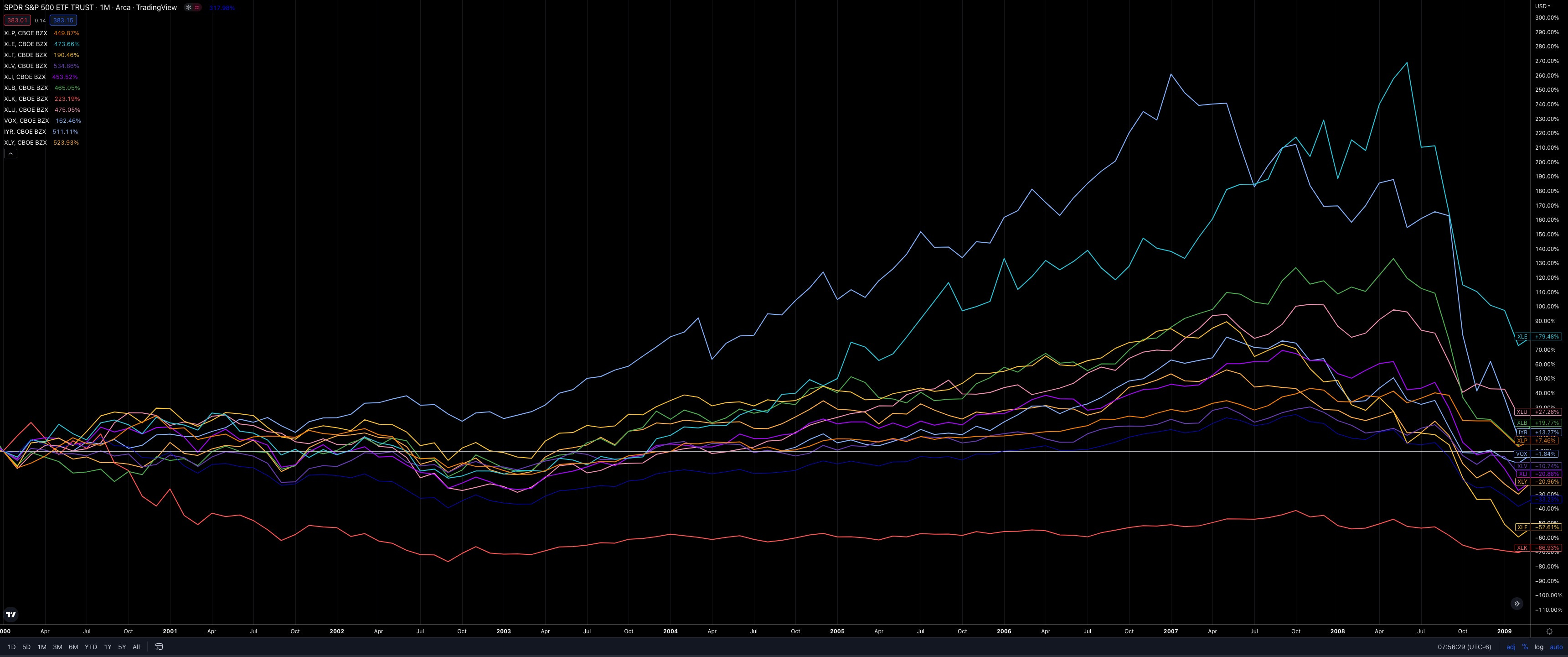
Going back to the start of the century to see where things landed at the end of the Great Recession.
Tech (XLK -67%) was the biggest laggard in the first decade (Dotcom bubble recovery), and there are two notable peaks at the top right of the chart: Real Estate (IYR) and Energy (XLE).
Real Estate had a fantastic first seven years to start the century (~270% gains), then, as we all know, came crashing down hard. It was the first domino to fall in the GFC era and ended with a measly 13.7% return by the end.
From that Real Estate peak in 2007 through the Energy peak in June 2008, there were only a few notable Sectors to trade in positive territory over the 18 months:
XLE - Energy (+55%)
XLB - Basic Materials (+18%)
XLU - Utilities (+16%)
XLP - Consumer Staples (+4%)
By June 2008, every other sector was already down. Then nothing was spared between Aug 2008-March 2009.
As I’ll share in the following chart, you may already know that the leader of the first era (Energy +79%) had the worst performance in the next era, between 2009-2020. And on the other side of the spectrum, the worst-performing sector from 2000-2009, Technology (XLK -67%), became the pack's leader over the next decade.
I will also note the second and third worst Sectors from 2000-2009 were:
Finance (XLF -53%)
Consumer Discretionary (-21%)
I’m noting those returns now because they’ll appear again in the next section.
March 2009-March 2020 Sector Performance
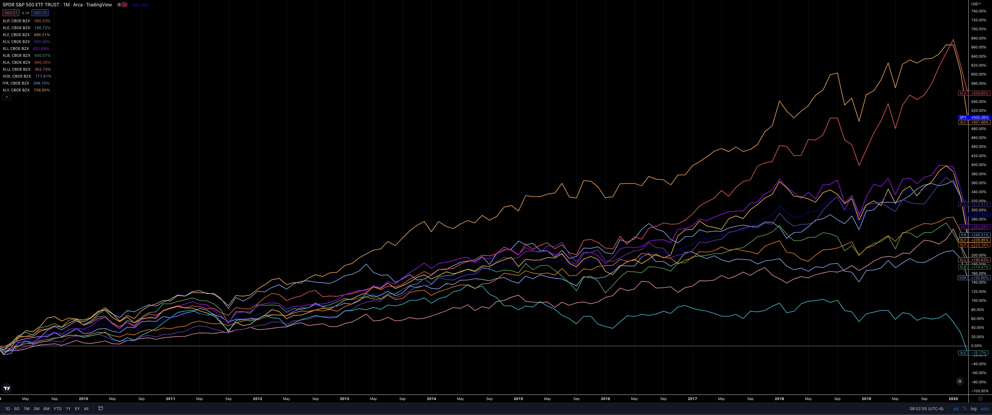
The rise and resilience of most sectors were impressive. Coming out of the GFC bottom, the rapid market move caught a lot of people by surprise. Of course, there were big shakeouts along the way, but each time the market as a whole was able to shake them off and keep grinding higher, thanks mainly to the FED and their money printers.
The top two sectors had notable returns relative to all others:
Technology (XLK +558%)
Remember that this was the laggard with -67% returns in the previous era.
Consumer Discretionary (XLY +501%)
Remember that this was the third worst sector in the previous era, with -21% returns.
And then there is Energy (-15%), the previous leader from 2000-2009. On a relative basis, it had a horrible run between March ‘09-March ‘20 with a -15% return while the rest of the market was up about 300%.
Key takeaways:
Technology: The previous laggard had now become the leader of the pack.
Energy: The previous leader was now the laggard.
Finance: The previous 2nd worst sector was now in the middle of the pack with +240% returns.
Consumer Discretionary: The previous 3rd worst sector was now the 2nd best.
So it was almost a complete flip-flop from top and bottom.
2020-2022 Sector Performance
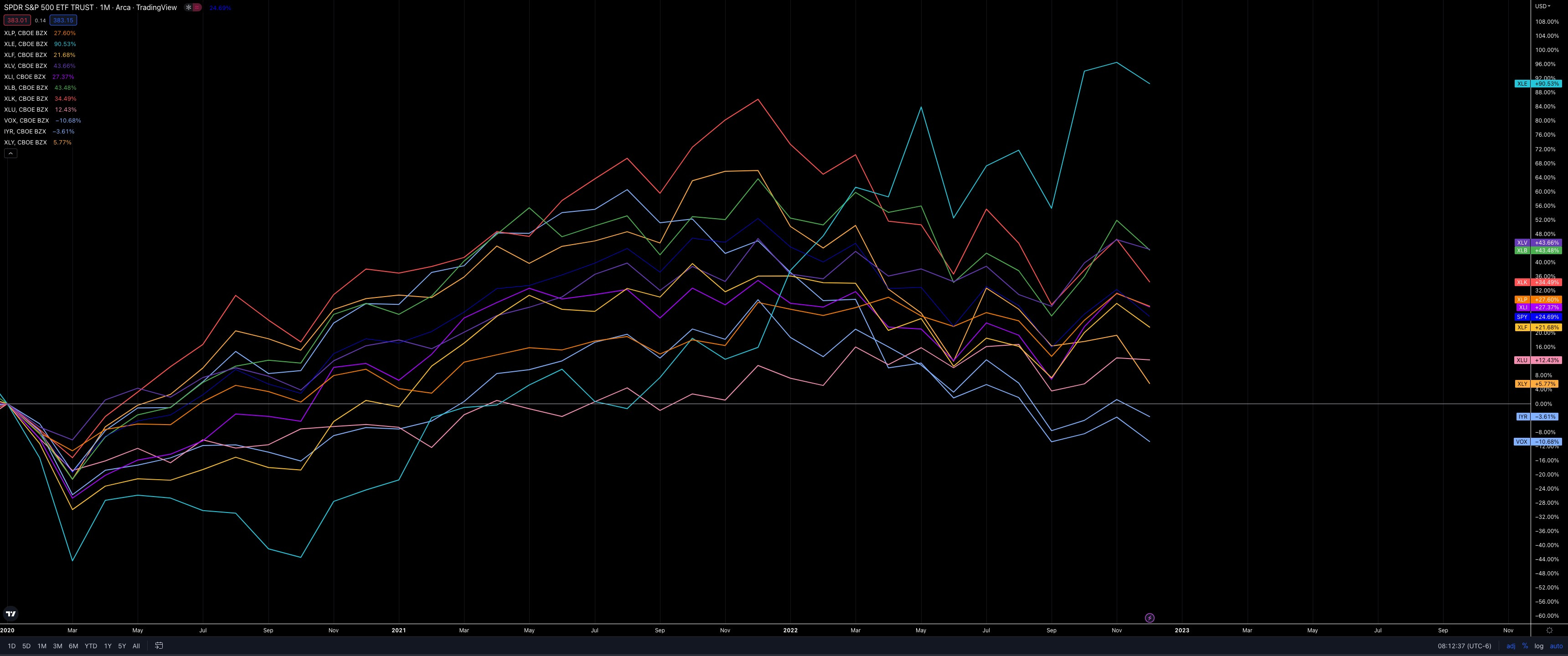
We now have nearly three years of data in the Covid era, which I’ll say started in Jan. 2020 for all intents and purposes.
There’s an obvious outperformer here: Energy (XLE +90%).
Remember when oil prices went negative in April 2020? I sure do. So many oil jobs were lost, and projects were canceled. Refinery revamps put on the shelf. This is a more extreme version of what happened after the shale & fracking boom from 2014 that led to oil prices collapsing.
With 30% of the decade over, there is still time for continued Energy dominance relative to the other sectors.
Here’s a quarterly chart of XOM vs. SPX (adjusted for dividends):

I’m using XOM as a proxy for XLE because there is much more data going back to the 1960s.
As we advance, I suspect Energy will have a significant decade, and if that ratio XOM/SPX ratio of 0.06 is to be tagged, then Energy is only halfway there.
Wrapping up the Sector analysis: If you haven’t noticed the pattern yet, it seems the leader of the last era becomes the laggard and vice versa. So what does that mean for Technology?
Here’s a quarterly chart of NDX vs. SPX
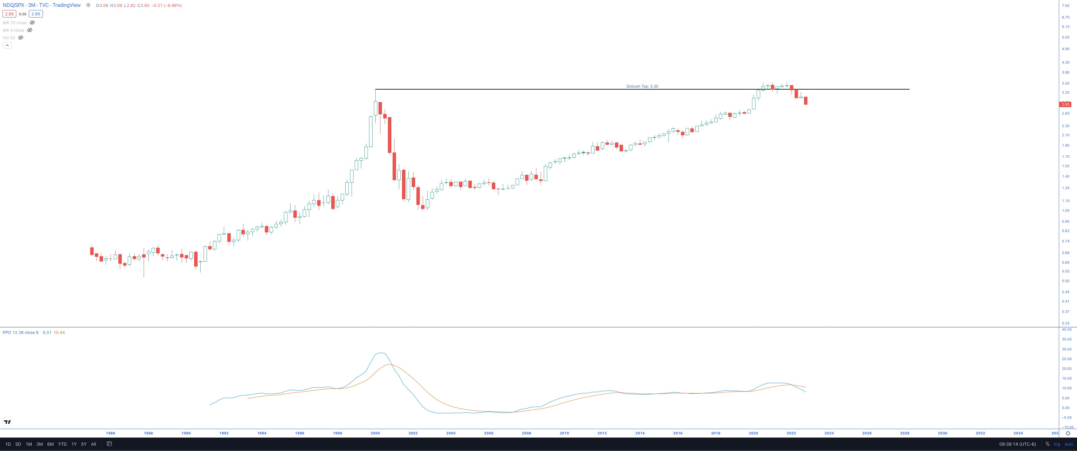
I’m not going to make any predictions here, but it’s not looking good for tech right now.
The fact that the Dotcom top rejected the relative strength chart vs. SPX while putting in a relatively high momentum crossover is not good.
And if you look closer, there’s a significant negative divergence in the momentum (PPO indicator).
For the above reasons, I’ll be revisiting my watchlist chart and looking to replace some tech names with other sectors.
One final comparison of Energy vs. Tech, using XOM and IBM as proxies (for more data than their parent sector ETFs)
XOM vs. IBM, Quarterly Chart

If you allow for such an extensive range, there has been a 30+ year consolidation period.
There is also a very deep bullish momentum crossover, with the steepest rate of change of all the bullish crossovers that have occurred.
Quarterly Charts
Here are the eleven individual charts on a quarterly (3 Month) timeframe. After adjusting for dividends, I will sort them by their performance since Jan. 2020.
I’ll revisit these charts in 3 months.
Energy: XLE +90%
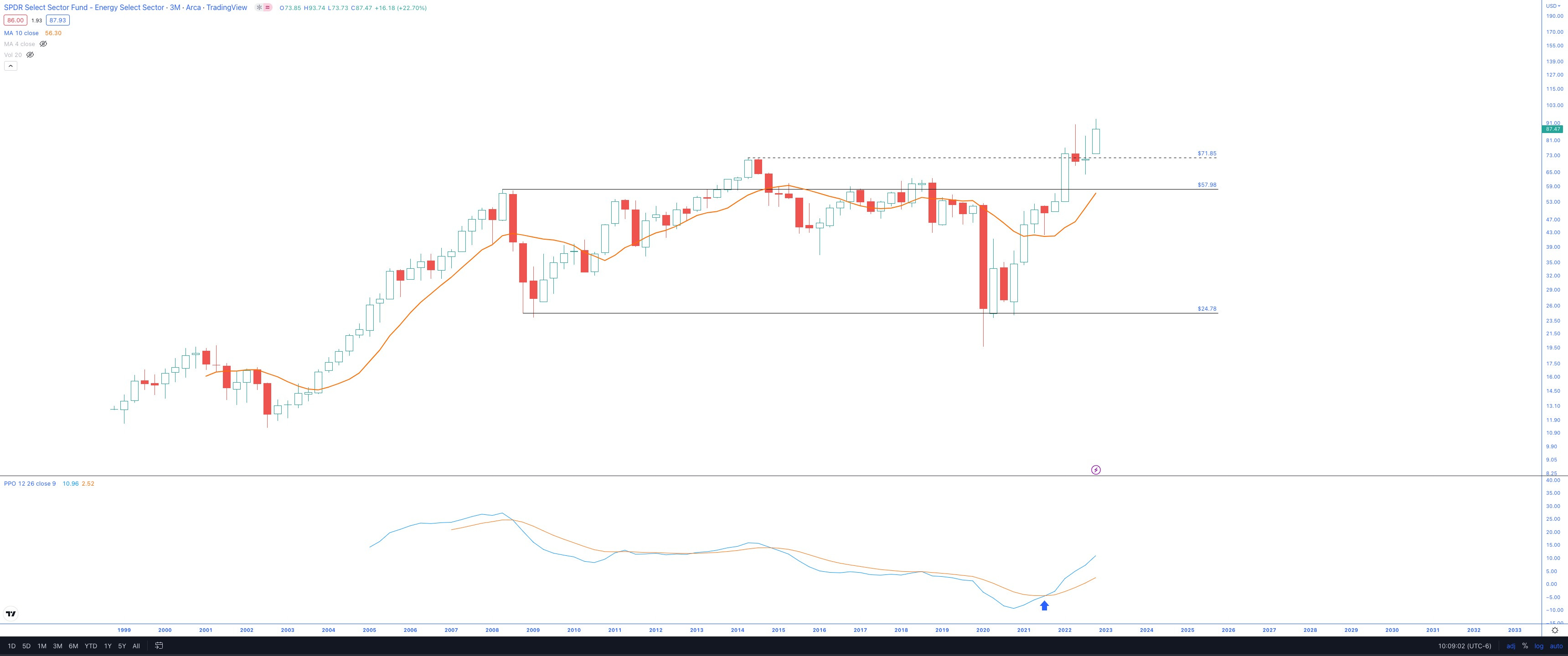
Breaking out with a recent deep momentum crossover
Healthcare: XLV +44%
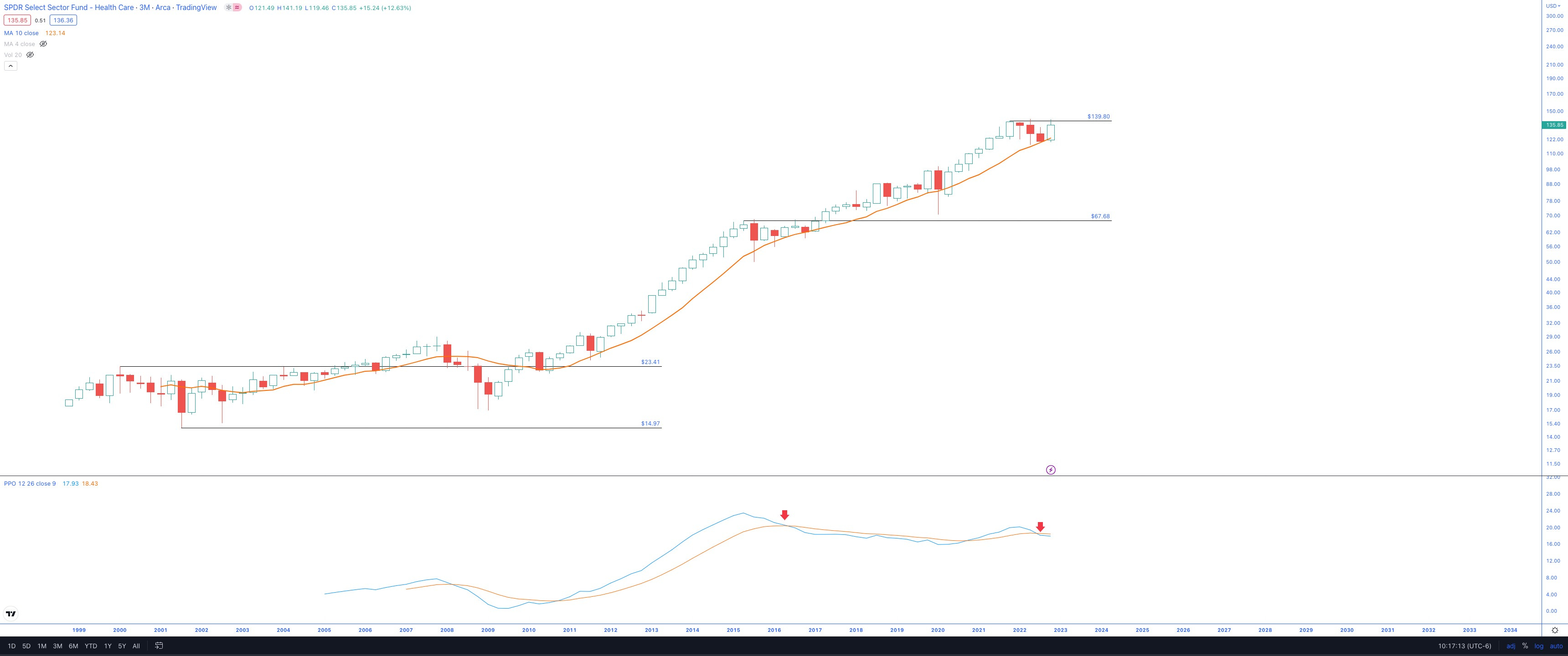
Notably, the price has ground higher along the rising 10-SMA.
And while there is a recent bearish crossover in the momentum, I will point out that there was also a bearish crossover in 2016 that did not result in a pullback, instead price grinded higher.
The recent coiling action below $140 could be setting up for the next leg.
Basic Materials: XLB +44%
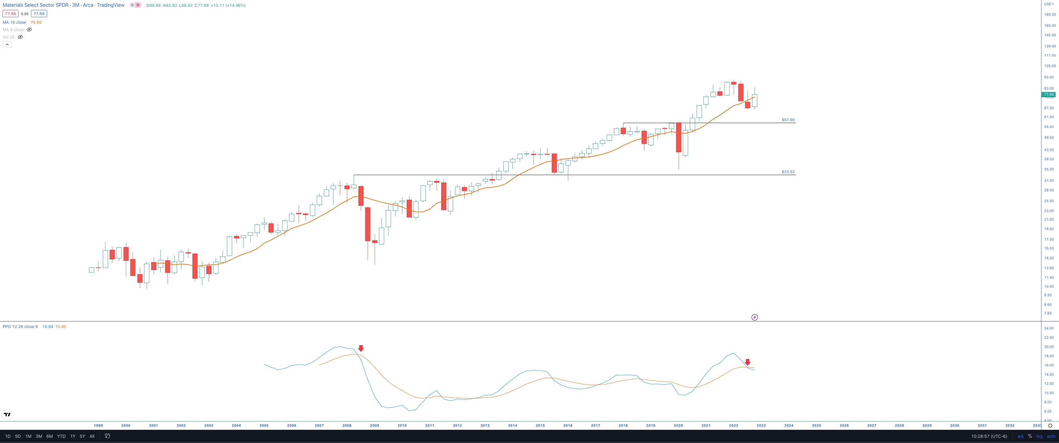
It is trending higher, but there is a recent bearish momentum crossover, which did not treat the chart well the last time it occurred.
Technology: XLK +34%

Rejection from the 10-SMA and a bearish momentum crossover.
There is quite a bit of room to drop in the channel and, even more, to fall to the Dotcom top.
As noted earlier, I will be adjusting the watchlist accordingly.
Consumer Staples: XLP +28%
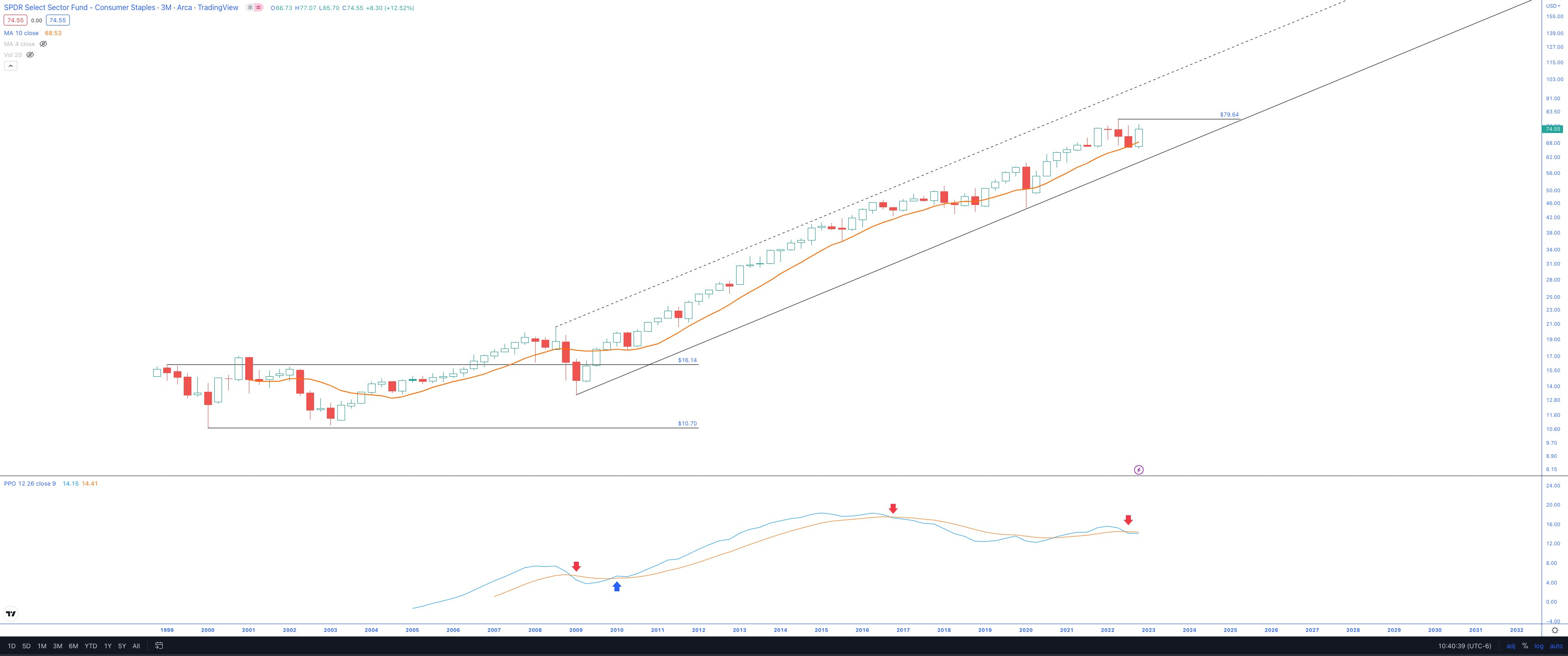
A solid decade-long channel with a recent bearish momentum crossover
If Staples consolidate and chop sideways for another 4-5 quarters, bringing it closer to the demand line of the channel while allowing the bearish momentum crossover to work off its energy, then I would like to be long this sector. So maybe something to play here in late 2023 or early 2024.
A move and close above the $80 level can lead to the next leg higher (similar to the Healthcare coil below $140).
Industrials: XLI +27%
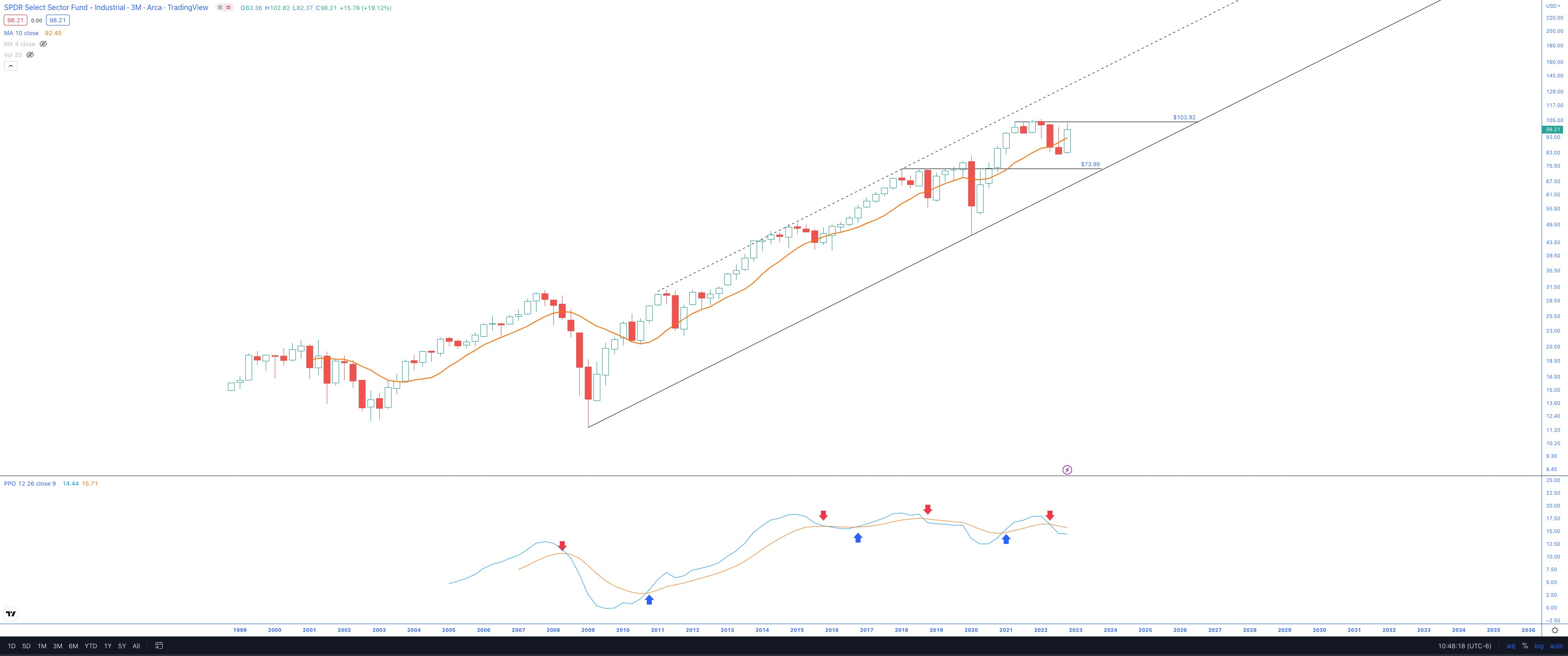
It looks like it could be rangebound for a while, but a break above $104 would be a positive development for the bulls.
Note the recent bearish momentum crossover.
Financials: XLF +22%
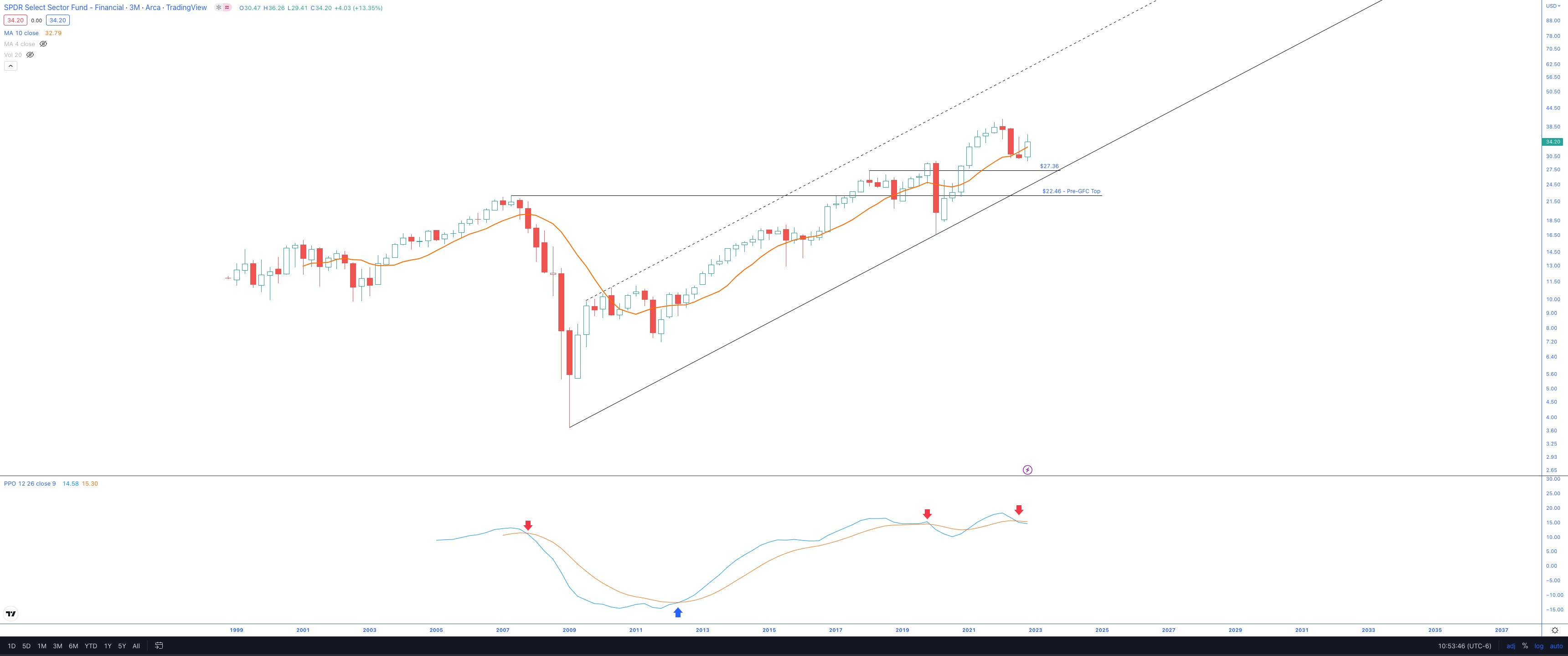
Holding above the pre-Covid highs is a big plus.
There is a decent wick on top of the candle and a recent bearish momentum crossover, so I’m approaching this sector cautiously.
Utilities: XLU +12%
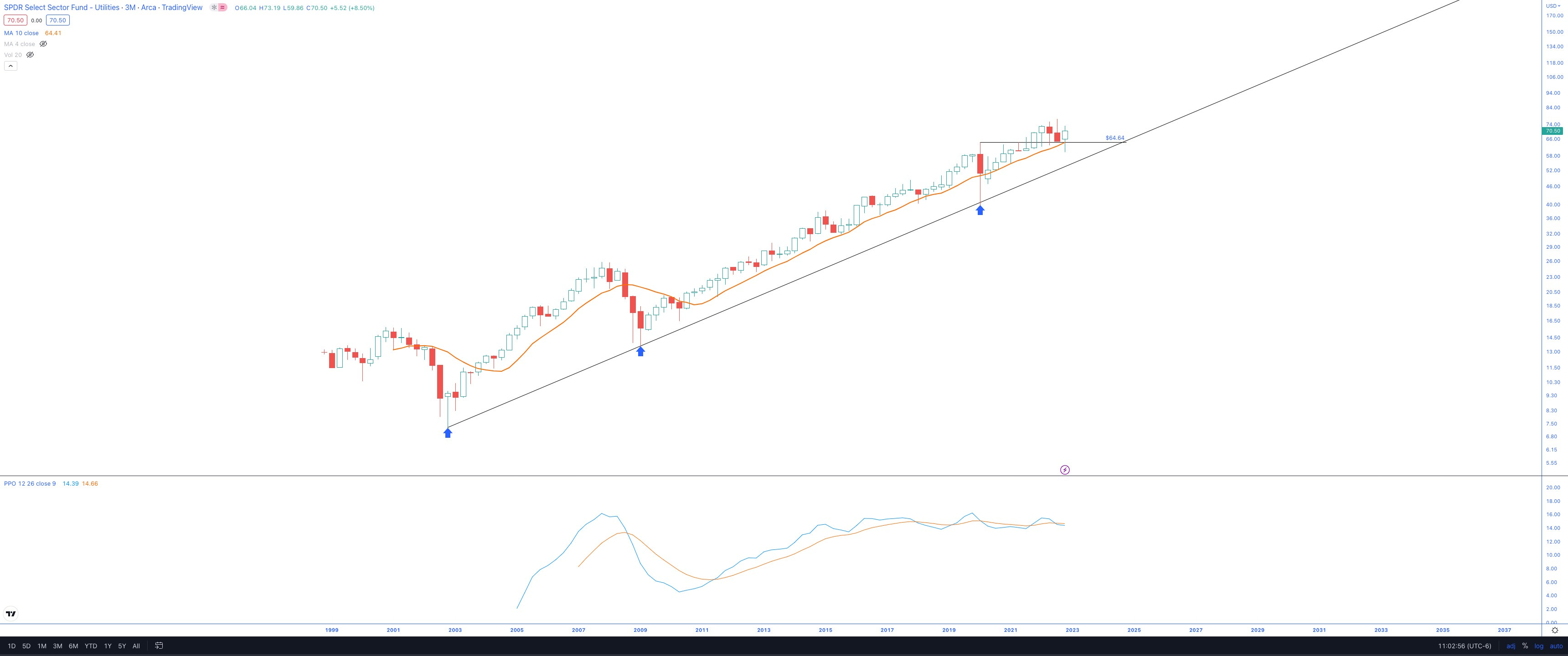
A slow and steady grind higher, respecting the 10-SMA
Consumer Discretionary: XLY +6%
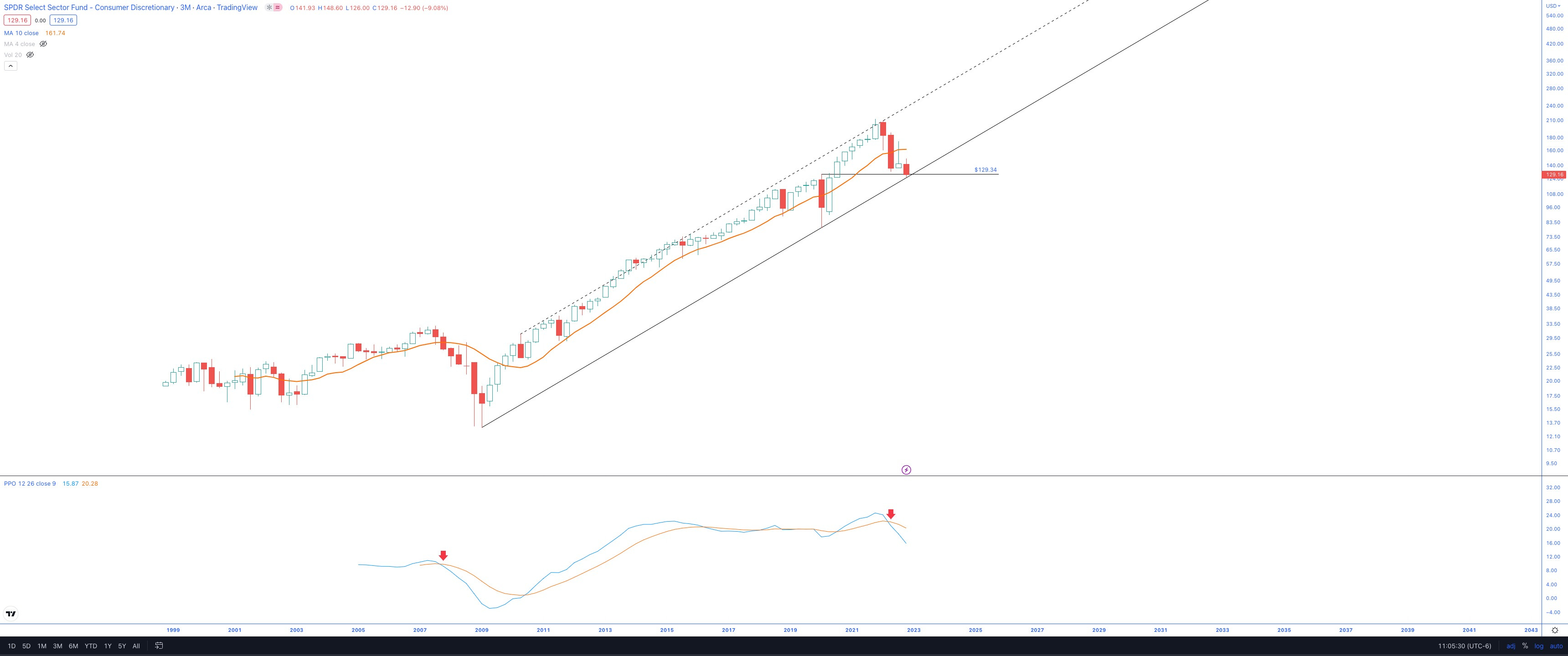
This is a concerning chart.
While technically, it has stayed in a channel with three tags, I am not liking the look of that rate of change in momentum and the slope at which it is declining from very high levels.
Should this channel break, things can get ugly for the sector and possibly the market as a whole.
Real Estate: IYR -4%
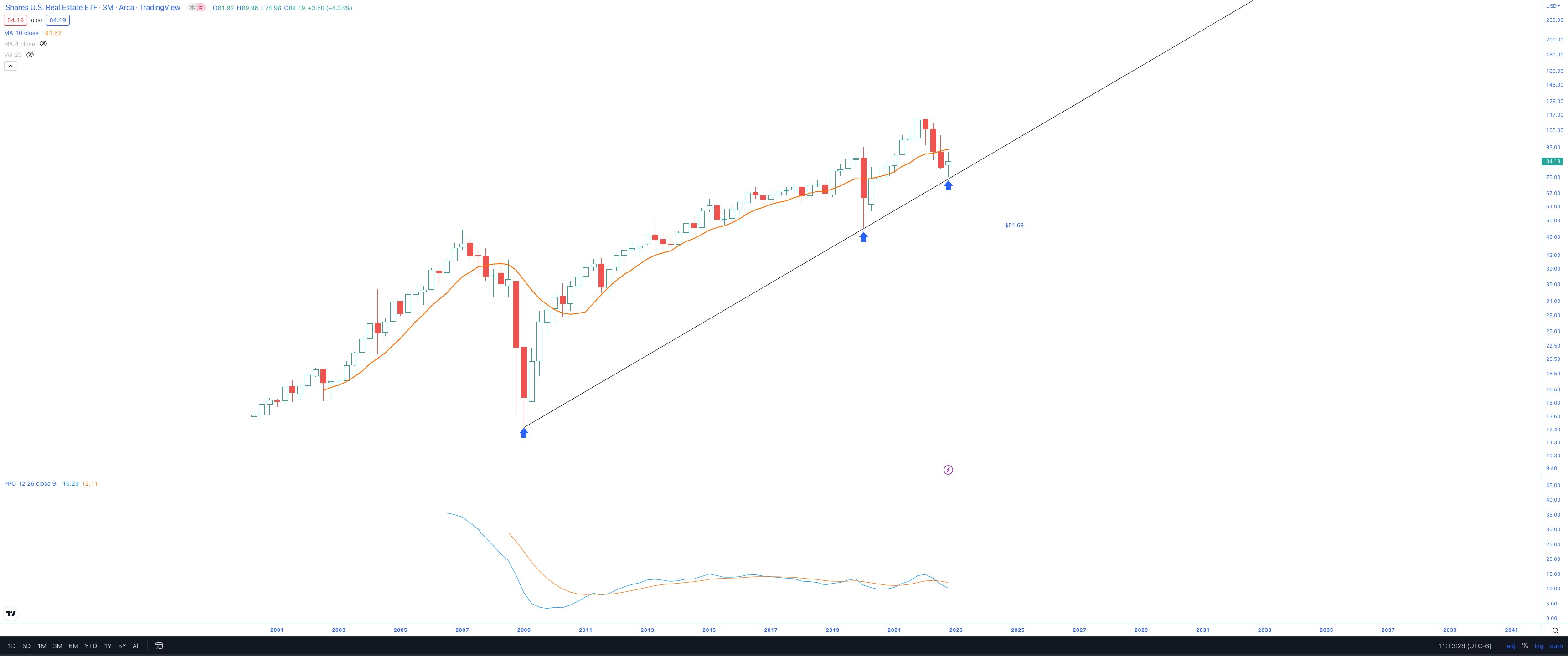
The downward thrust seems to be shortening, and the latest quarterly candle may be a nice pivot for this sector.
There’s a decent trend line with almost three nearly-perfect tags, and the momentum is still toward the lower end of the range.
Communication Services: VOX -11%
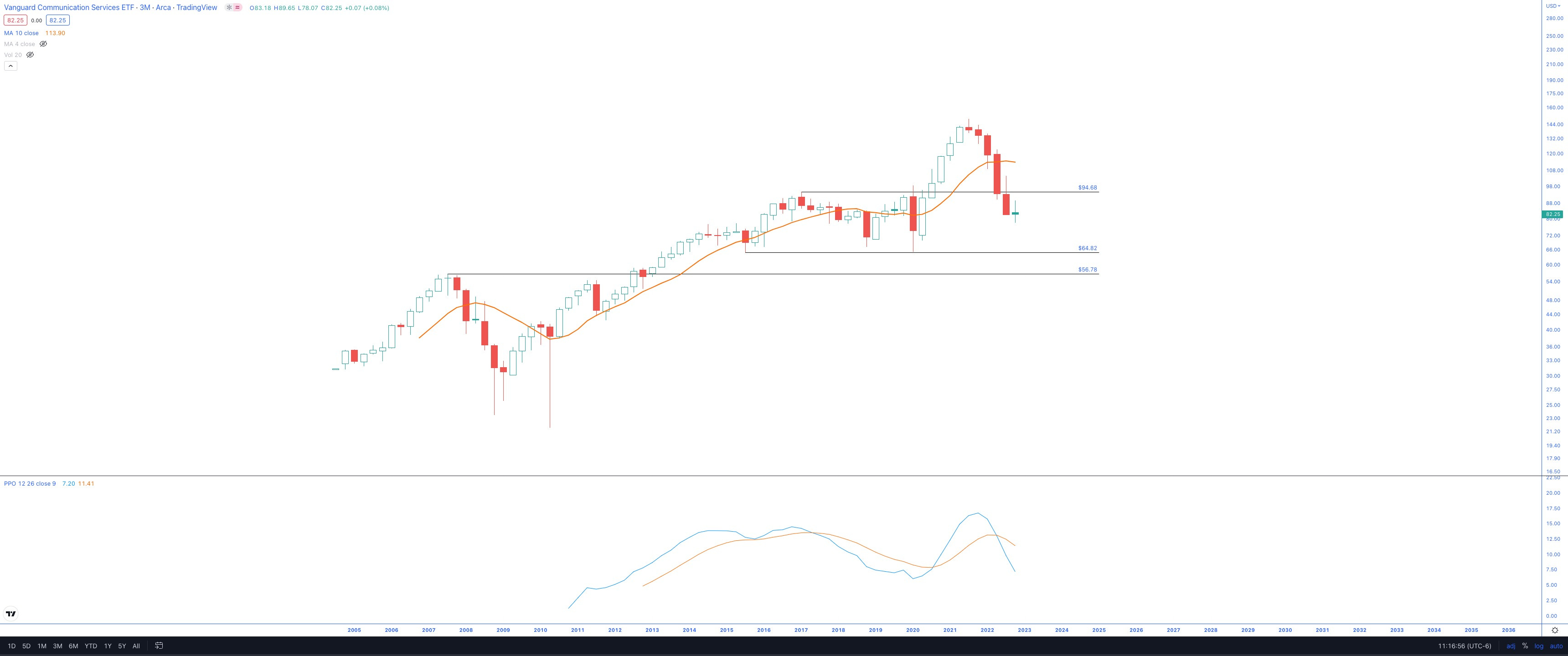
The worst-performing sector of this decade, and I’ll be avoiding it for now.
Primary Watchlist Updates
Now is an excellent time to go through the watchlist and make some updates. I’ll be sending out an updated watchlist next week.
Stocks vs. M2 Money Supply

There’s nothing profound in the above chart other than: “Where M2 goes, stocks follow”.
I’m watching (along with millions of market participants) where the M2 is headed.
Big Picture Views
I want to update you on a post I shared about three months ago (Sept. 2022):

From the post, I had a theme: Inflation vs. DJI performance with VIX as evidence suggesting more short-term chop ahead.
Today my goal is to zoom out and look at the largest, longest-lasting stock market trends of the last 100+ years’ worth of data and identify where it paid to be long. There are historically three major eras where the secular bull markets dominated. And these weren’t just rallies of the short-term variety. They were meaningful, 10-15 year bull markets.
For this exercise, I went through a charting session this morning, found where the YoY US Inflation rate peaked and plotted the coincident point on the 100+ DJI quarterly chart. What I found was pretty astonishing. I got a decent estimate on when I think the next secular bull market will begin and tried to confirm with the monthly VIX chart.
Below I’ll share the two updated charts
YoY inflation
DJI Quarterly chart
YoY Inflation (updated from September)

It’s looking more and more like inflation has peaked. So what happens next?
Well, that was the intent of my September post. I wanted to find out what happened to DJI historically after episodes of peak inflation.
DJI Quarterly Chart (updated from September)
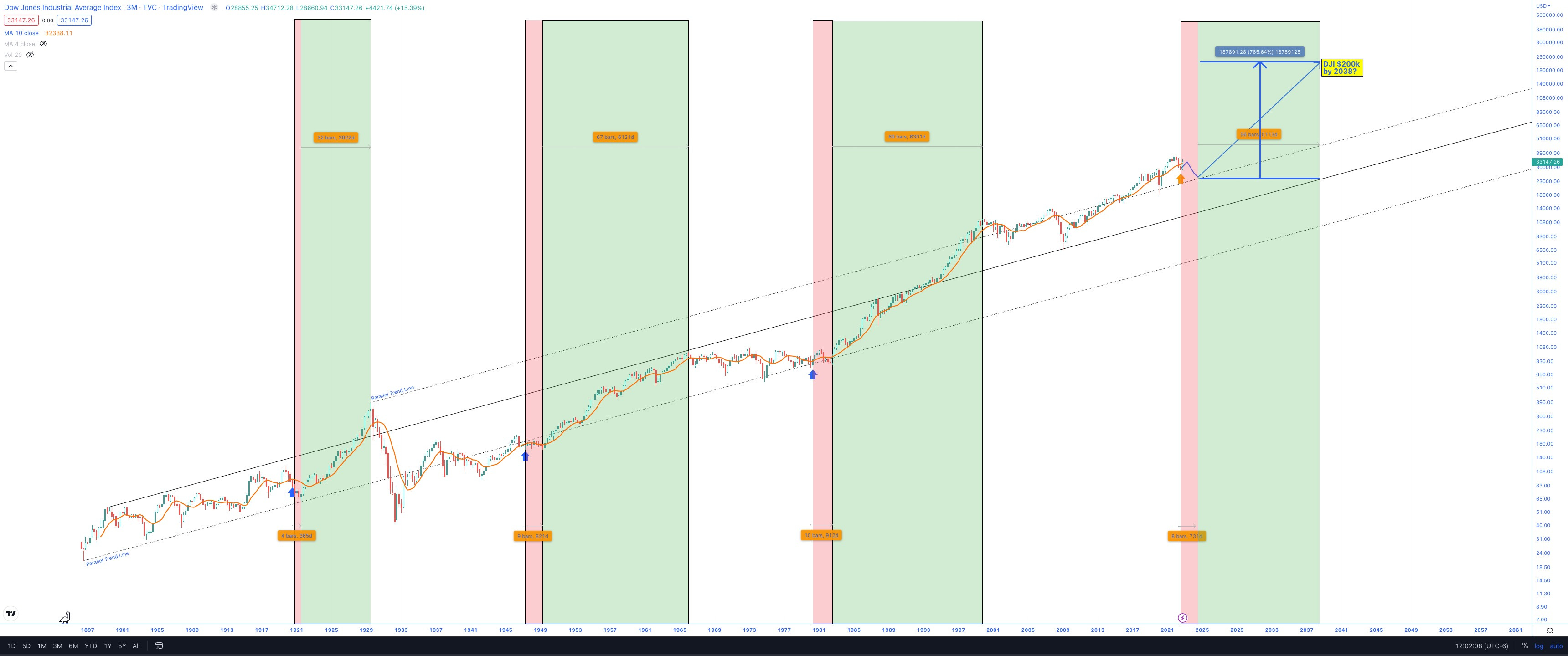
Here is the updated chart that I shared back in September. As expected, DJI rallied to where I had plotted the first pivot on the blue path. This was based on the highly bullish seasonality the markets were poised to enter at the time.
So now, as DJI enters the shaded red zone, I suspect the market conditions will remain choppy. I understand I’m going off a sample size of three, but it will have to do for this exercise because that’s all the data we have.
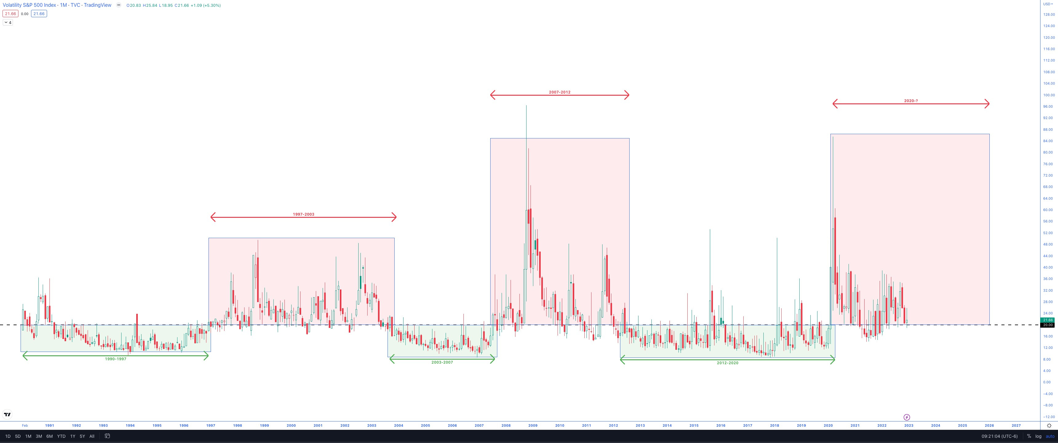
If the red zone represents choppy market action, the next six quarters or so should see heightened VIX. And as I did in September, I’ll refer to the monthly VIX chart shared earlier.
The heightened volatility has persisted in 2022.
The expected duration is ~6 years based on the two prior eras.
I understand this is a small sample size, but that is our data.
So if the high volatility era began with the Covid lockdowns, it wouldn’t end until 2026. That aligns with the next secular bull market that started eight quarters after the June volatility peak (July 2024).
There are typically 1-2 years of declining volatility from the high 40s down to the sub-20 area.
VIX
For more on VIX and my long-term thoughts, please see the January 2022 post:
The market has chopped approximately halfway through the historical timeframe of elevated VIX eras. So another three years-ish to go? Perhaps the peak VIX comes in mid-2024, then descends lower into the next mega bull cycle for stocks.
Stocks vs. Bonds vs. Real M2 Money Stock
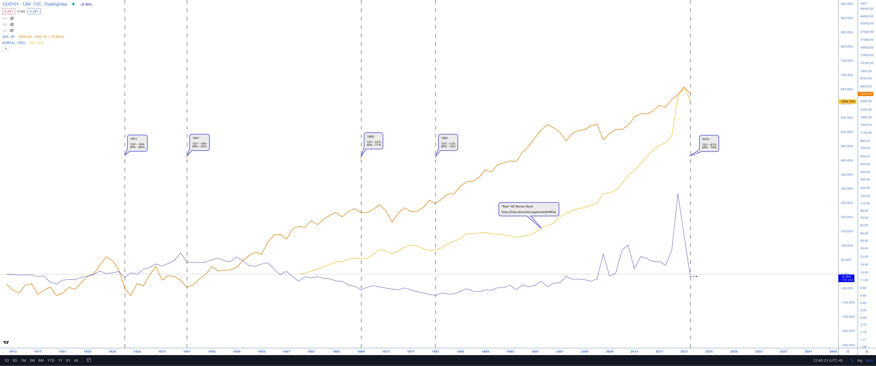
There has been much talk lately about bonds and stocks being down big over the last year.
The above chart shows the US10Y Bond (1/yield) vs. SPX vs. Real M2 Money Stock.
Real M2 Money Stock source: https://fred.stlouisfed.org/series/M2REAL
I’ve indicated the previous instances where both the US10Y and SPX are down 10% or more. It has only occurred four times.
Unfortunately, the Real M2 Money Stock data only goes back to the late 1960s, but in both cases where data was available, it appeared the money printers picked up their pace. I expect the same to happen this time around.
Santa Claus Rally
The Santa Claus Rally period has two more days left. It is often used as a leading indicator of things to come.
Remember, this period includes the final five days of the year plus the first two days of the new year. So Tuesday and Wednesday data will be critical.
Here are some stats I’ve dug up:
When the 7-day period is positive:
1 Month Returns: +1.6%
3 Month Returns: +2.9%
6 Month Returns: +5.3%
When the 7-day period is negative:
1 Month Returns: -0.3%
3 Month Returns: -1.2%
6 Month Returns: -0.3%
So going into Tuesday, the current Santa Claus period (last five days of 2022) has resulted in +0.45% gains (SPX).
Seasonality
I’ve shared this several times before, but worth reiterating: Currently, markets are in a very bullish seasonal period from Oct-April.
Please see below for more:
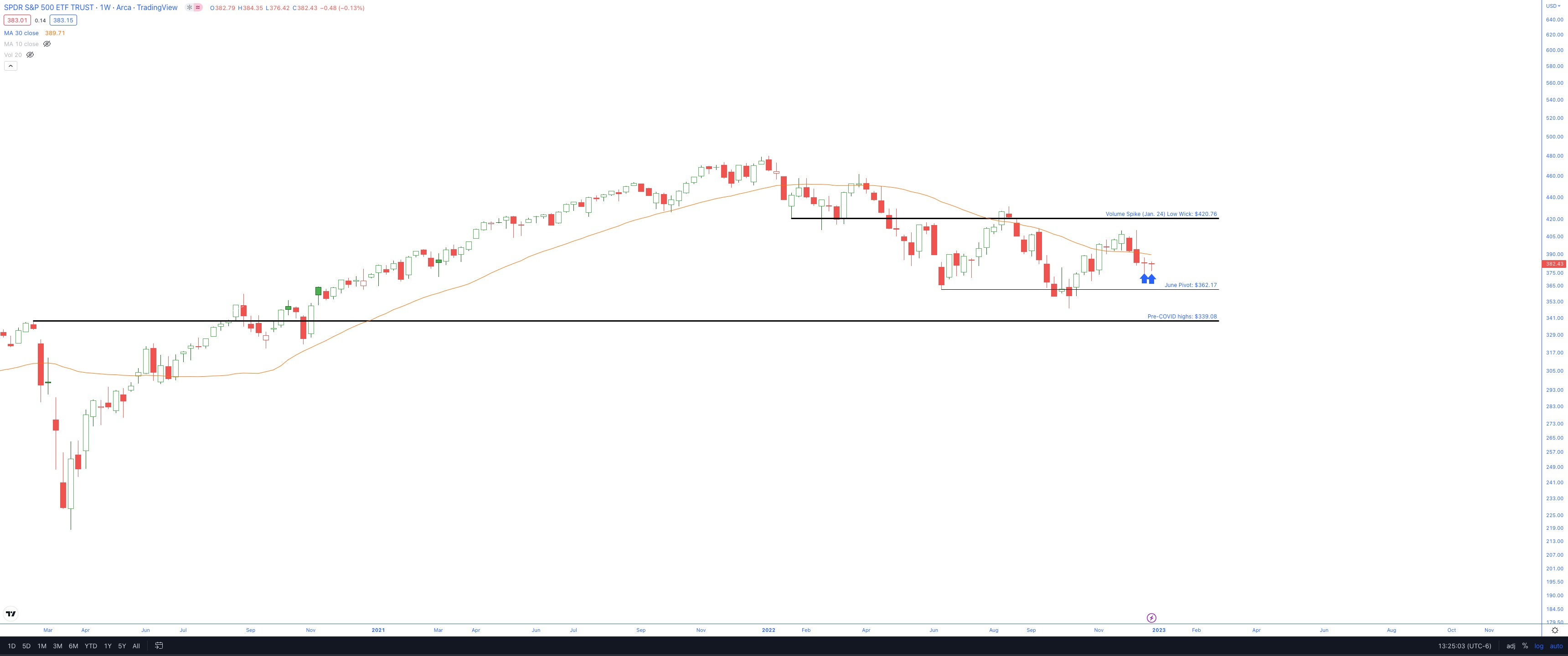
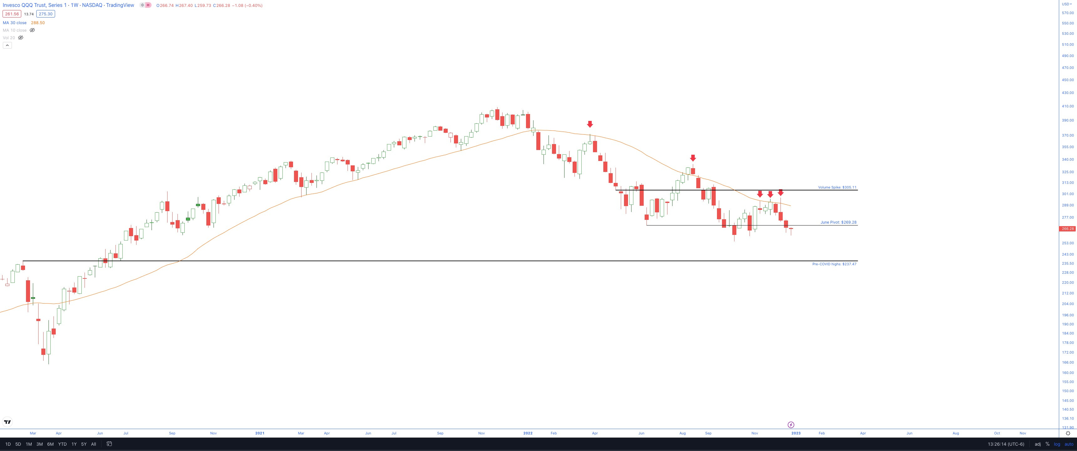
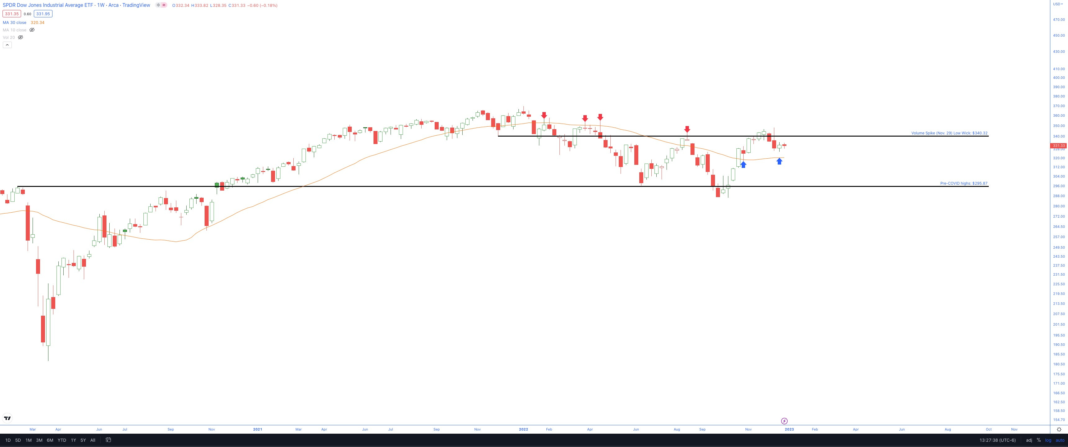
Quick Update on the Four Major ETF Weekly Charts
This wouldn’t be a complete update if I didn’t include the latest weekly ETF charts of the four majors. Please see below.
Perhaps the bullishness I’m about to note below on the weekly charts results in an excellent first half of 2023, followed by choppy/downside action in the 2nd half.
Many market participants expect the FED pivot may come sometime around March, and the forward-looking market might pick up on this earlier in the year, potentially sometime in Jan/Feb.
After the next two sessions, we will have an answer on the Santa Claus rally and at least some statistics on what we might expect over the next 1, 3, and 6-month period.
Note: These are weekly charts, and the tie goes to the higher timeframe quarterly charts shared earlier. VIX remains above 20 (for now), and with three out of four majors below their declining 30-week SMAs, it remains up to the bulls to prove they have absorbed the supply.
General Comments:
Three of four remain below their respective 30-week SMA
But, as noted earlier, the seasonal period is bullish through April
Two of four have put in what looks to be potential reversal Doji candles (needs confirmation with upside follow-through next).
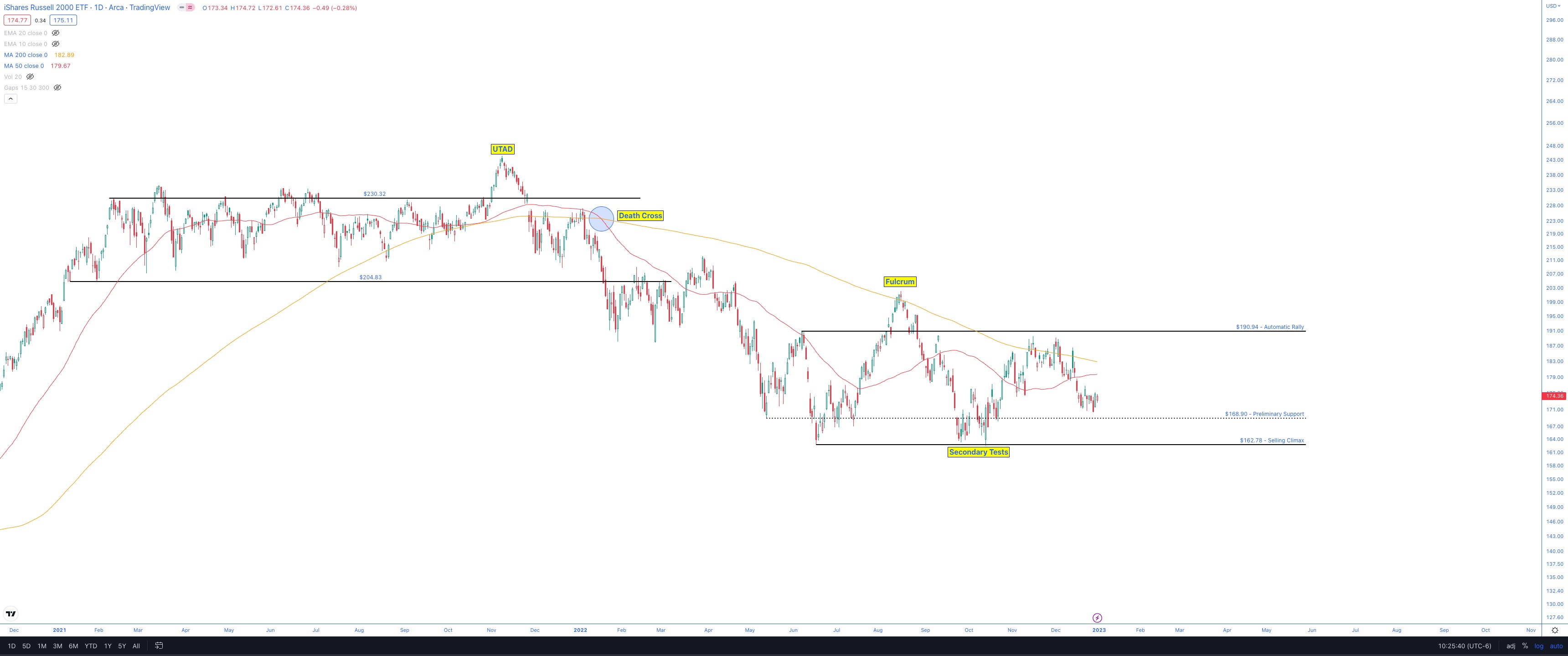
IWM has a potential bullish fulcrum pattern developing
DIA is the clear leader now
SPY
QQQ
DIA
IWM
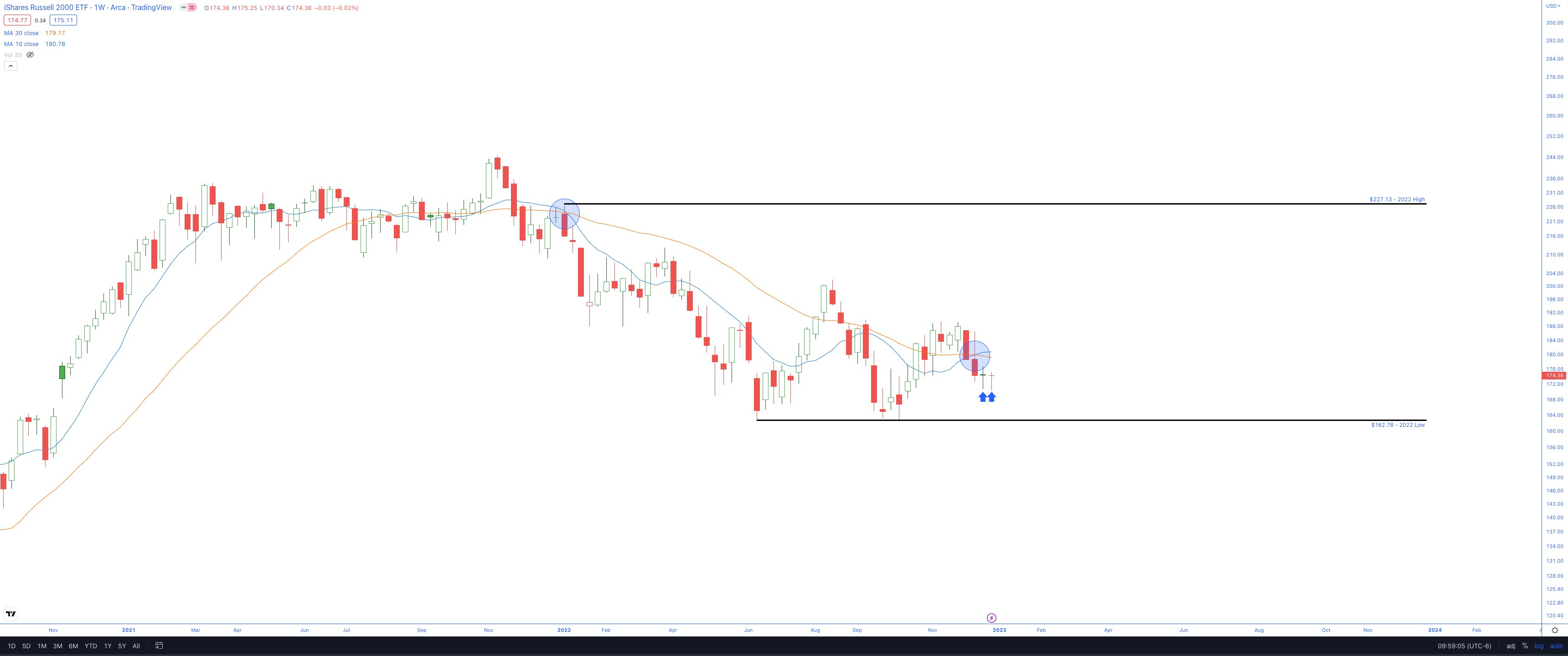
IWM Daily highlighting potential Fulcrum reversal
That’s all for now, folks.
May you have a blessed year of happiness, health, and safety.
And remember to follow the price & don’t argue with the market for it is always right.

Best Regards,
Trace