Market Health: The Good, The Bad, The Ugly And More!
Market Health: The Good, The Bad, The Ugly And More!
A Technical Analysis of Current Markets via the Charts


Hello friends, family, and followers,
Trace Busta here from StockTwits (@TraceBusta) & Twitter (@TraceBustaChart). I am excited to announce that I will be starting a weekly publication of stock market analysis here on Substack called Charts For Freedom. The goal is to share my market thoughts, chart ideas, and the stock picks that I will make in a new personal portfolio that will be discussed and tracked here. I will analyze the overall market indexes, scan for market leaders, and provide additional analysis on gold and silver and any other markets that I believe provide good investment or trading opportunities. And finally, Cryptocurrencies. I believe there is a potentially strong bull market coming this summer/fall in crypto space and will be providing thorough analysis of Bitcoin and other opportunistic alt-coin chart setups. I believe this will be a great platform to get all my thoughts across and I can provide my position updates as well. If I make a trade or investment, I will be sure to share along here. I hope you enjoy!
For more about the objectives, goals and of course a disclaimer, please see here:
Now to the fun stuff: Charts!
Overall Market Analysis via Index ETF’s:
1. Large Cap $SPY:
Chart 1: 30-Week Moving Average with Trading Range
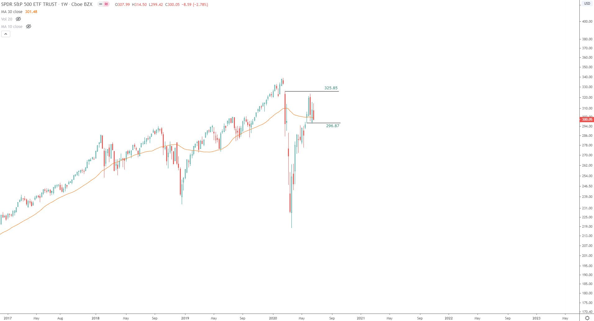
In choppy, large trading range with price nearing support area of $297 (Remember this price area, as it comes up again in the following charts).
Price closed below the 30-wk MA (also closed below the 200-day MA on daily chart).
Chart 2: 1% PnF of SPY
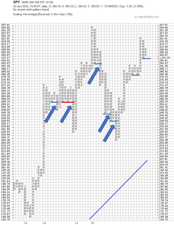
Each box represents a 1% price gain from the box below it. Look at the chart and you’ll see that price increases by 1% on each consecutive row.
Note the double bottom breakdowns (1 occurrence of triple bottom breakdown colored in red). When these breakdown signals are printed, I take note. The chart shows that these signals have resulted with further downside. Dating back to 2018, each breakdown signal has resulted in a minimum of 3 boxes of further decline, and in some cases a maximum of 11 boxes of further decline. Close at or below 296.91 would issue double bottom breakdown. This level is also noted on the weekly, in chart 1 (296.87).
General comment on Point and Figure: I will be doing a follow up post soon going into detail on why I use PnF in my technical analysis. But for now, please bear with me.
Chart 3: 30m Futures PnF
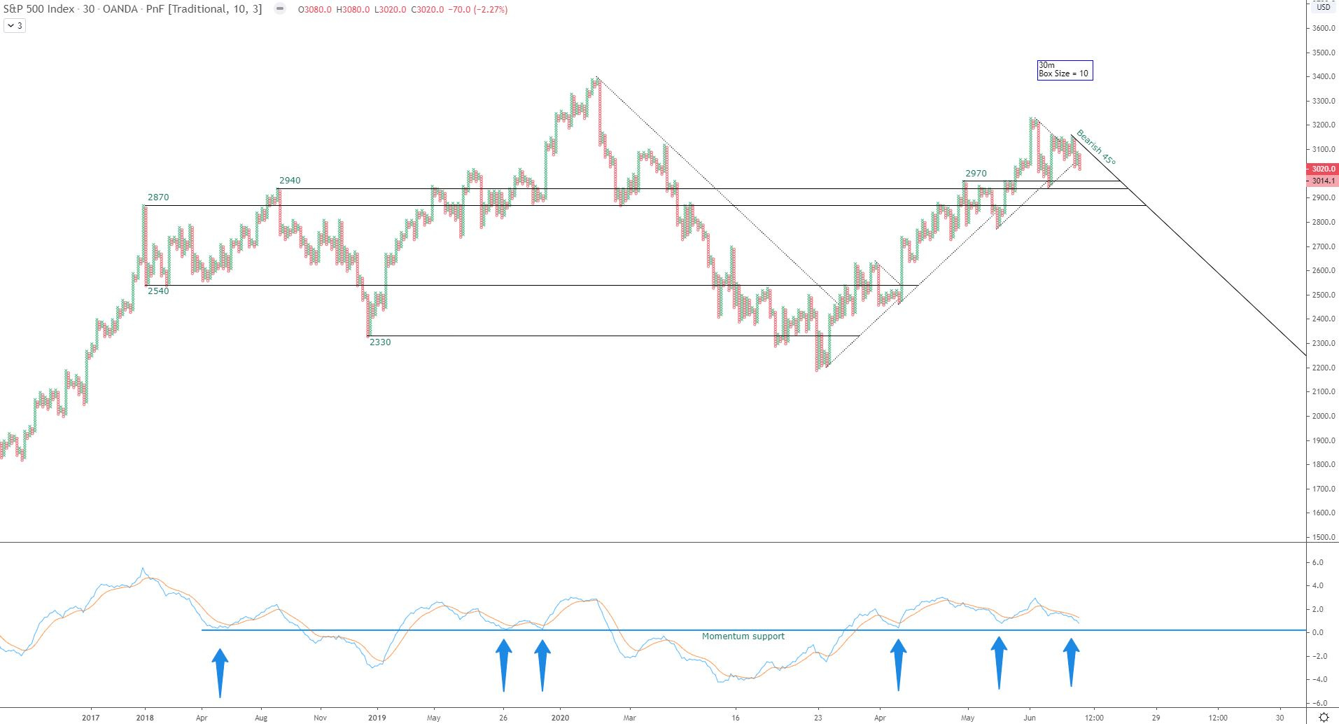
Under a bearish 45° trend.
Note the support level around 2970 (SPY 297ish).
Also note the momentum is approaching a support area (just above 0) that has served as a good area for long positions if it has held.
Chart 4: 5m Futures PnF
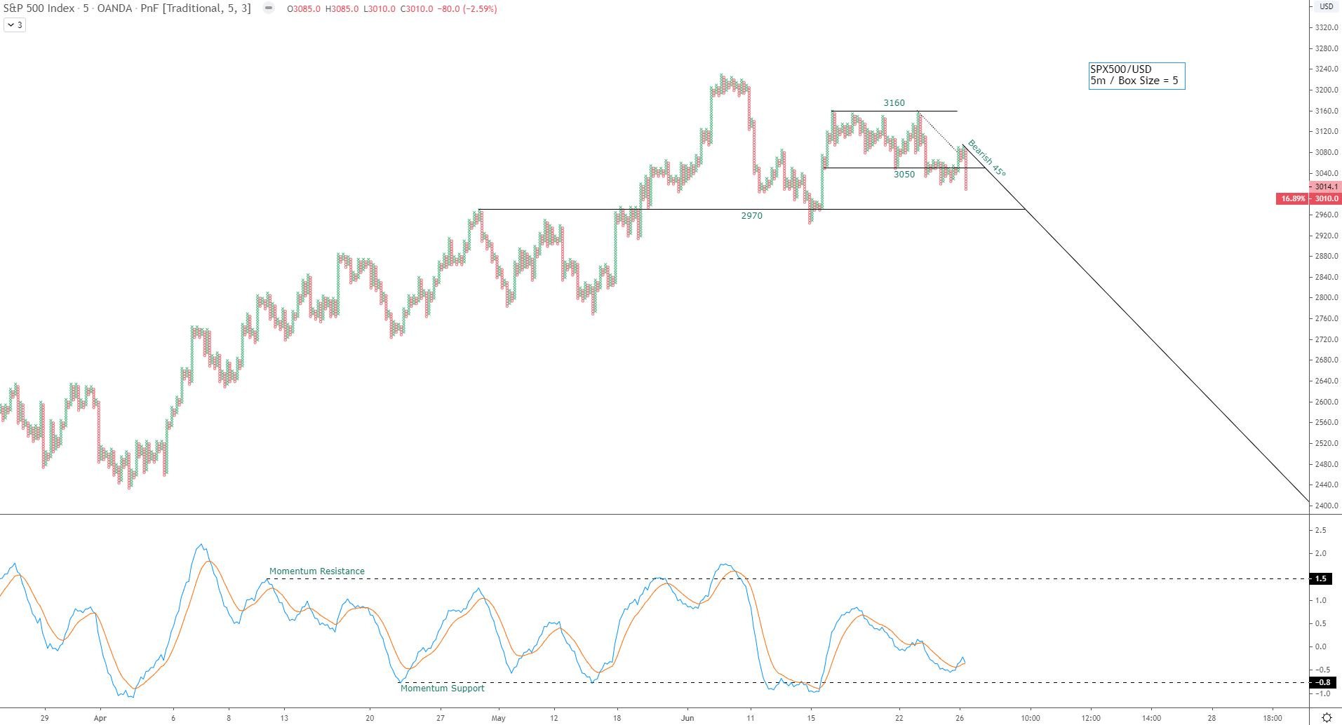
Under a bearish 45° trend with loss of recent support.
Note the support level around 2970 (SPY 297ish) and momentum indicator is approaching the support areas established in April.
2. Large Cap $QQQ: Leader of the pack
Chart 1: Chart 1: 30-Week Moving Average with Trading Range
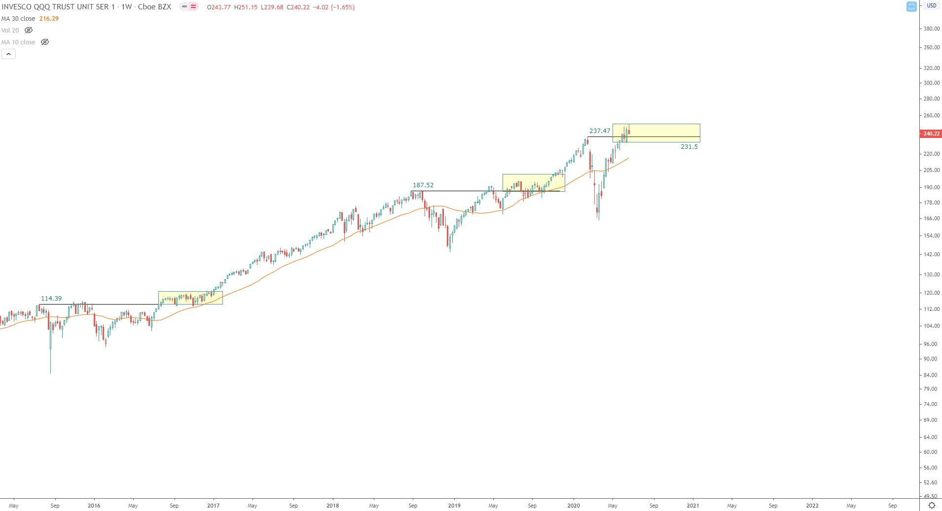
Price is above breakout level (Feb ’20 highs) but extended from 30-wk MA.
May need some rest to work off bullish sentiment and allow the 30-wk MA to catch up.
With that said, in my opinion the trend is clearly higher, not lower.
I’ve noted an area of support at $231.50. This level also comes into play on the next chart (PnF).
I’ve also highlighted previous areas where price became extended from its 30-wk MA.
Chart 2: 1% PnF of QQQ:
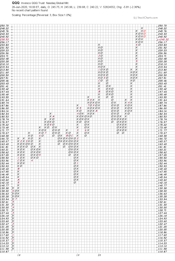
Box Size and Double-Bottom Breakdowns: See comments from SPY 1% PnF Chart.
Double bottom breakdown would print on close at or below $231.52, which is where the support level is noted in chart 1.
On the flipside, an Ascending Triple Top Breakout signal would print with close at or above 250.70.
Chart 3: 30m Futures PnF:
Here I’ve noted the bullish 45° trend lines, and a horizontal line at $9700.
I’ve also added the next PnF Objective (one of many potential objectives on this chart) that will remain active until a close below the March lows. Yes - I know that is a wide range, but that is how PnF Objectives work. They remain active until a new low is printed below the range from which the count was taken.
3. Mid Cap $MDY: “No Man’s Land”
Chart 1: 30-Week Moving Average with Trading Range:
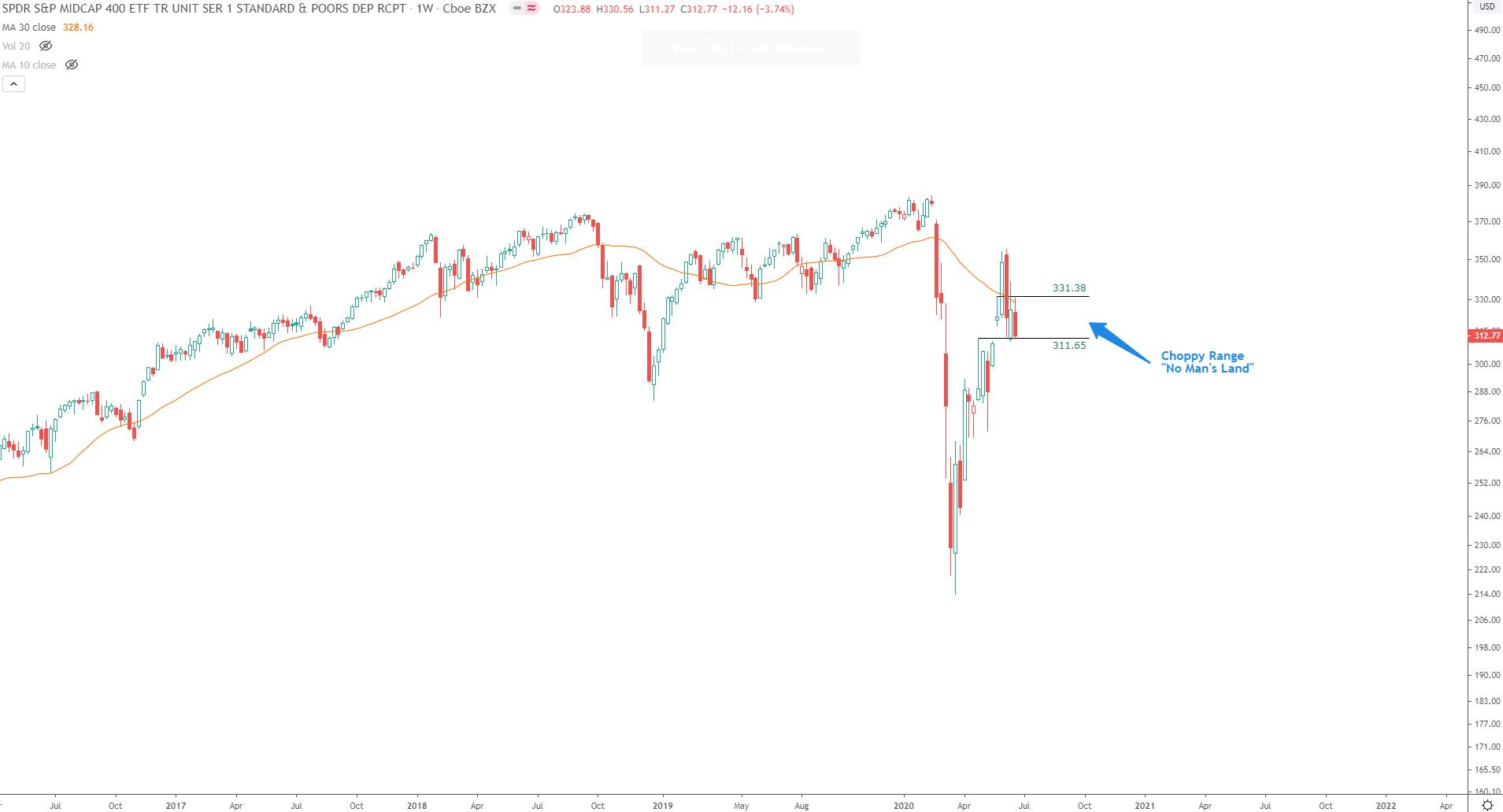
I’ve identified a range I call “No Man’s Land”. I avoid these trendless, choppy zones until they breakout in either direction (preferably to the long side, but shorts make money too).
Price has closed below the declining 30-wk for the 3rd straight week. A weekly close above 331.38 would begin to repair this chart. Until then, I avoid.
Chart 3: 1% PnF of MDY:
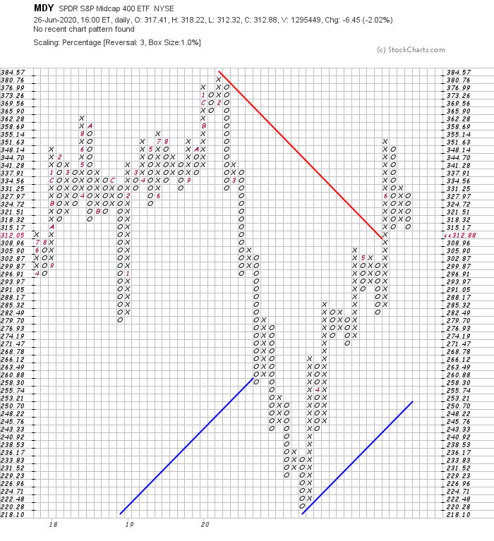
Not much to say here other than price is flirting with a double bottom breakdown signal at 312.05.
4. Small Cap IWM:
30-Week Moving Average with Trading Range:
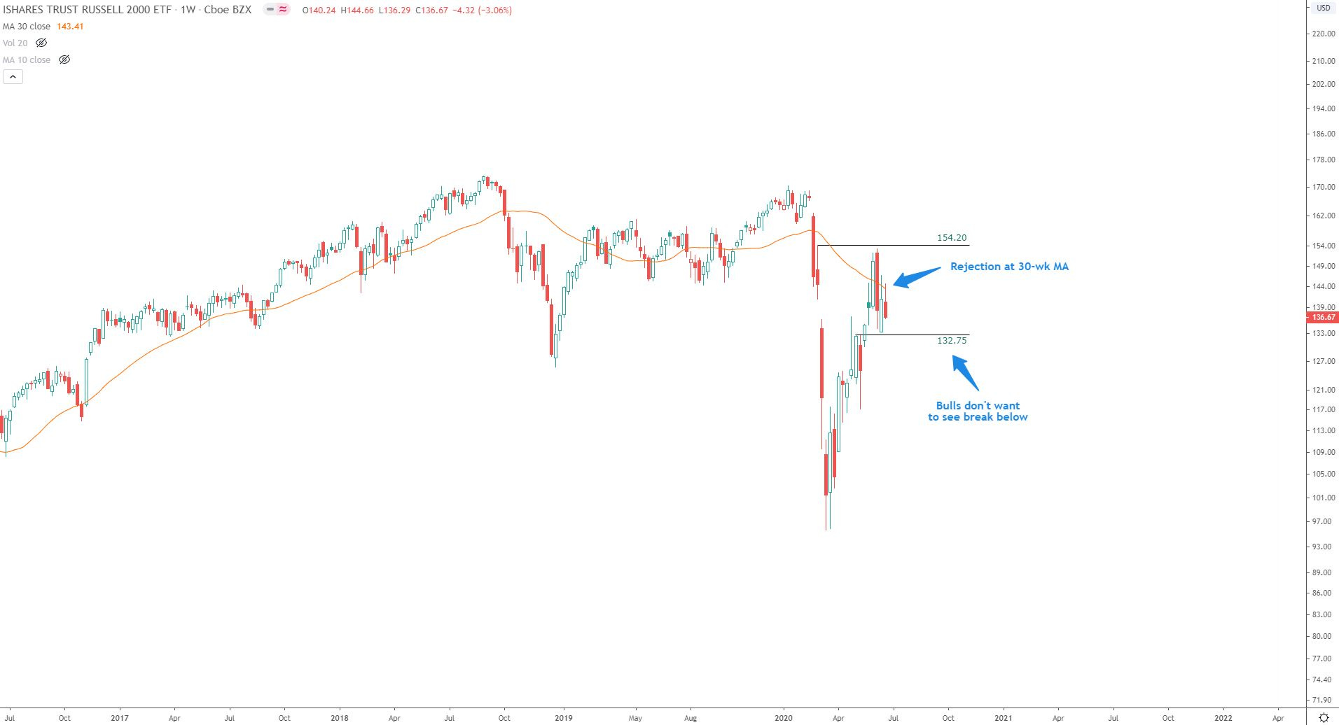
Recent rejection at 30-wk MA, price remains in a wide choppy range with no conviction on either side.
Bulls do not want to see a break below the 132.75 area (and especially below the 130.50 area).
Chart 2: 1% PnF of IWM:
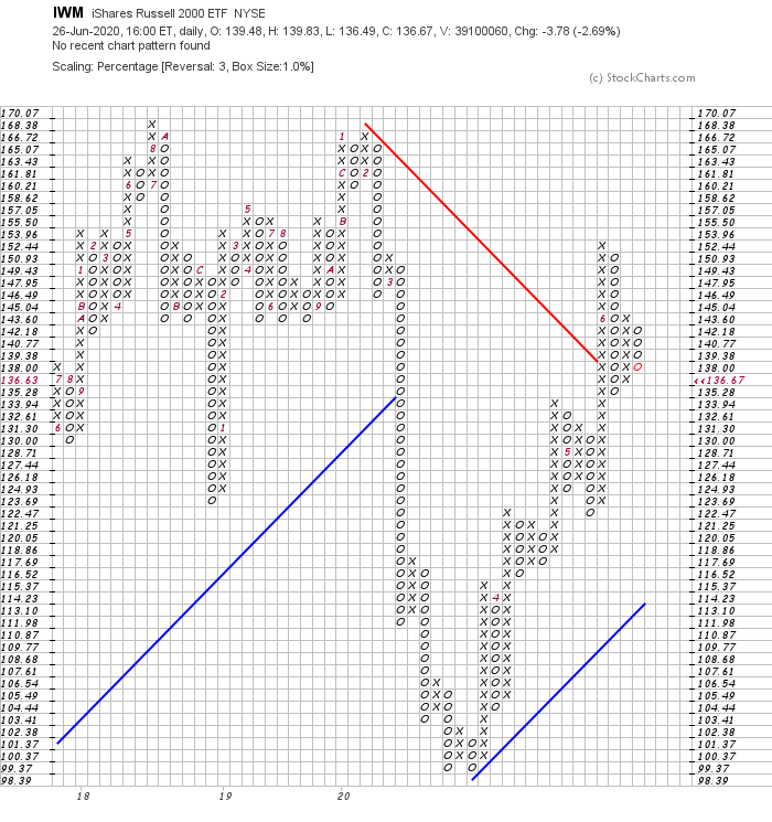
Same comments as other 1% charts. Double bottom breakdown at 133.94, however a double top breakout would print at 145.04.
Price is in a choppy zone, coiling for the next directional leg.
Bonus Chart 3: Weekly Pitchfork of IWM:
I made this pitchfork chart of IWM a couple years ago using the anchors from the 2002 low, 2007 highs and 2009 lows.
I want to note the MACD support levels. Until this recent 2020 crash, the indicator had held above the -7.20 level (weekly chart).
Price wicked at the exact pitchfork support line and so far, the reaction higher has been remarkably like that of the Great Recession’s final bottom reaction. And they say charts don’t work…pshh ;)
Summarized Thoughts of Four Major Indexes:
Three out of the four major indexes have been in chop zones of late, with price closing below the 30-wk MA’s of large cap (SPY), mid cap (MDY), and small cap (IWM) ETF’s. QQQ has shown tremendous leadership and is the only one to recapture its early 2020 highs. I am cautious on the markets but am also aware that the 2nd half of election years have historically been some of the most bullish periods for market gains. Perhaps I will dive deeper into this on a follow up post because it’s relevant to the period the markets are about to enter.
Sector Analysis:
Best looking to worst looking:
1. Technology
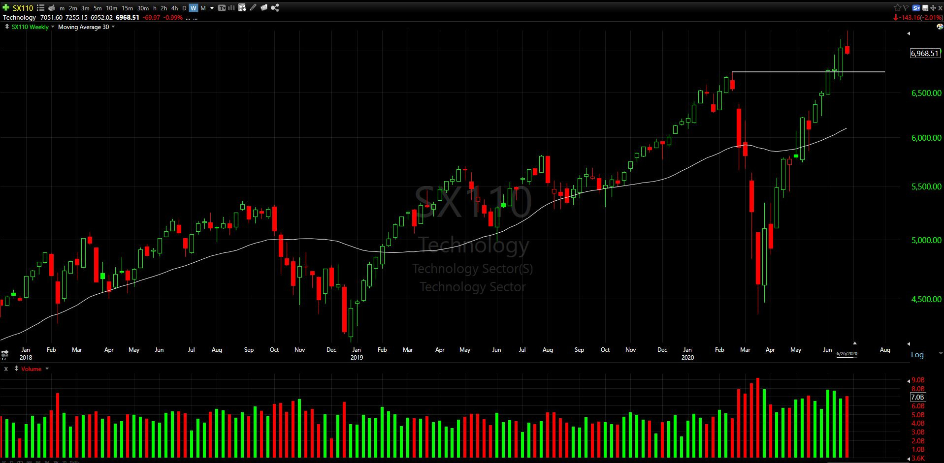
Pros: Only sector that remains above the Feb ’20 highs.
Cons: Stretched from weekly 30MA. Weekly candle may indicate change of character (high wick, close at lows, first red candle in 6 weeks).
Two possible support zones on chart. 1: High wick from 2 candles ago, 2: Feb highs
2. Healthcare
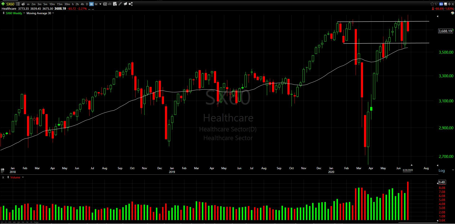
Pros: Above a rising 30-wk MA which served as solid support recently (x2).
Cons: A false breakout and back into trading range.
3. Consumer Cyclical
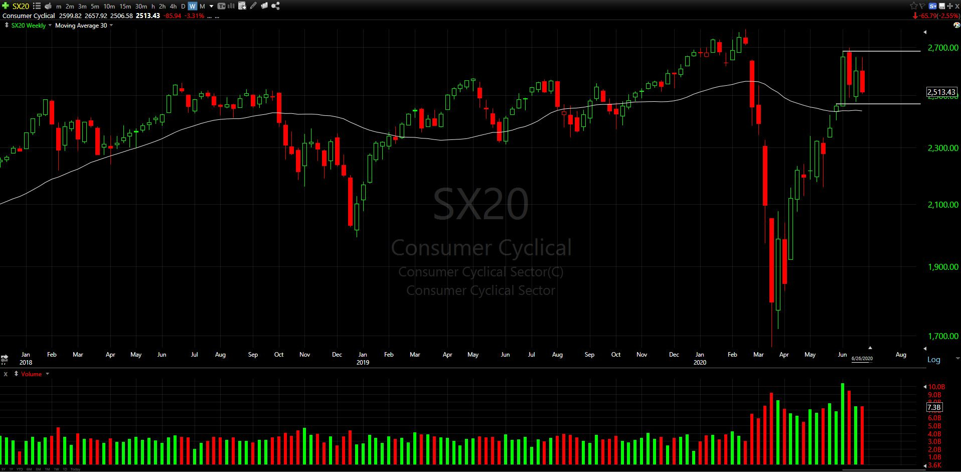
Above flat 30-wk
4. Basic Materials
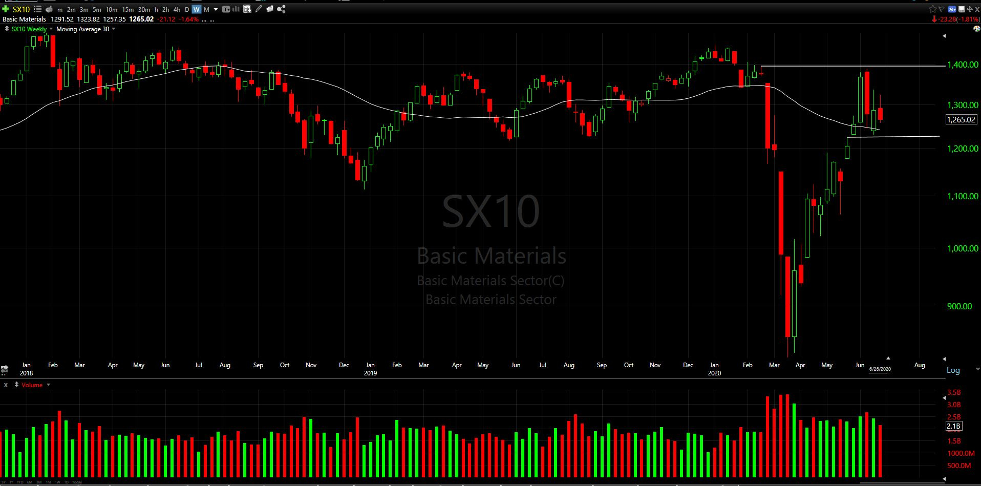
Above declining 30-wk. Avoid but note near recent demand area.
5. Consumer Defensive
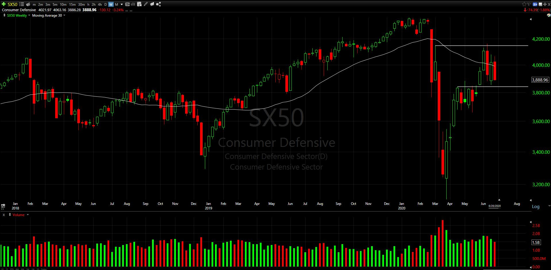
Below declining 30-wk. Avoid but note near recent demand area.
6. Industrials
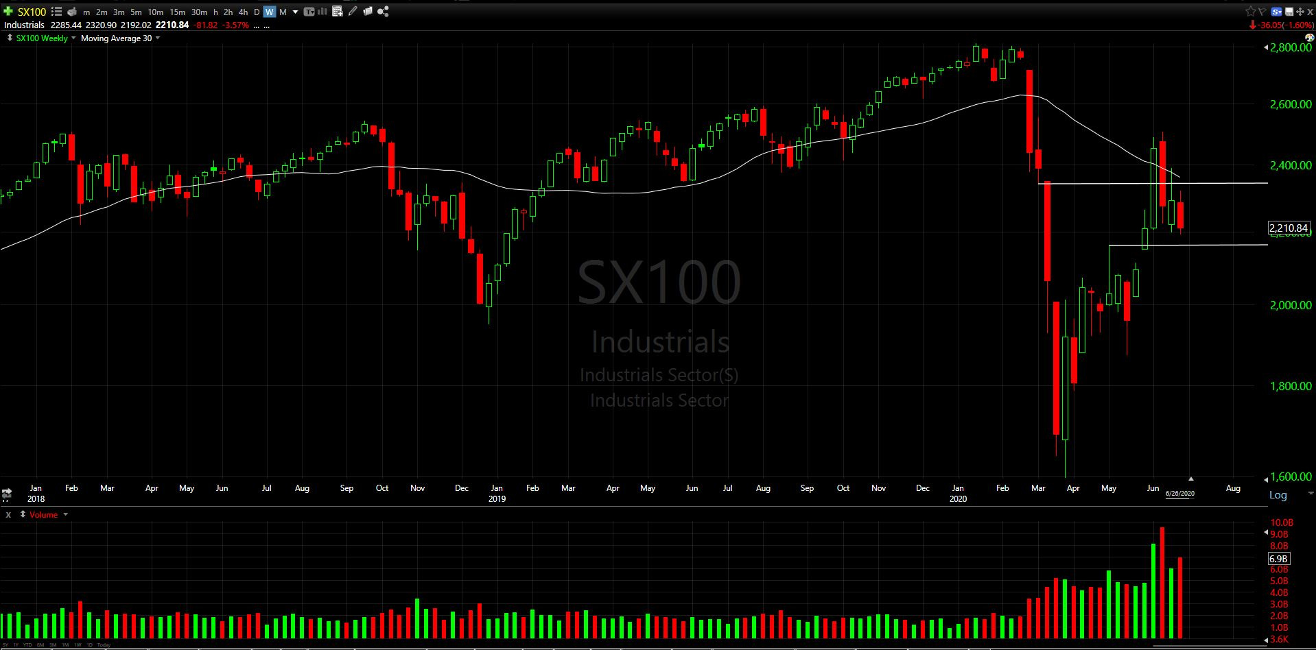
Below declining 30-wk. Avoid but note near a potential support area.
7. Real Estate
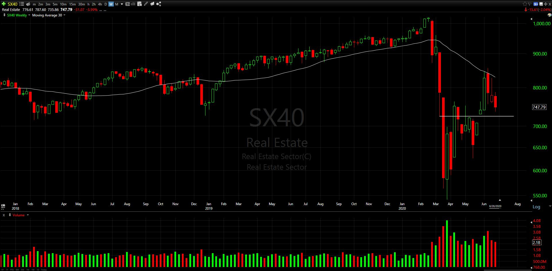
Below declining 30-wk. Recently rejected 3x at declining 30-wk MA. Avoiding, but note the low wick near low wick support from mid-March.
8. Energy
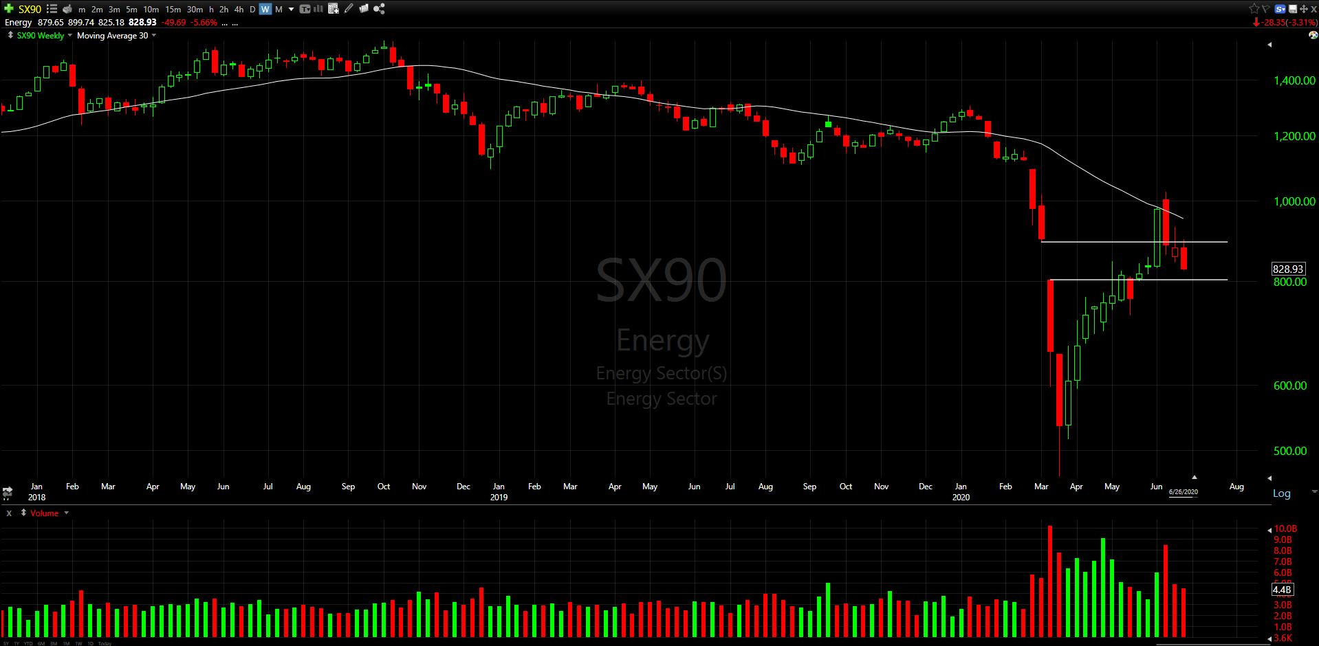
Below declining 30-wk. Avoiding.
May find support around 800 where the March gap down (Saudi Arabia oil price cut) occurred. Could be very constructive if found support above that level.
9. Financial Services
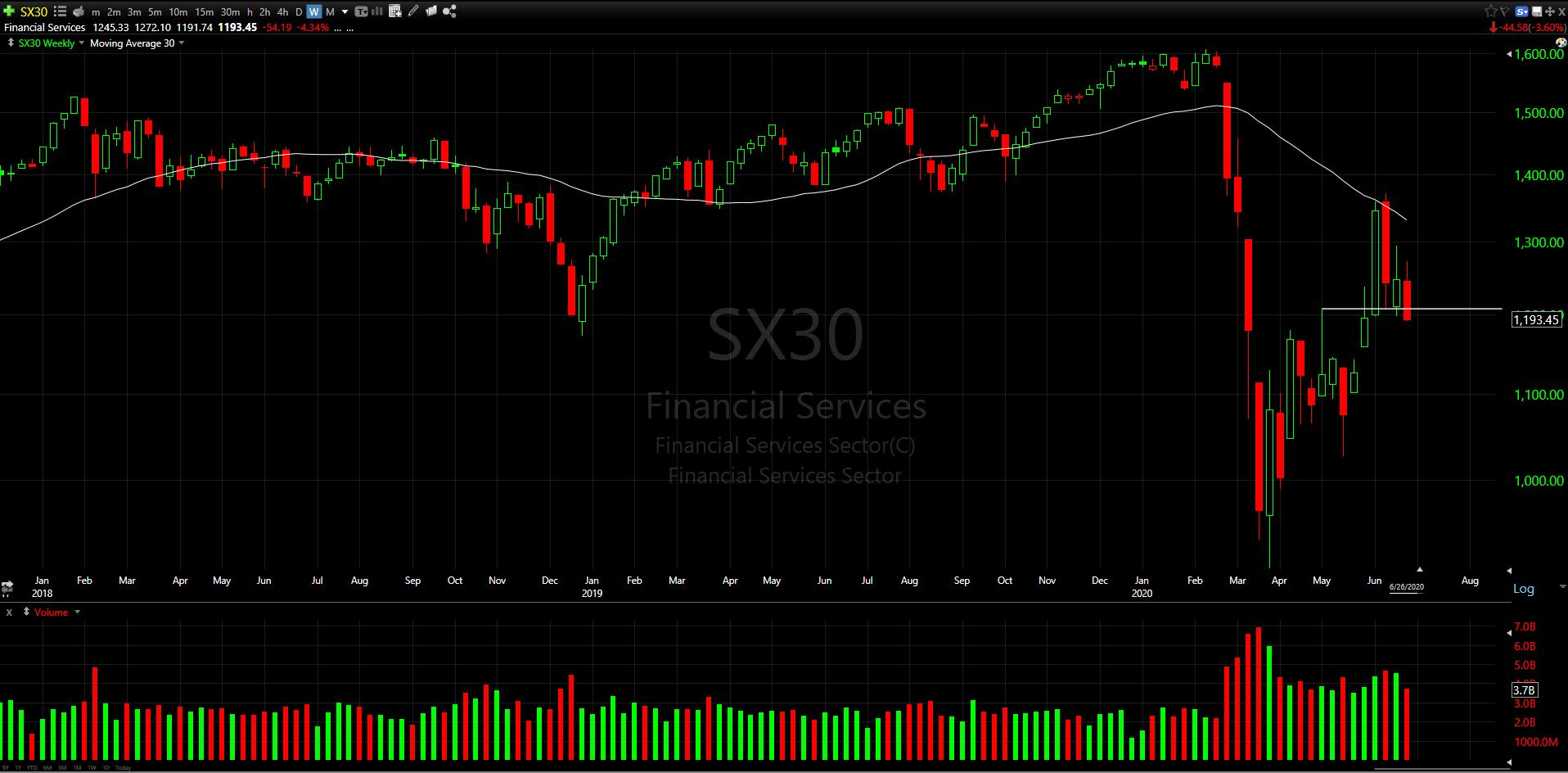
Below declining 30-wk.
Lowest weekly close in 5 weeks.
May be broken technically – Recently rejected at 30-wk MA, needs to halt decline quickly and show improvement.
10. Communication Services
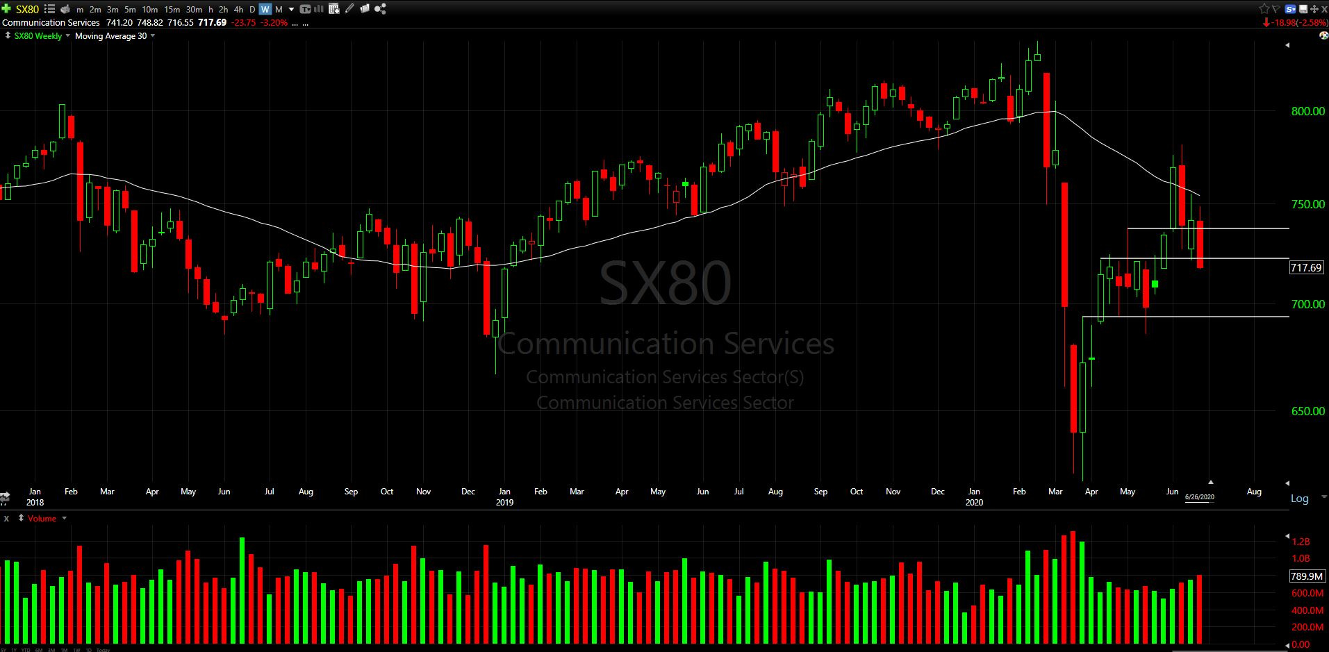
See comments from Financial services.
Long rejection wick at declining 30-wk MA
Price has re-entered prior 7-wk congestion zone
11. Utilities
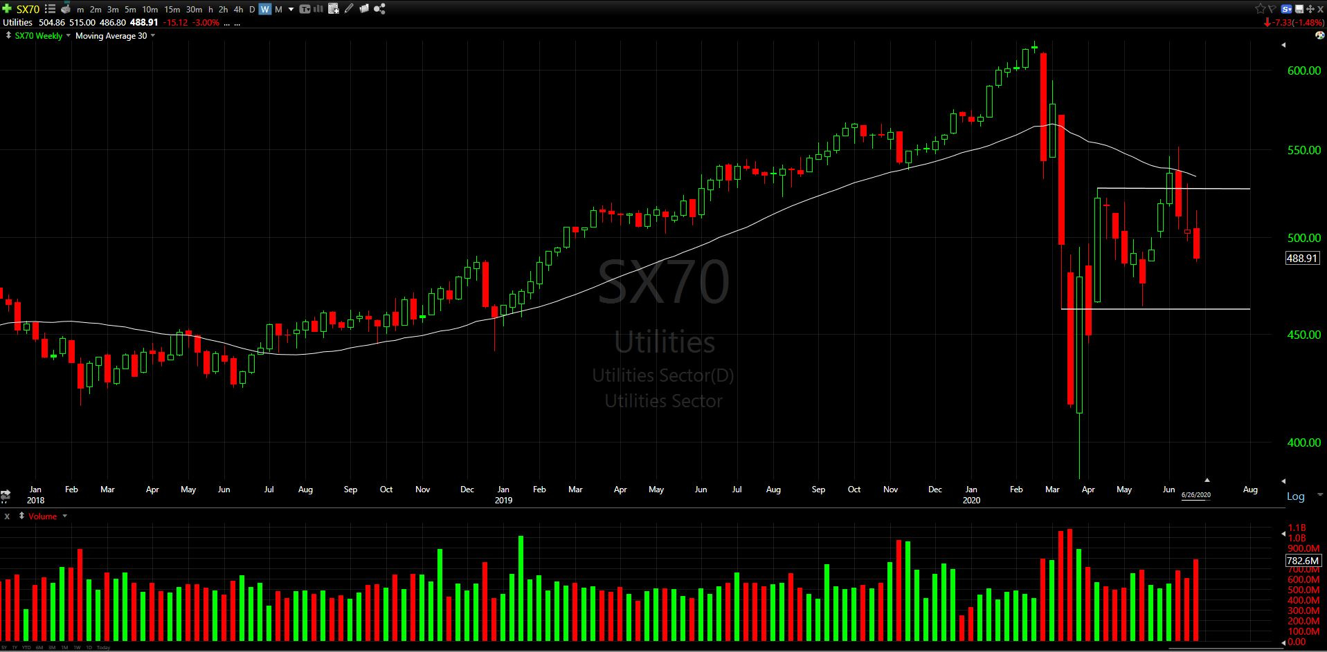
Lowest weekly close in 6 weeks. Avoiding.
Summarized Thoughts of Sectors:
The Good: 3 out of 11 sectors are above a flat or rising 30-wk MA.
Technology
Healthcare
Consumer Cyclical
The Bad: Ok this could have been “The neutral”. Basic Materials which is above a declining 30-wk MA.
The Ugly: 7 out of 11 sectors are below a declining 30-wk MA, with several needing emergency repair to avoid another repeat of March.
With all this chop and indecisiveness in the markets, it’s no wonder many people are getting frustrated and not sure whether they should be in the market or not. Until a clear trend higher emerges in most of these sectors, caution is warranted.
Stock Pickers Market:
As noted above, most sectors and major indexes are not in good shape. I have said repeatedly that this market of late has been a stock pickers market. I sense the frustration all over Twitter and StockTwits lately from traders that are getting chopped up and whipsawed in and out of positions. I hear about it on the news and from discussions with friends and family. With that said, I do believe there are ways to outperform the market (on the long side) with disciplined approaches and exits. There are other advanced options strategies that can be optimal in trading ranges, but for this blog I will stay focused strictly to common shares (at least for now). Recently I shared some “chart idea considerations of the week” on StockTwits stream (@TraceBusta):
Links for ideas post:
Performance of Picks in Theoretical Portfolio*:
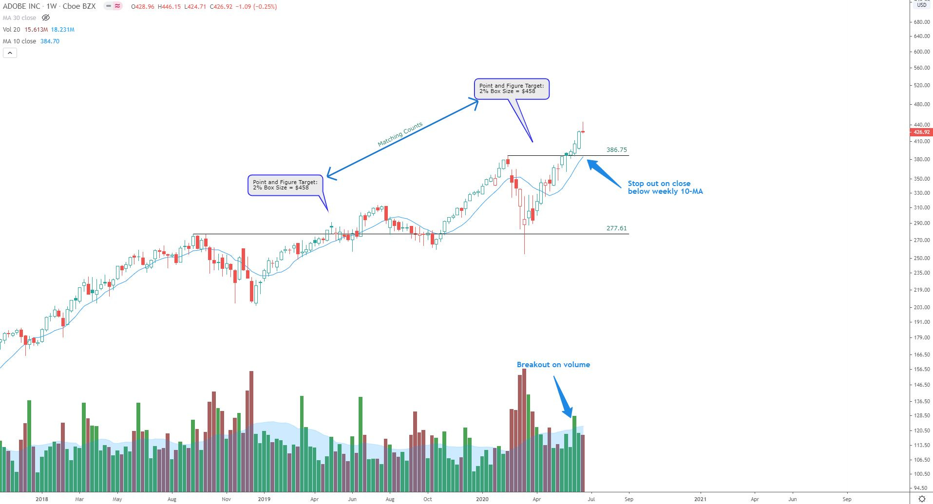
ADBE: +7.05% vs. SPX +0.51%; (2 weeks)
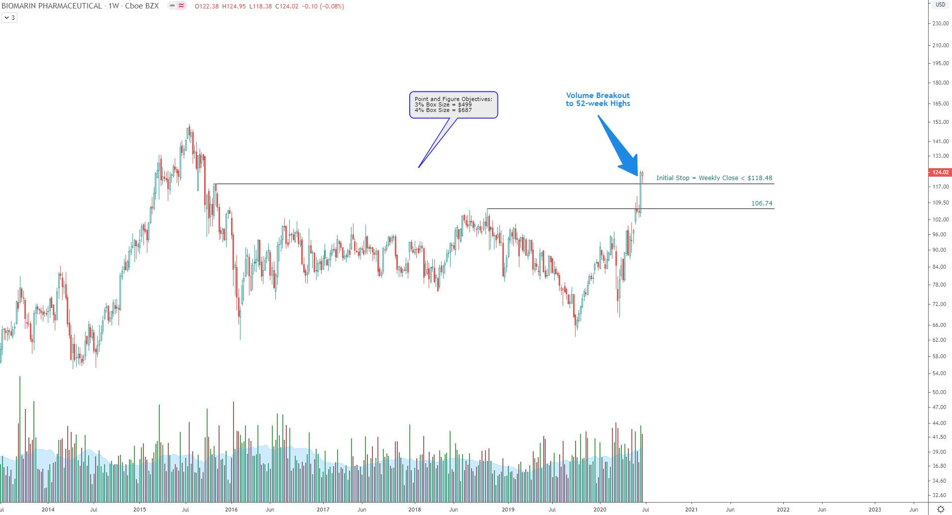
BMRN: +18.08% vs. SPX +0.51%; (2 weeks)
AMD: -4.83% vs. SPX +0.51%; (2 weeks)
ZLAB: +0.17% vs. SPX -2.75% (1 week)
BHVN: -4.11% vs. SPX -2.75% (1 week)
BTAI: +3.93% vs. SPX -2.75% (1 week)
NVAX: +14.48% vs. SPX -2.75% (1 week)
*Performance vs. SPX if position taken at the open of the following trading day (Monday) and position held to date.
All these stocks were chosen based on pre-determined criteria (which I’ll get into in a later post). To emphasize the point about a stock pickers market, I’ll use a theoretical portfolio called “Charts For Freedom Recs”. If I had purchased each of these stock picks in equal dollar amounts** at the open on the following trading day of my posts (linked above), this theoretical portfolio has yielded a 4.97% gain vs. the SPX 0.57% gain.
**For this example, I assume one of the many brokerages that are now allowing purchasing of fractional shares was used. i.e. For a $200 stock, one can purchase $100 of a stock to own a fraction of a share, instead of having to pay $200 for the whole share.
I would like to point out that there were 5 winners and 2 losers. Out of the 5 winners, 4 outperformed the SPX index by > 5% (this is if you count BTAI up 3.93% vs. SPX down 2.75% over the same period). The noteworthy gainers were ADBE +7.05%, BMRN: +18.08% and NVAX +14.48%. I realize this does not sound like much, but keep in mind this is only over a 2-week period in a choppy market.
Over the years I have learned most of the capital appreciation is from the big home run winners and learning to let them ride has been extremely rewarding. I am convinced that a disciplined, systematic approach is required to survive the markets and come out ahead. As the great Jesse Livermore said:
“Just remember, without discipline, a clear strategy, and a concise plan, the speculator will fall into all the emotional pitfalls of the market - jump from one stock to another, hold a losing position too long, and cut out of a winner too soon, for no reason other than fear of losing profit. Greed, Fear, Impatience, Ignorance, and Hope will all fight for mental dominance over the speculator. Then, after a few failures and catastrophes the speculator may become demoralised, depressed, despondent, and abandon the market and the chance to make a fortune from what the market has to offer.”
For this blog, beginning next week after the 4th of July Holiday, I am planning to start a new portfolio based on my actionable ideas. Instead of using the 4.97% gains from above, the % gain will be reset to 0.0% and I will start fresh. I will share my ideas here, weekly, and note the strategies I plan to take for each pick (target buy zones, stops, etc.) If a position is taken mid-week, I will send out portfolio updates. I am looking at options to implement a scorecard or performance tracker vs. the index benchmarks. If anyone has any suggestions, please let me know on StockTwits or Twitter!
For my current positions, here are the charts and I will note where my current stop levels are. Note: The Charts For Freedom Portfolio may end up using some of these stocks noted below. If so, an update will be sent out just like all other picks for the portfolio.
Long Positions (mix of commons and calls):
1. AAPL
2. ADBE
3. ALNY

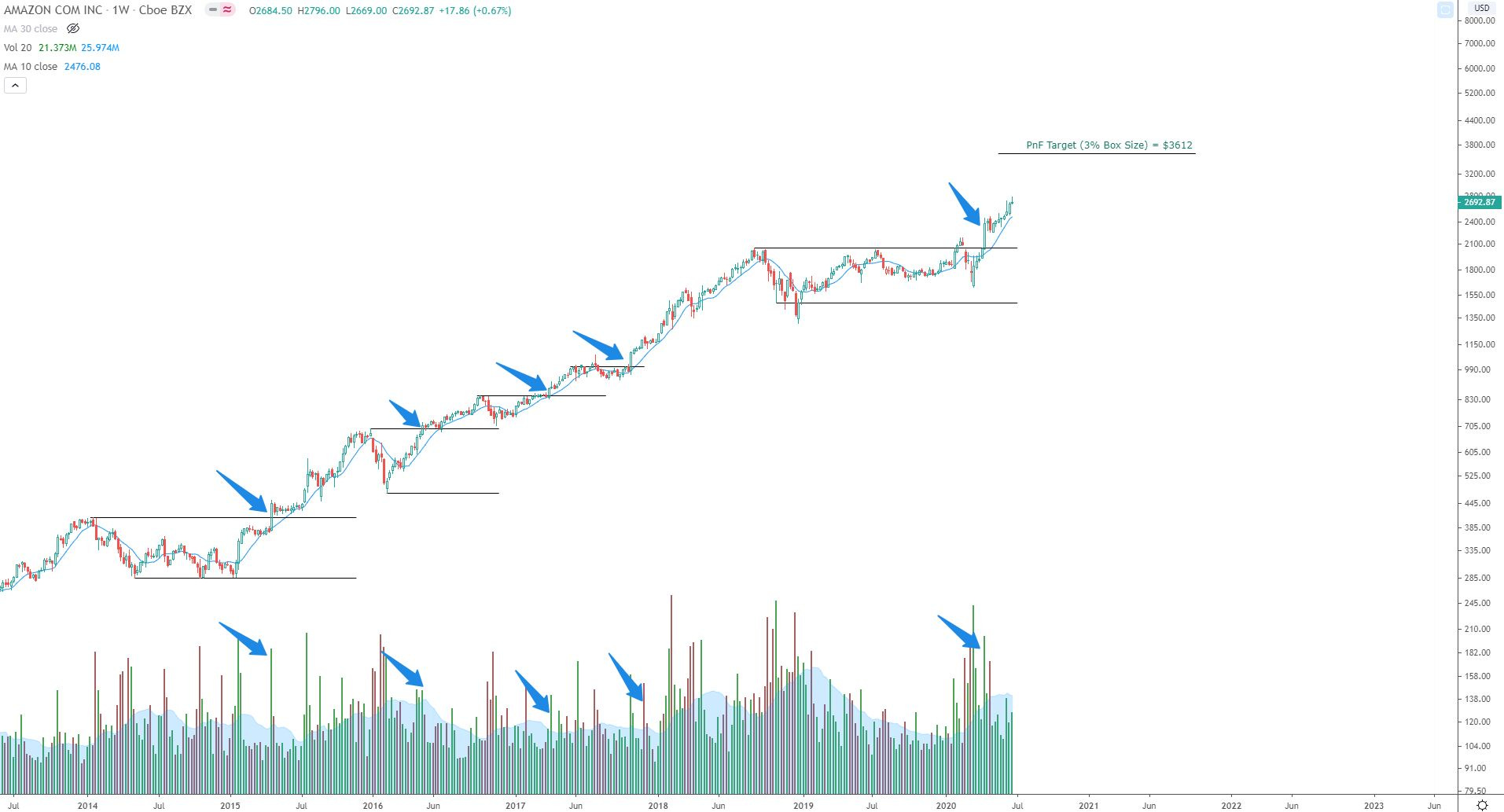
4. AMZN
5. BMRN
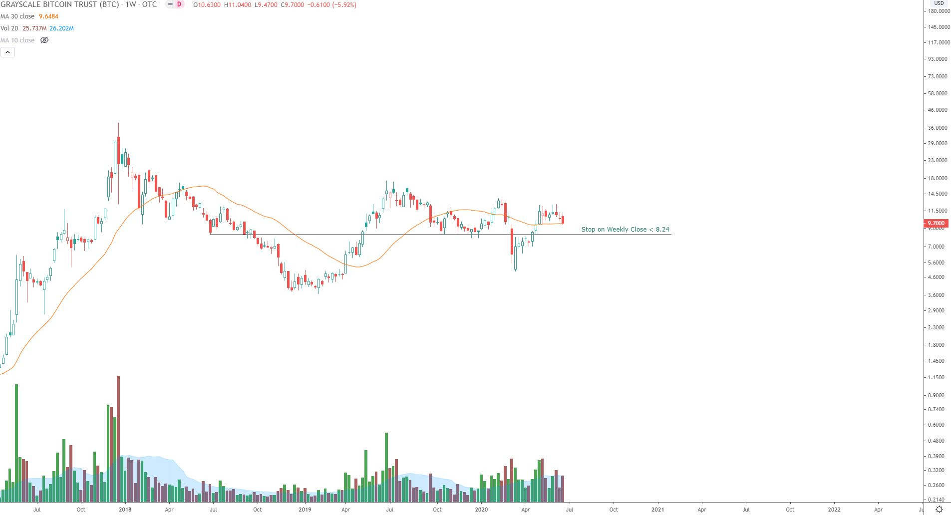
6. GBTC
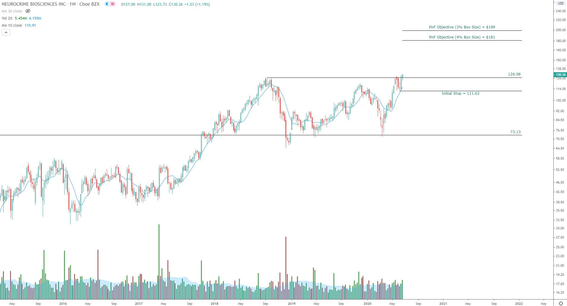
7. NBIX
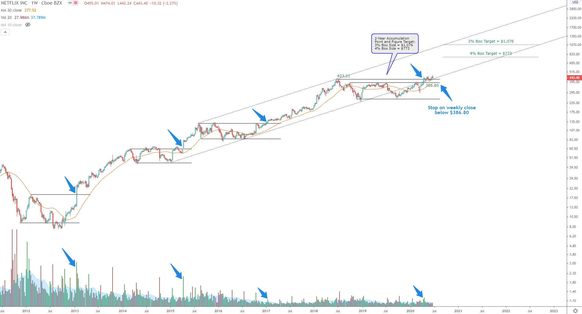
8. NFLX
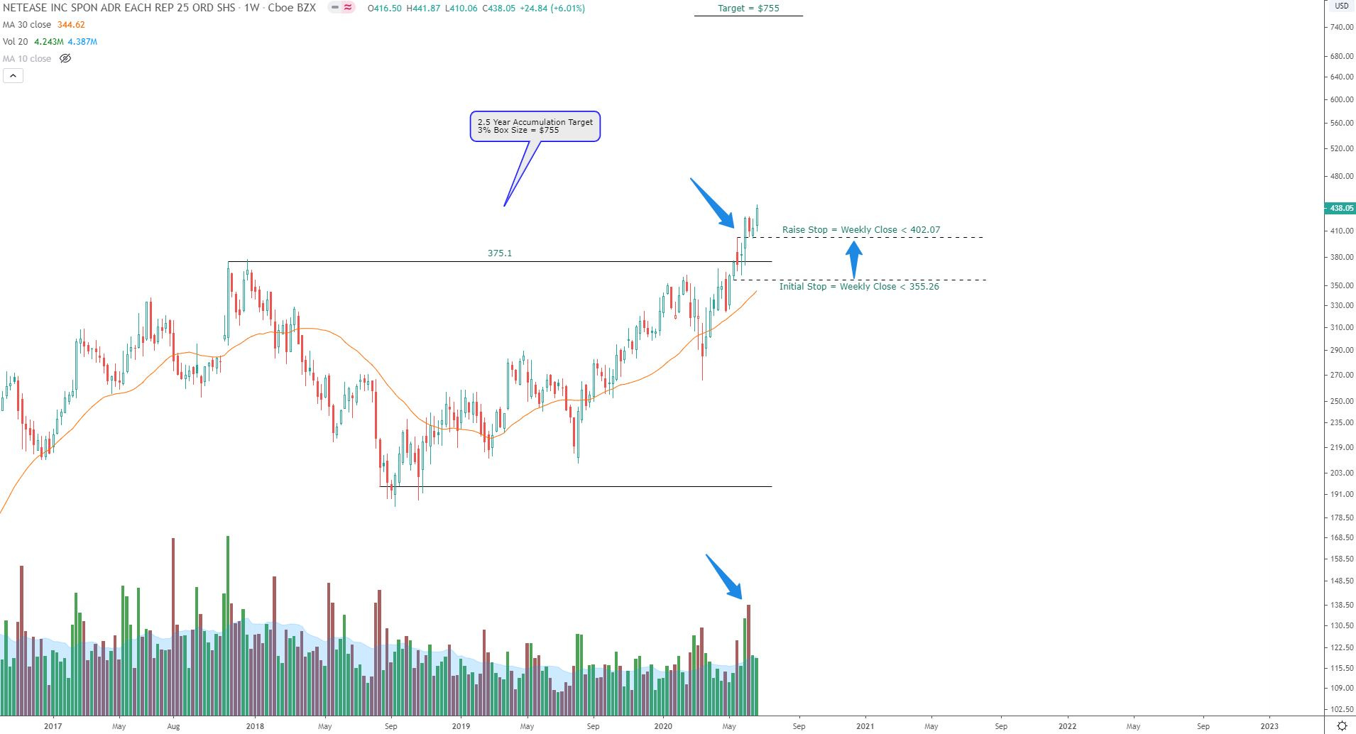
9. NTES
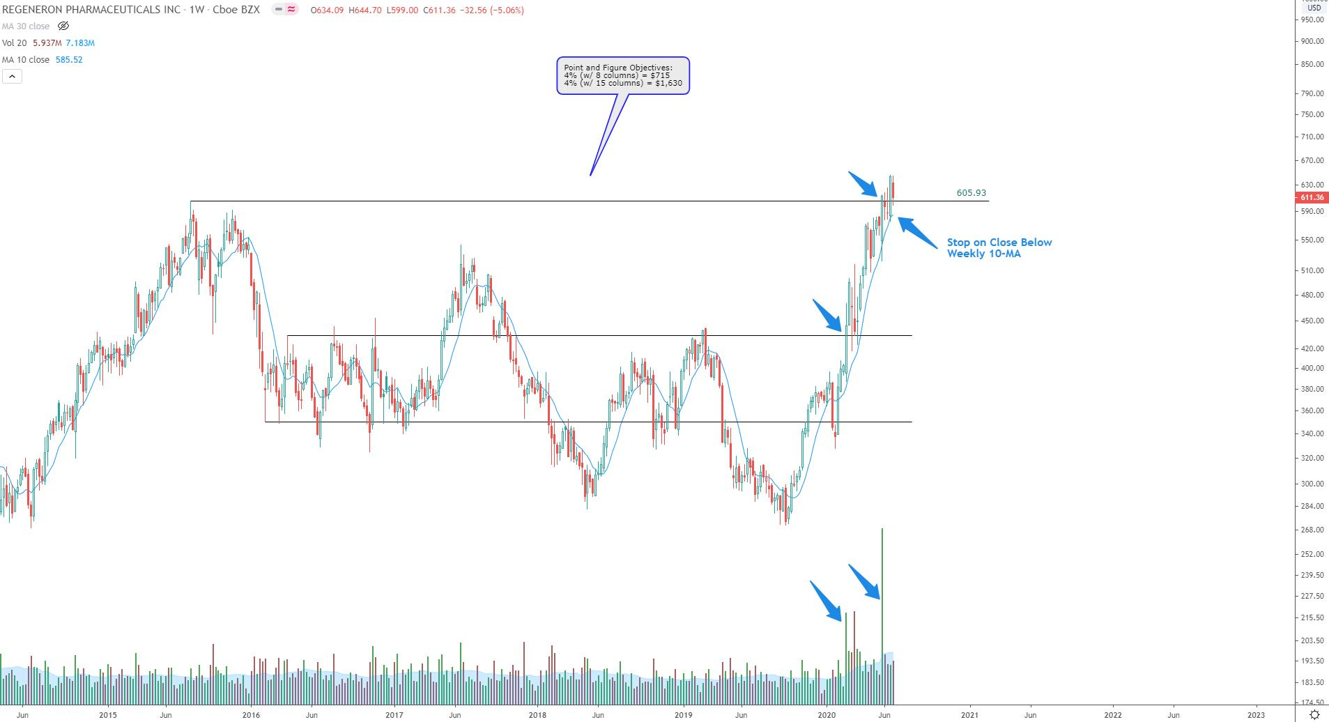
10. REGN
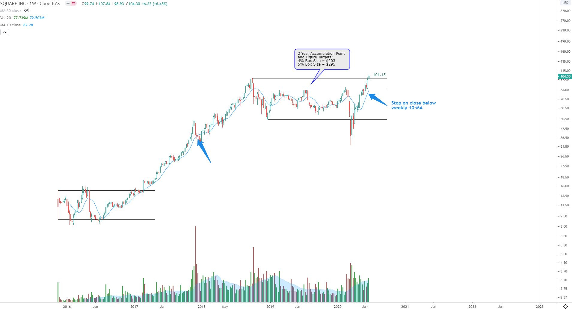
11. SQ
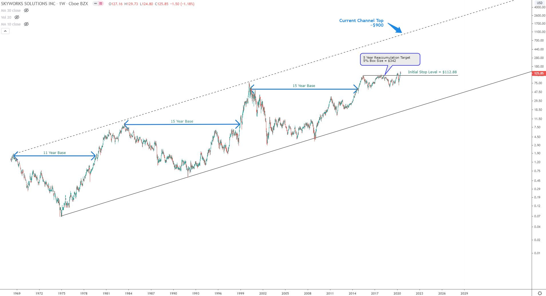
12. SWKS
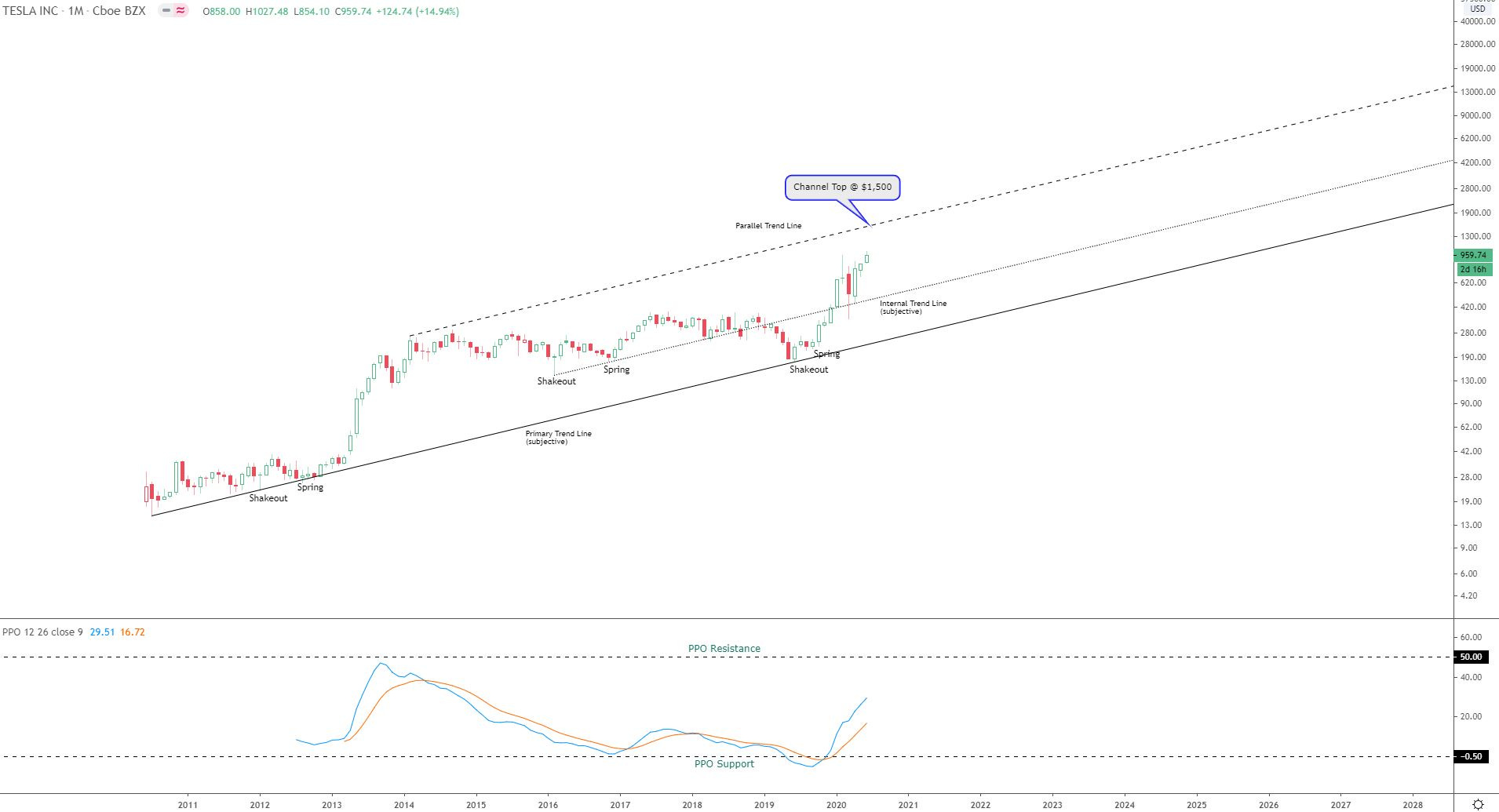
13. TSLA - Monthly chart shown. Will use weekly close < 10-wk MA as stop for calls.
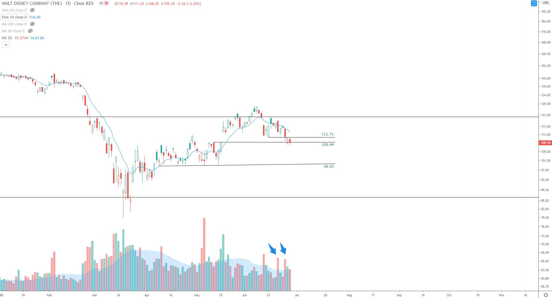
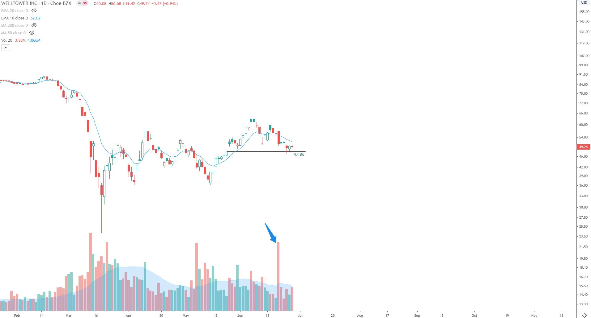
Short Positions (puts only): These will be closed out on daily close > 10-day MA
1. DIS
2. WELL
Bitcoin and Alts: (Note, the weekly candles are still in-progress until Sunday evening. For that reason, perhaps for future Crypto posts I will do a separate email)
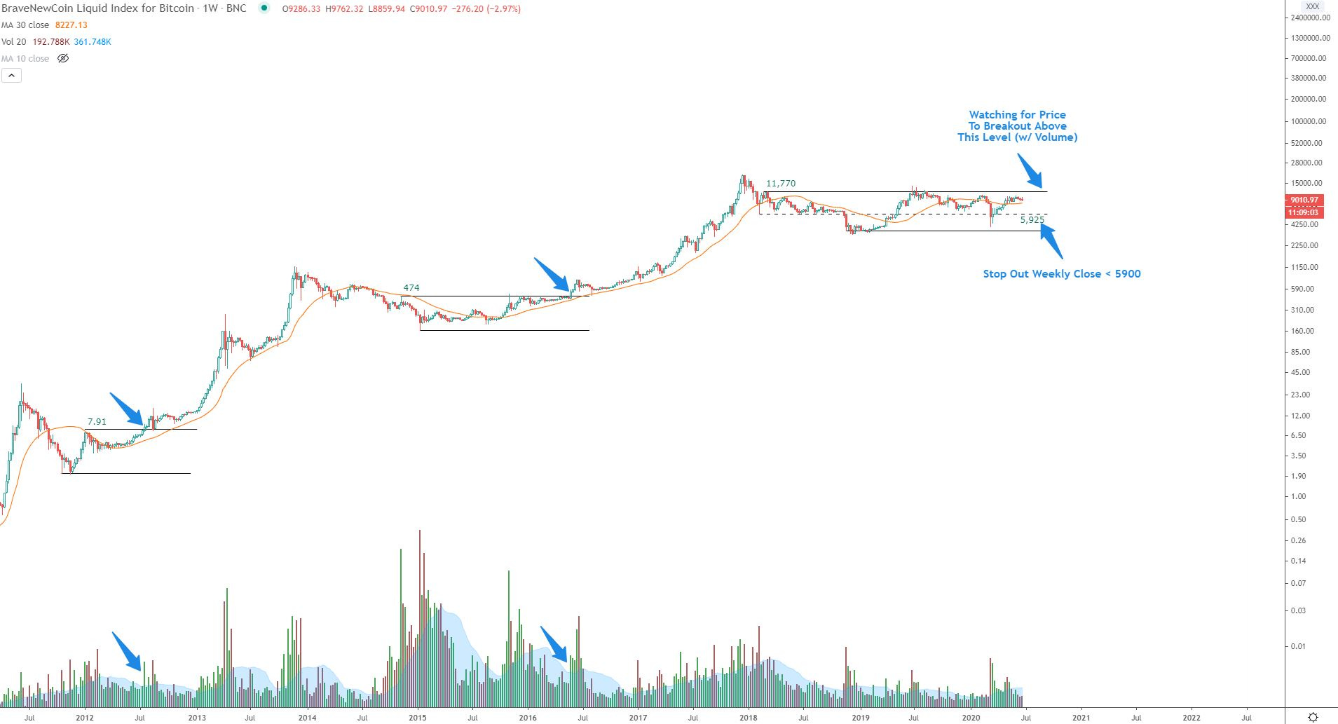
1. Bitcoin
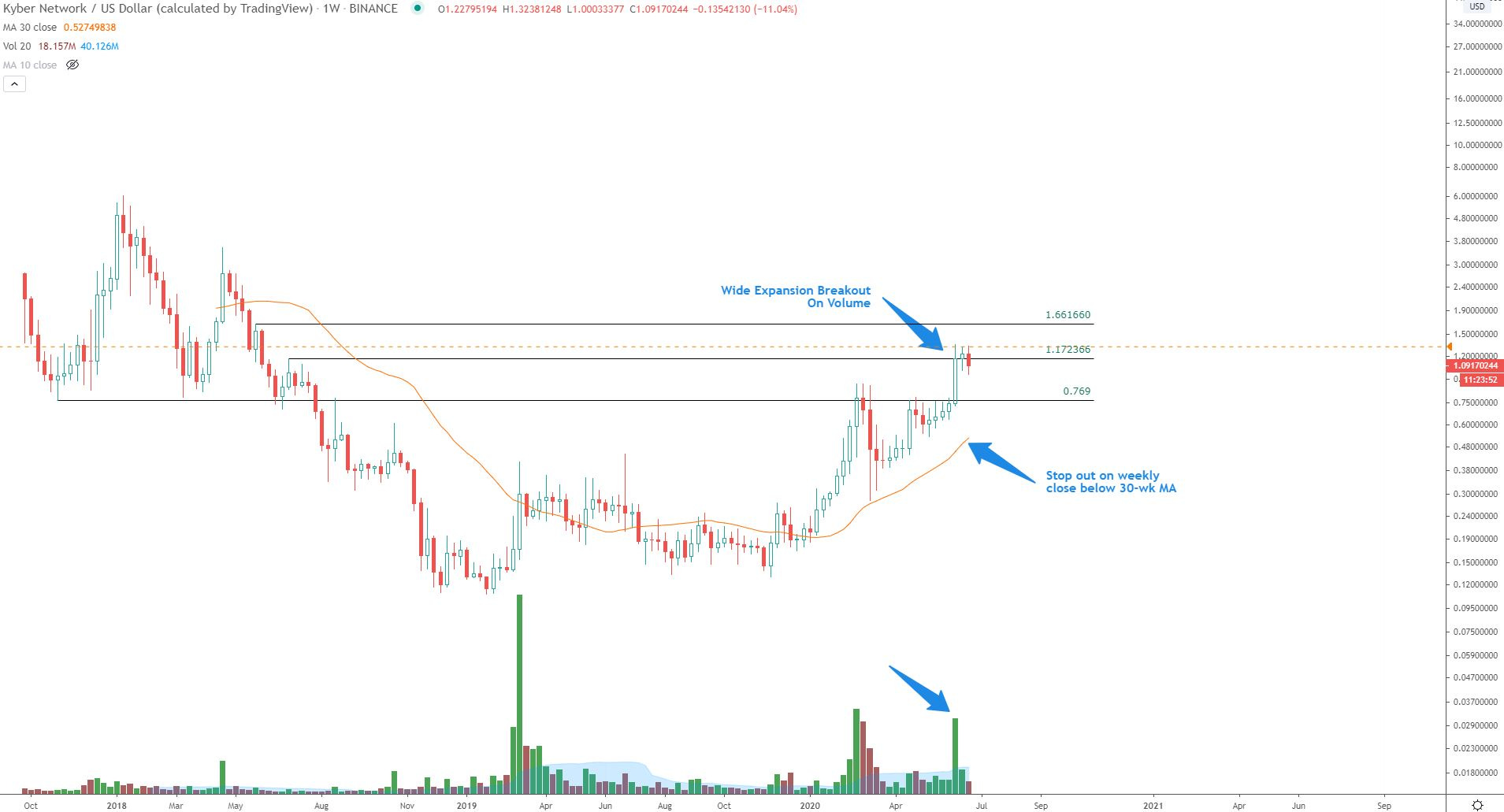
2. KNCUSD
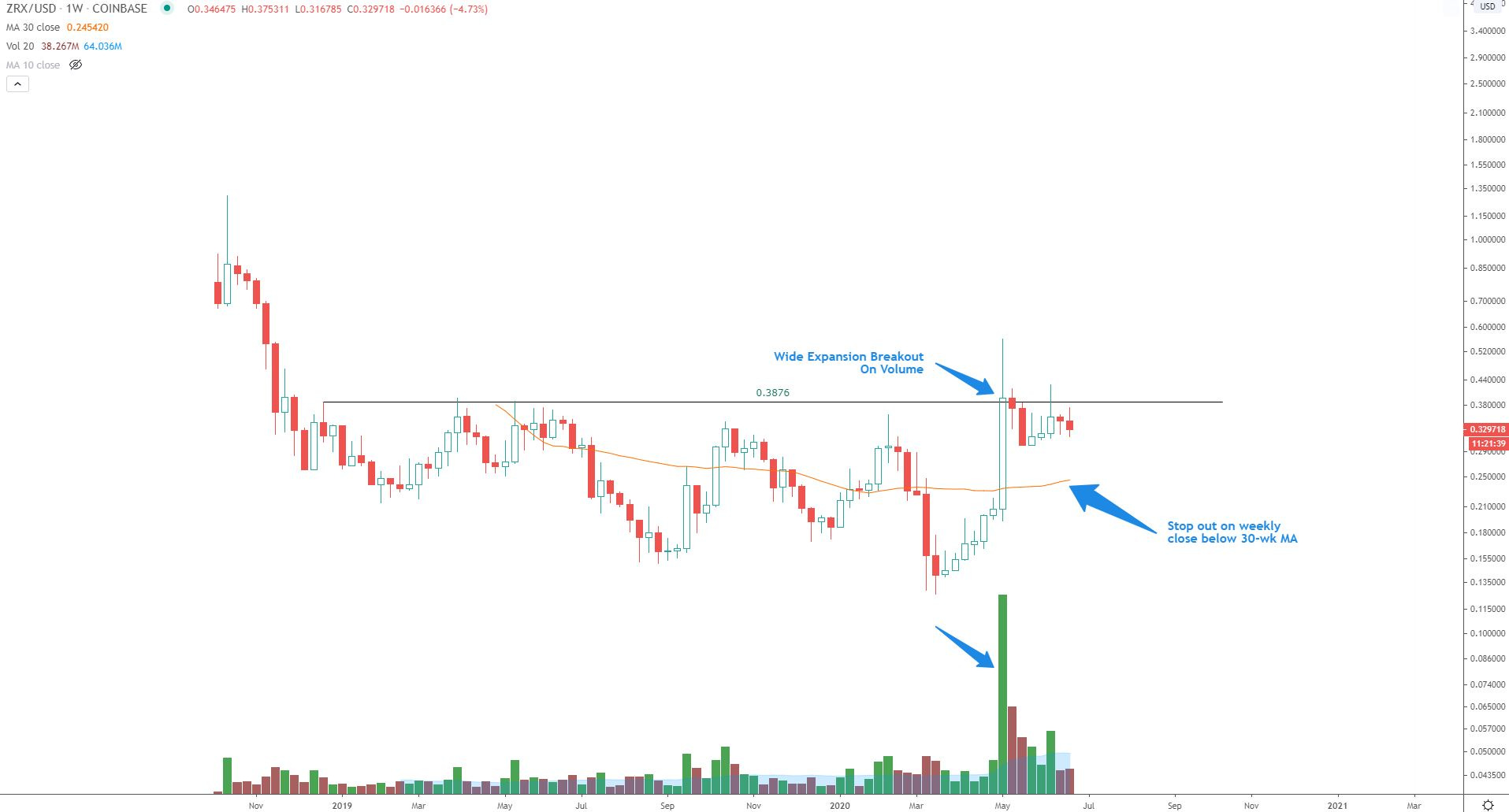
3. ZRXUSD
Closing thoughts:
Stocks:
It is a choppy, mostly trendless stock market. As noted in the sector charts, breakouts are failing, and volatility is high. I am extremely cautious on stocks now and am looking to minimize new positions until things stabilize. I will remain in my current positions until my pre-determined stops are taken out. If my stops begin to get taken out, I will respect them, and I may just stay in the resulting cash positions until the overall market health improves. Having cash on hand in a big market drop is ideal, and I seek to preserve as much cash as possible if markets turn lower. To quote Livermore again:
“A loss never bothers me after I take it. I forget it overnight. But being wrong - not taking the loss - that is what does damage to the pocketbook and to the soul.”
Additionally, here are a couple relevant trading rules from Livermore:
1. “Continue with trades that show you a profit, end trades that show a loss”
2. “End trades when it is clear that the trend you are profiting from is over”
In the meantime, I will continue to seek great setups in the best behaving sectors but will tread lightly until overall market health improves.
Bitcoin and Alts:
As noted on the Bitcoin chart, I am watching for price to break out above the range with volume. Price has consolidated for nearly 2.5 years in the wide range, and price is back above it’s 30-wk MA which is beginning to curl higher. I am watching alts closely, and looking for the ones showing relative strength vs. BTC. Alt positions are small, and stops are given more room due to the high volatility.
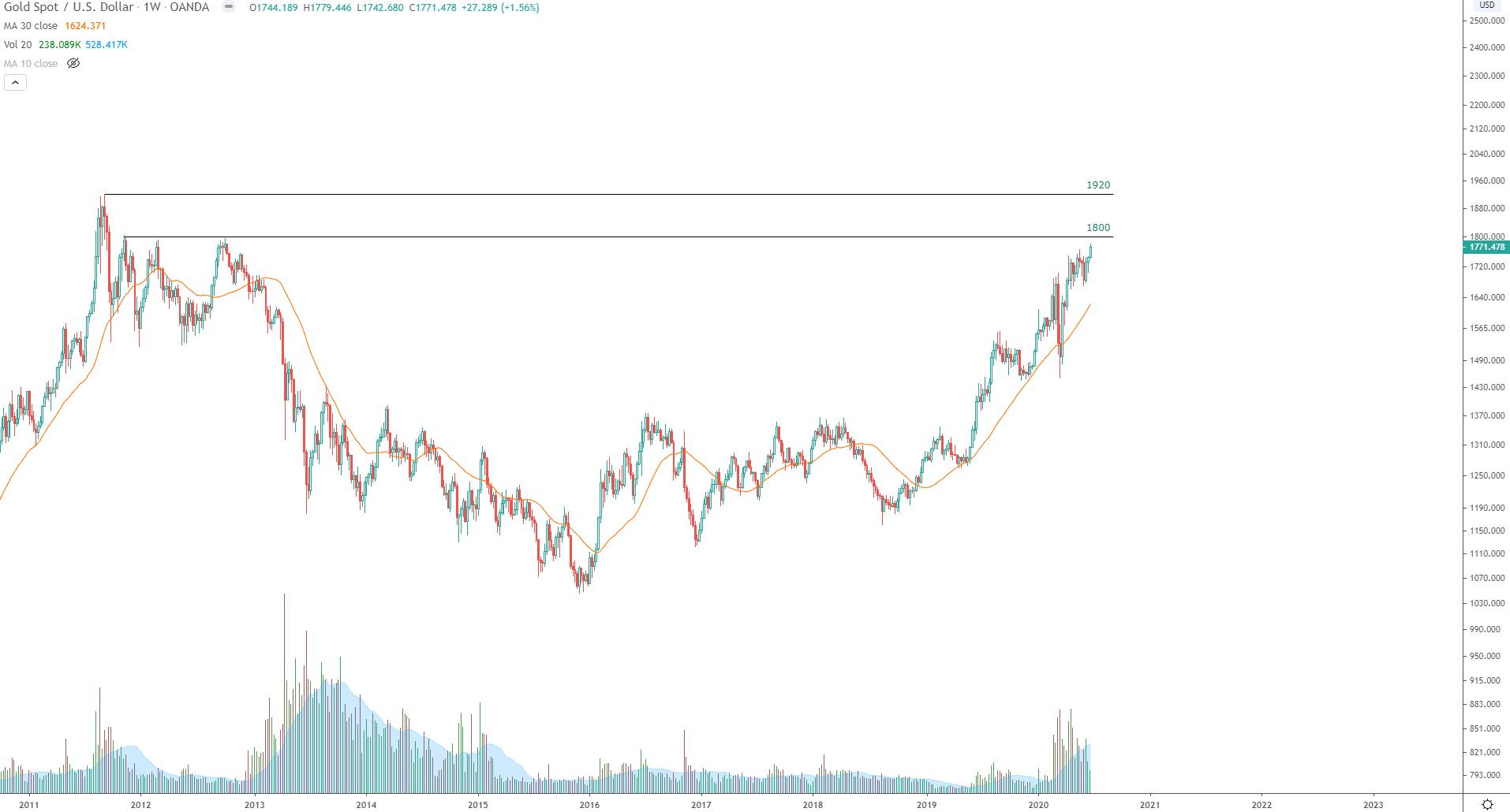
Gold:
I recently closed out gold and related positions (miners) not due to weakness, but rather due to fact that price is approaching historical resistance levels. If price should be able to rise and hold above the $1920/oz level, I will consider getting long again.
Thank you very much for your time, and I truly hope you enjoyed this weekend update and subscribe for future updates! If you enjoyed this post, please spread the word about this blog and also leave a comment on Twitter or StockTwits if you have any feedback. Don’t forget there is a market holiday this coming Friday in honor of the 4th of July. Cheers!