

Market & Volatility Eras
Market & Volatility Eras
Big Picture View for Perspective

Good afternoon investors and traders,
I’ve been thinking about the equity market & volatility eras a lot lately, and I’ve finally had time to put my thoughts into chart form.
Volatility
Volatility is a two-edged sword.
There have been excellent times for premium buyers when things seem smooth sailing. At times, it seems easy to make 2x-5x on dated call positions.
On the flip side, there have also been long-lasting, painful eras for the premium buyers.
There are, of course, a few exceptions within each era, but for the most part, once VIX is in a new era, it stays there for a while.
The chart below gives a visual:
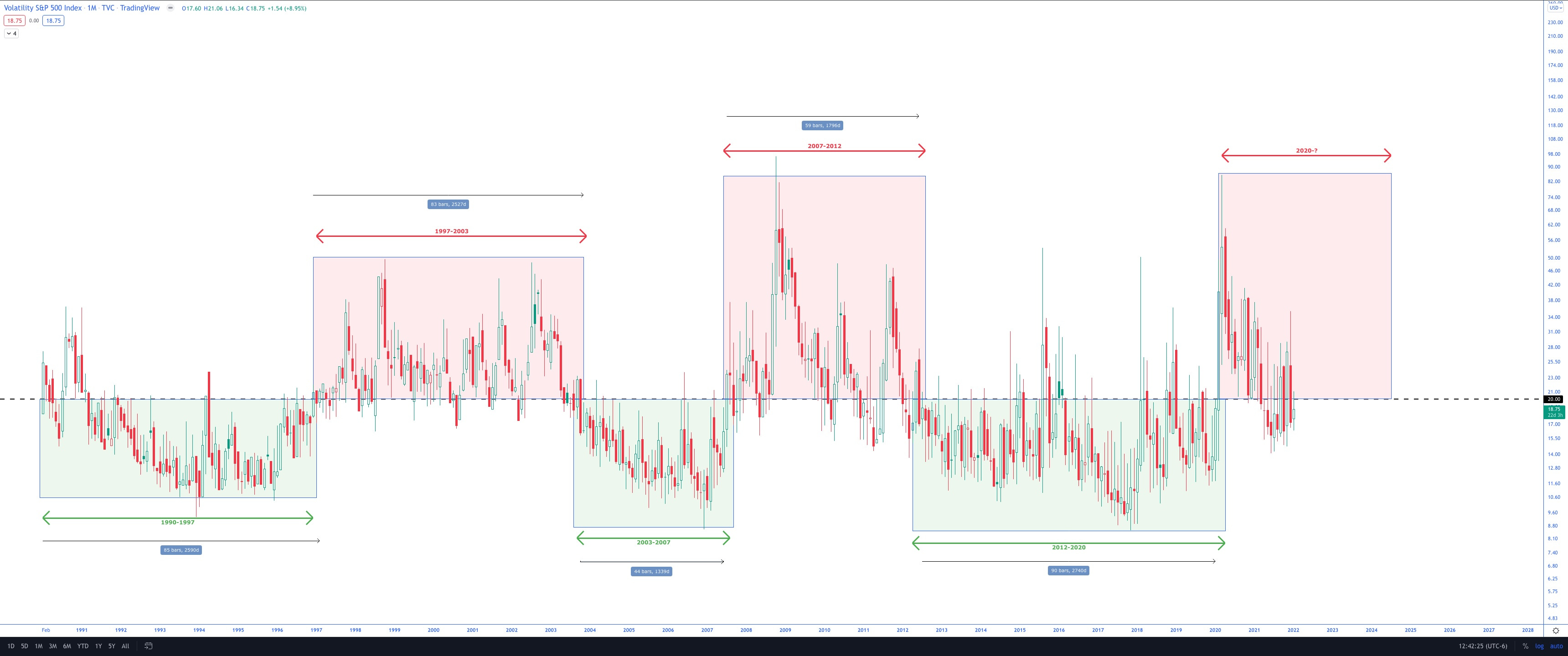
Going back to 1990, when the VIX data starts and using the 20 level as the delineator, there are apparent eras of heightened and lower volatility.
Once VIX enters an era, it has tended to stay there for years.
So far, there have been two prior heightened volatility eras and three lowered volatility eras.
On the high volatility side:
Late 90’s to the early 2000s. This period lasted 83 months (7 years) and was impacted by the tech boom leading into the dot-com bubble.
2007-2012: This period lasted about 60 months (5 years). It started with the housing market troubles (see the Big Short), which carried over into the financial markets, leading to the “Great Recession.”
I think of these as the “Hide yo kids, hide yo wife’ periods. I still feel them as if they were yesterday.

On the low volatility side:
The most extended era was the 2012-2020 period, which lasted 90 months (7.5 years).
The shortest era lasted 44 months (3.5 years) between 2003-2007.
On average, the three eras have lasted 73 months or six years.
In these periods, “everything is awesome.” The setups seem perfect. Every trader is a genius— buy the dip, right?

Equity Market Perspective
The equity markets just came out of one of the best ten-year runs ever. And who knows? It may still be going. Perhaps the 2020-2021 volatility spikes were all she wrote, and the tag of the 10-year SMA in 2020 was enough to refill the tank.
For perspective, here is a long term, yearly chart of the SPX:

Over the years, there have been some incredible generational runs, each with its nuance. But what the last three runs all had in common was stopping-action once extended from the 10-year SMA. I’ve plotted the 10-year SMA (orange) to help analyze these moves.
I’ve shown this extension at the bottom of the chart. I can’t help but notice that the extension indicator ended very near to this level with the 2021 close, but not quite all the way there.
I don’t know if this current run is over or not. Nobody does. The markets will do what they will.
Perma-bears, all with too many followers, have been calling the top since 2011. And they’ve been wrong. It has paid overwhelmingly to be “long” the markets from the 2009 lows.
After reflecting on the above charts, I have my caution flag up. Perhaps there are a few years left with additional gains, and I’d gladly take that outcome. However, I am not going to stay bullish in this environment blindly.
I plan to continue following the charts, taking what the market gives, and getting out before shit hits the fan.
Trade responsibly.
All the best,
Trace