

Cause & Effect

Cause & Effect. That’s what I look for on most charts. Why do markups occur so violently to the upside catching most people off guard with their “overbought” indicators? This is the same concept many people refer to as “The bigger the base, the bigger the move”. Look at the Tesla move over the past 15-months. So many people were caught off-guard. They either didn’t study the chart and notice that there were 5-years of chopping, accumulation action prior the markup. The move wasn’t guaranteed, nothing is. But the potential was there.
I think of it as a boiling water kettle. Get that thing hot enough and the steam will find its way out. If you have the means to superheat it, you better get out of the way.
Whenever I’m looking at potential entries, I ALWAYS gauge the potential energy. The reward to the risk. I do this by utilizing Point and Figure counting. When a stock has already put in a 2x, 3x, 4x etc. type of move, I always check to see how much “gas is left in the tank.” If there was enough energy for a 10x move, then I won’t hesitate to seek long setups. This is something I think a lot of perma-bears struggle with.
I went through the Top 11 Nasdaq100 names (link here) tonight and started to look at the Point and Figure charts for some counts. As I suspected they are all amazing. I chose one for this example (AMAT), but I could have chosen any other of the eleven.
Here is the monthly chart of AMAT:
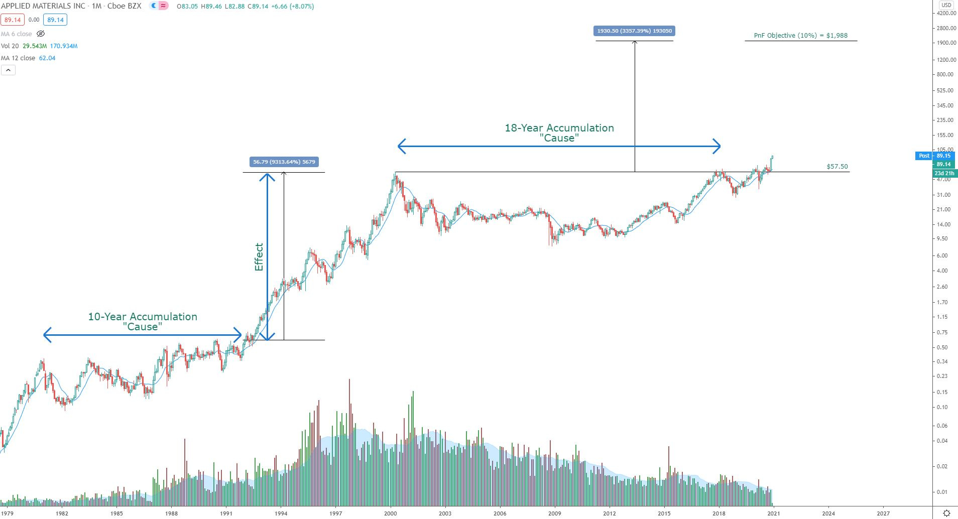
Using the 10% Point and Figure chart I was able to come up with a target of $1,988. Yes that seems insane - but consider that this stock chopped around for 18 years (cup) and then an additional 2 years (handle).
The move to $1,988 from the breakout area (buying climax from the Dotcom era) would represent a 3,350% move. That seems insane I know.
But consider the 10-years of chopping action from 1980-1990 that resulted in a 9,300% move! These massive moves take many years to complete - so I’m not talking about this as a get rich quick setup. This is a type of setup I look at for high probability setups and leap setups.
Here is the Point and Figure chart that I used to come up with that sky high target of $1,988

There are 20 columns in the count over the 18-years
This is a 10% box size chart, which yields an objective of $1,988 when using the anchor point of $6.53.
As mentioned earlier, the above example is just from one of the eleven top Nasdaq100 stocks from last night’s post. I most likely could have chosen any of the other ten and come up with massive counts.
Just a few questions I ask when looking at setups:
What is the potential move?
How much of the energy has already been expended?
Is the stock currently above or below resistance levels?
When I learned to find these setups, and use solid risk management things started changing drastically for me. Risk management to me means not going all in on a position, regardless of how awesome the setup looks. Waiting for the right entry is of paramount importance, especially if using time sensitive options.
Have a great night!