

Bitcoin Update - 10/25/20
Bitcoin Update - 10/25/20
Targets With Point and Figure Counting Examples (Horizontal and Vertical)


When dealing with charts that rise exponentially, it is imperative to utilize the log scale feature. Many people are introduced to stock charts with the arithmetic charting - and there is nothing wrong with that. Using this method is ok for stocks that are trading in a long-lasting range, however once price escapes from the range the arithmetic charts may start to look distorted, especially true for rapid risers. I always default to the log scale because that is my preference, and it fits better with my timeframe. My go-to time frame is the weekly and using log scale has worked out better for me. For more on the topic check out this post.
So which scaling system is best? Both systems have their advantages and disadvantages. One's preference largely depends on analysis style and timeframe. Traders looking to capture short-term price movements or analyze trading ranges may prefer arithmetic scales for price purity. Chartists interested in trends and long-term price histories will likely prefer log scaling. Notice that a log scale is best used when prices have moved a significant amount, up or down.
So, with that said, when looking at the historical Bitcoin chart, logscale has to be used in order to see how price moved in the earlier days (pre-2016) - without having to zoom into that period. The same also applies to Point and Figure! Often a point and figure chartist will use the ATR to establish a box size - which is fine for recent action - but it will make the historical periods disappear on the chart. For example, the current ATR(20) on the daily chart of BTC is $363. If you were to plot the ATR(20) chart it looks like this:
Daily Point and Figure with ATR(20) box size:
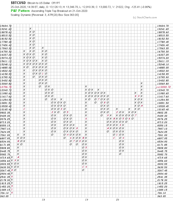
Notice how there is no data prior to 2017? That is because it’s all encapsulated in the box size of $363. Bitcoin traded for quite some time under $360 and all that data is gone. So here is a log scale chart (using 5% box size) which shows more historical data on the chart:

This particular ticker on Stockcharts ($BTCUSD) only has data going back to 2014, but it is still an improvement on the chart from the ATR method because it includes the consolidation that lead up to the prior bull run. There is some good info to use from that period and there’s enough data to generate some point and figure counts (both horizontal and vertical counting methods). So, the bottom line: I will always default to the log scale on Bitcoin and equivalent charts.
Now for the targets. Below I will show how I can generate some targets on both the horizontal & vertical counting methods of point and figure.
Horizontal Method:
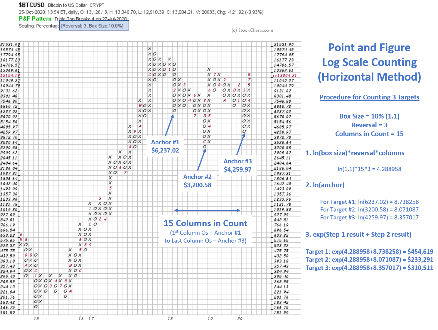
I have embedded the procedure for counting the 3 targets so this chart can be saved as a reference - hopefully this is helpful for quick reference in the future.
This chart is a “High-Low” variety of Point and Figure (see here).
First - This is a 10% box size chart
Second - This is a 3-Box Reversal chart - meaning a new column of Os will print when price reacts by 3 boxes. In this case it would take a pullback to $9,131.62 to generate a new column of Os.
Third - There are 15 columns in this range of accumulation that I am considering. This is where the “Horizontal” name comes into play. I am counting horizontally across from left to right to get the final input for the count.
The counts are (from most conservative to most aggressive):
$233,291
$310,511
$454,619
These are very high targets and would represent massive % gains from current prices. But these are legitimate point and figure counts using the methods I have learned over the years. The past 3 years have generated a lot of chop, so much chop in fact that 15 columns on a 10% chart were generated (recall that each new column only takes place on a 30% move - 3 box reversal x 10%). More chop yields more columns which yields higher counts. If there were to be a 30% pullback to print an additional column of Os, then the above counts will only increase.
Vertical Method:

I have embedded the procedure for counting the vertical target so this chart can be saved as a reference - hopefully this is helpful for quick reference in the future.
The target here is based on the first column of Xs off the bottom. I call this the “count column”. This is where the name “Vertical” comes from. I am counting the Xs in that important column off the lows. The anchor is the low from the prior column of Os, or $3,520.64.
Steps 1 & 2 are basically the same except the horizontal columns are replaced by the Xs in the count column. Step 3 is the same.
NOTE: This target is inactive until an X prints above the highest X in the count column, which will be at $13,369.61
Notice how there is currently a long column of Xs in progress. This can eventually be used as a 2nd vertical count with anchor $5,154 - but the column is not established until there is a 3-box reversal of Os. The higher the thrust in this current column, the higher the count will be. A thrust up to $20k before a 3-box reversal would establish a column of 14 Xs and yield a target of $282,300. At this point that is a hypothetical scenario only - but there will eventually be a column of Os - so bulls want to see this current column to continue its thrust higher prior to the next column of Os.
These counts represent amazing potential. And I need to emphasize that this is POTENTIAL - nothing is guaranteed. Nevertheless, I always like to measure the potential reward on any investment or trade and having solid targets in place helps me make better decisions with respect to reward vs. risk.
Here is the current weekly candlestick chart of Bitcoin:
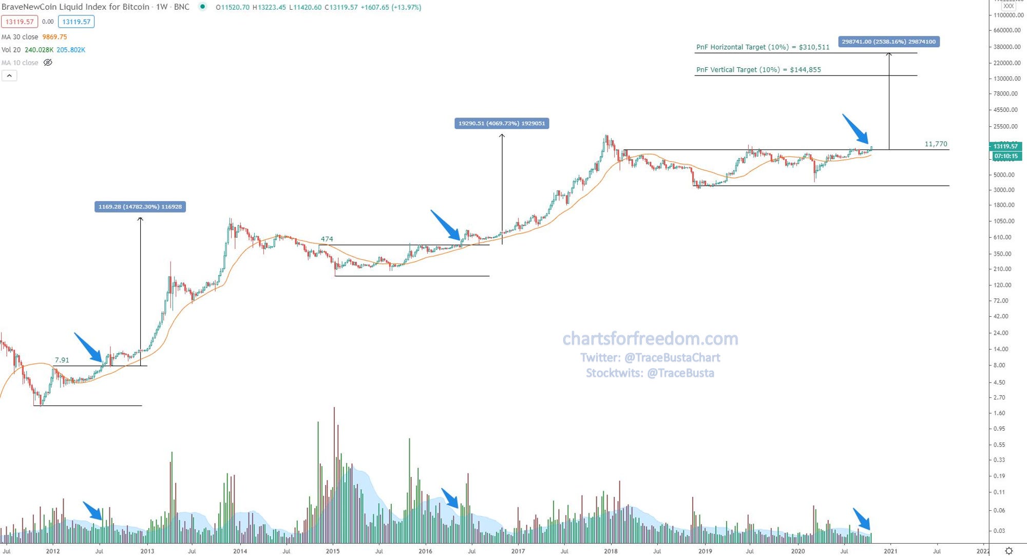
The recent rise in price was enough to breakout above the $11,770 area. Price has now wicked to a level that is 13% above the breakout area ($13,363 weekly high wick). There is relatively high volume (relative to the 20-period volume average) to match this week’s candle.
Note: In both prior two breakouts from the consolidation ranges, there were hefty pullbacks to test the breakout area.
In August ‘12 there was a 50% pullback to test the breakout.
In June-August of 2016 there was a 38% pullback to test the breakout.
I have shown the prior two % gains on the chart. These are massive. A rise to the middle horizontal count of $310,511 would be a much smaller % gain (2,538%) than the prior two instances of 14,782% and 4,069%.
When will the next set of targets be achieved? I do not know and nobody else does. There is a analog to the prior bull rally that suggests the top may come sometime around Dec ‘21 (shown below):
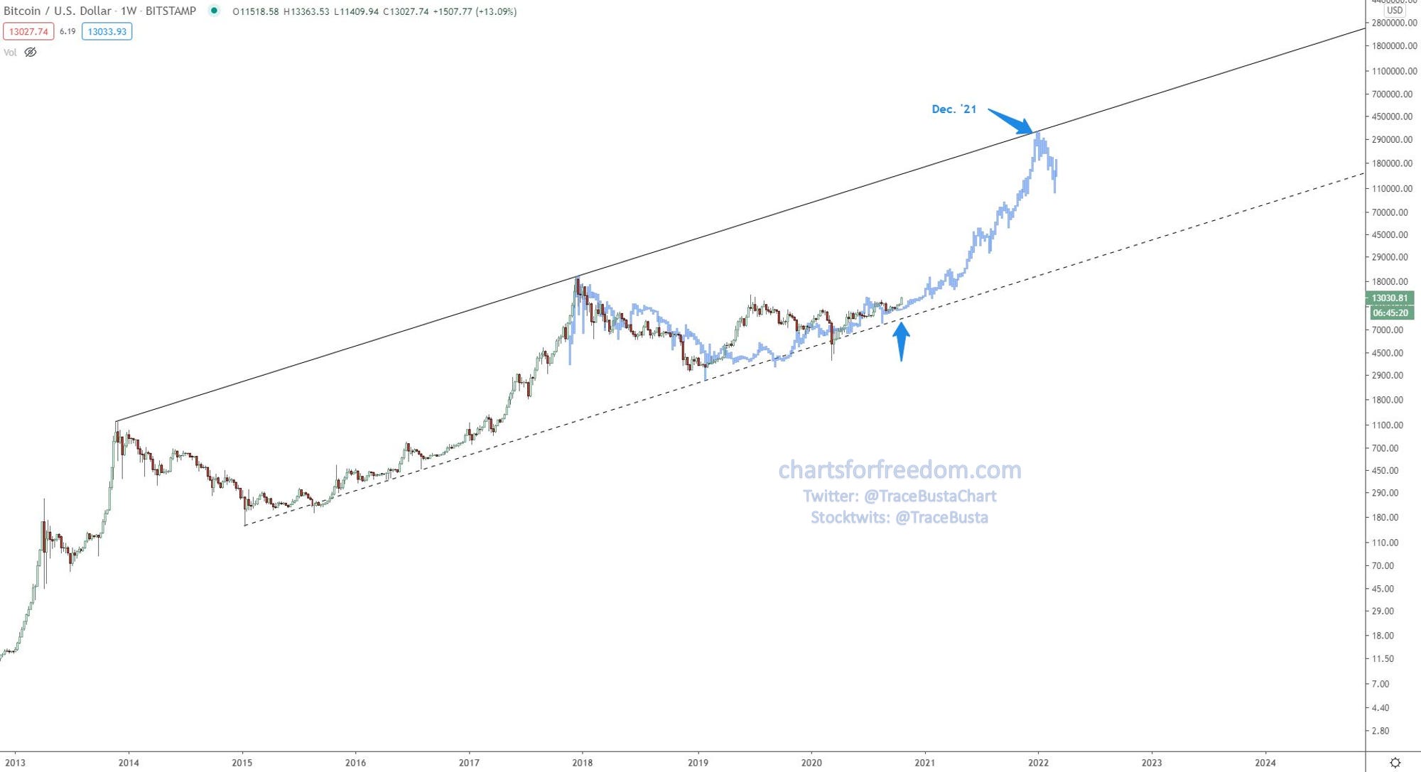
Nothing ever plays out exactly the way it did before. This is just an example of how a bull market can develop, with a late 5-7x move coming in the final months of a 4 year rally. Major gains and major shakeouts along the way. This is shaping up to be a nice 12-15 months if that prior analog were to play out. Again, nobody knows.
I will note that I do have a stop loss set just under $8,200. Nothing is guaranteed, and I always want to be prepared to close out the position should the breakout turn into an upthrust after distribution. I am prepared and know my risk/reward. The best time for a plan was yesterday, the next best time is today.
All the best,
Trace