

Big Picture Views, Inflation, Volatility & Market Eras
Big Picture Views, Inflation, Volatility & Market Eras
Zooming out for answers

Good morning,
What if one knew when the markets would enter a 10-20 year period of 750% gains? If you knew in advance, wouldn’t that be very rewarding?
I’m a big believer in cycles and history rhyming. Human nature and psychology persist through different eras. Fractals and all that.
Today my goal is to zoom out and look at the largest, longest-lasting stock market trends of the last 100+ years’ worth of data and identify where it paid to be long. There are historically three major eras where the secular bull markets dominated. And these weren’t just rallies of the short-term variety. They were meaningful, 10-15 year bull markets.
For this exercise, I went through a charting session this morning, found where the YoY US Inflation rate peaked and plotted the coincident point on the 100+ DJI quarterly chart. What I found was pretty astonishing. I got a decent estimate on when I think the next secular bull market will begin and tried to confirm with the monthly VIX chart.
The 100+ Year Inflation Chart (YoY)
Starting with the inflation chart.
On August 21, I shared the 102-year inflation trend line:

At the time, I concluded with:
If the YoY inflation rate were to decrease back to 5% in May ‘23 and get down to 2% in May ‘24 (which doesn’t look unreasonable according to the historical reactions from the trend line), the four-year impact would be +22.5%. Pretty steep. I don’t know what it all equates to or the consequences for the markets, but just some food for thought.
Here’s that chart again, updated with August data now:

There are three prior instances where the inflation tagged the downward sloping trend line:
1920
1947
1980
The 100+ Year Dow Jones Industrials Chart
I plotted those precise inflation data points on the 100+ Dow Jones Industrials chart. And that is where I started to see from a visual perspective what I had suspected for some time:
Once inflation peaks, there isn’t an instant market rebound; it takes 1-2 years to work through
The DJI quarterly chart below shows the three prior inflation peaks in blue arrows:

The zones shaded red was the chopping or flatlining action of the markets, averaging eight quarters in duration (2 years).
The zones shaded in green were the secular bull markets, averaging 56 quarters in duration (14 years).
I’ve plotted a few parallel trend lines that fit the data well and a potential path (blue) the markets might take as they work through this post-peak-inflation era. The ultimate destination is DJI $200k-ish by 2038-ish. The target is projected from the average gains of the three prior secular bull markets.
So an approximate 14-year rally that travels from ~$20k-$30k to ~$200k. I’ll take it. But do the markets really need to wait until July ‘24 to get things going? Well, the monthly VIX chart seems to suggest so.
The Monthly VIX Chart
On January 9, I shared the “Market & Volatility Eras” with paid subscribers and later opened it to the public.
Here’s what the updated chart looks like now:
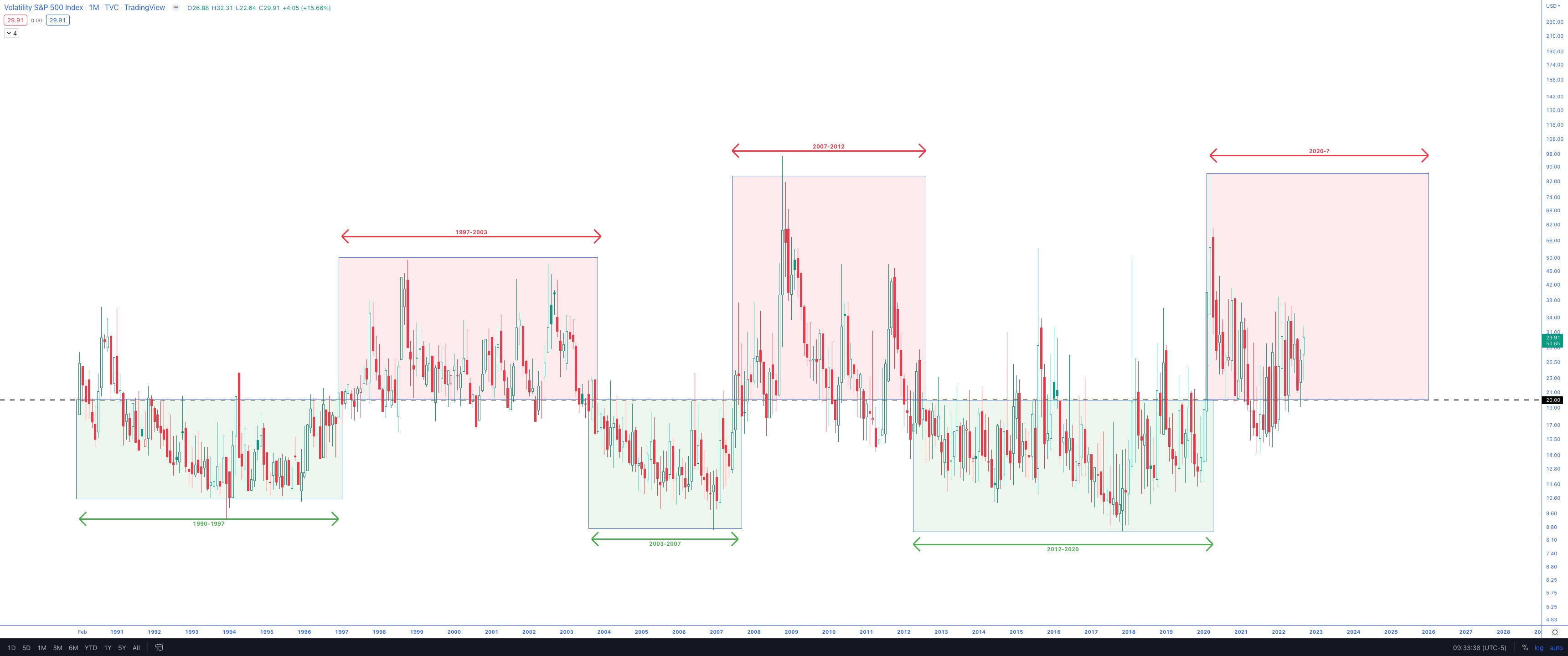
The heightened volatility has persisted in 2022.
The expected duration is ~6 years based on the two prior eras.
I understand this is a small sample size, but that is our data.
So if the high volatility era began with the Covid lockdowns, it wouldn’t end until 2026. That aligns with the next secular bull market that started eight quarters after the June volatility peak (July 2024).
There are typically 1-2 years of declining volatility from the high 40s down to the sub-20 area.
The 100+ Year SPX Chart & the Extension from the 10-year SMA
In January (same VIX era post shared above), I noted the extension SPX had from its 10-year SMA.
Here is the updated look:

The extension from the 10-year SMA peaked in the same area as the historical comps, and the extension has been cut precisely in half.
Further downside should be limited; I suspect it will be a timing AND price combination before the extension resets to healthier levels, i.e., the price could flatline for two years and allow the moving average to catch up.
Have a great week,
Trace